People are always obsessed in keeping themselves up to date. This desire contributes to why so many of us are addicted and dependent on social media platforms. Any news or information could be spread almost instantaneously with the power of the internet now using news apps. However, you certainly can’t trust everything you read online, can you?
So, where do you go for fast and reliable sources of news?
Broadcasting companies notice the change in the market as audiences are moving from televisions to computers, tablets and mainly, smartphones. They will have to adapt to the changes in the market by launching their own websites and mobile news apps to keep their audiences happy, or satisfied at the very least. CNN and BBC News are great examples.
On the other hand, we have also witnessed the emergence of multiple news apps over the last five years. Notable ones include Flipboard (2010), Yahoo News Digest (2014) and a localized news app for Malaysians, Spot News (2014)
To test how good these news apps work for the users, we compared them based on five key areas:
- Reading layout of articles
- Personalization options of article topics
- In-app search functionality
- Bookmarking experience of interested articles
- Sharing process of selected articles
The boxes in yellow highlights which news app has performed the best in that particular area tested.
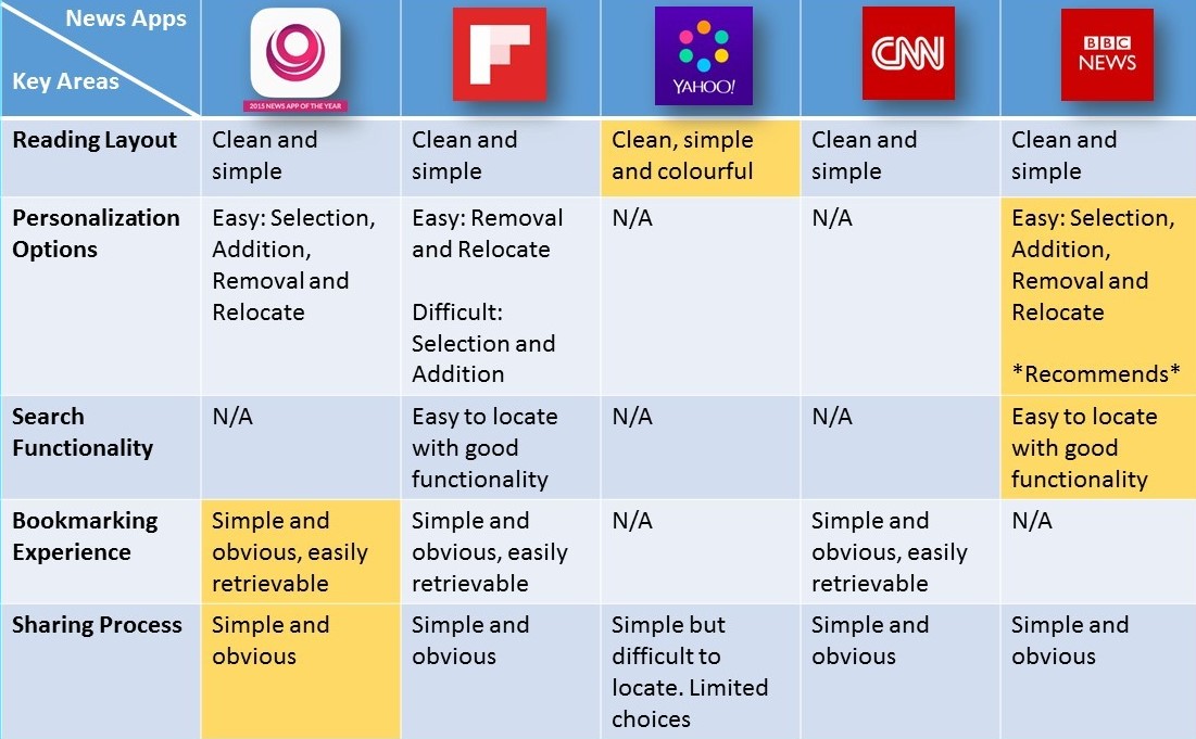
Summary of key areas tested against various news apps.
Reading Layout
The reading layout of all of the news apps above is generally clean and simple. No matter how good your content is, your users won’t stay long without a comfortable reading experience. Yahoo News Digest has the edge among the other apps as they include a wide variety of colours in the app.
Yahoo News Digest: Colourful reading layout.
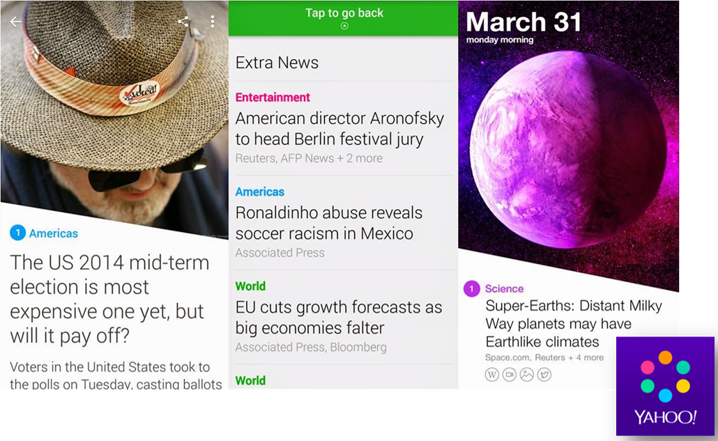
On the other hand, the other apps limit themselves to colours that are closer to their logos. Perhaps it is part of the branding process but Yahoo definitely deserves the credits for their ability to include a variety of colours without making the app appear messy.
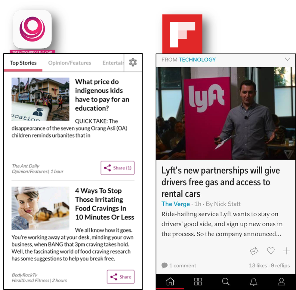
Spot News: Reading layout follows the theme color of the app – white & purple.
Flipboard: Reading layout follows the theme of the app: white & red.
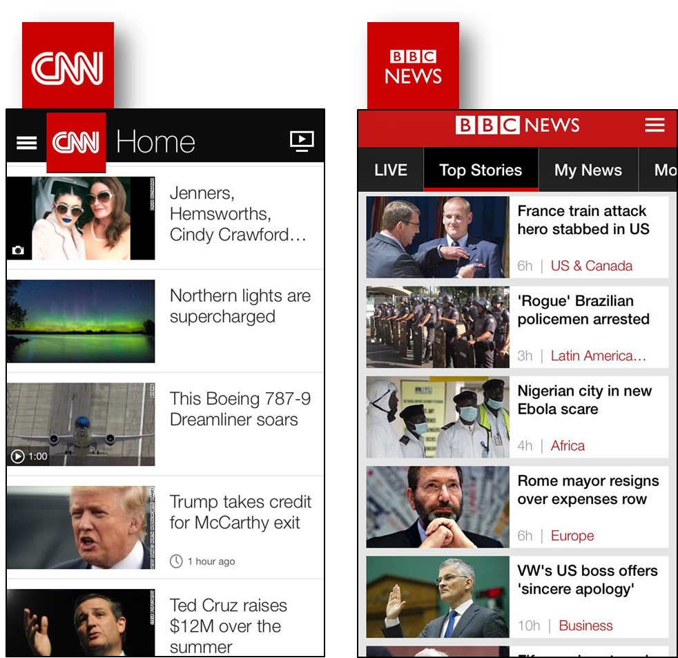
CNN & BCC News app: Reading layout follows the theme of the app: white & red.
Personalization Options
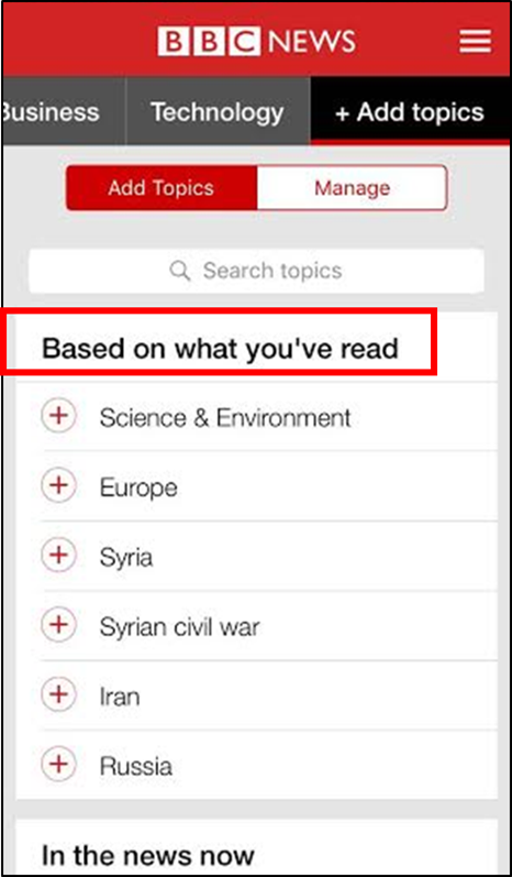
Users will feel more engaged and connected to the app if more personalization options are being offered. BBC News is doing a great job in recommending news topics based on what users have personalized earlier as it improves the overall user experience of using the app.
BBC News app: Recommended topics are based on what the user has read.
This feature also helps to increase the time spent by users on the app, as users will stay on longer simply because there are more articles to read. The process of selecting, adding, removing and relocating the news topics is fairly easy for users to understand as well.
Search Functionality
The only two apps to provide a search option/function for users are Flipboard and BBC News. Many search bars in websites and apps fail to produce the expected or related results for users.
However, it’s not the same in Flipboard’s and BBC News’ case. These two apps have an excellent search function: When certain keywords are entered, only related articles are displayed.
Here is a comparison of how both of these apps reacted to the word “Facebook”:
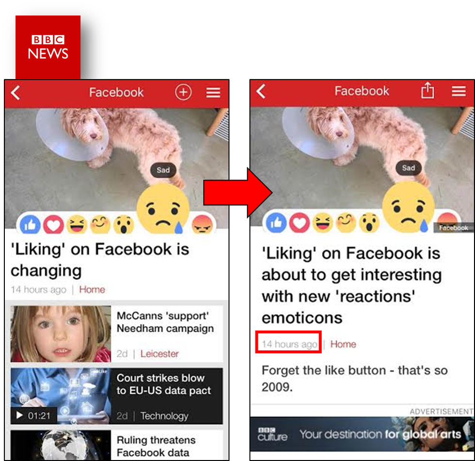
BBC News app: Search results for “Facebook”. The most recent article related to “Facebook” was uploaded 14 hours ago.

Flipboard: Search results for “Facebook”. The most recent article related to “Facebook” was uploaded a day ago and presented in web-view.
BBC News has the edge over Flipboard as their published news articles are more up-to-date and presented in app-view. On the other hand, Flipboard’s articles are curated from external web sources, not as up-to-date, and moreover some articles tend to be presented in web-view.
The search function tends to be a tricky area in building websites and apps to most developers. If you can’t excel it, exclude it. There really is no point in keeping something that is dysfunctional in your app. Perhaps that’s why the rest didn’t include a search bar, who knows?
Bookmarking Experience
Among all, Spot News has the best bookmarking function: It is very direct and requires the least number of steps to bookmark an article for future retrieval.
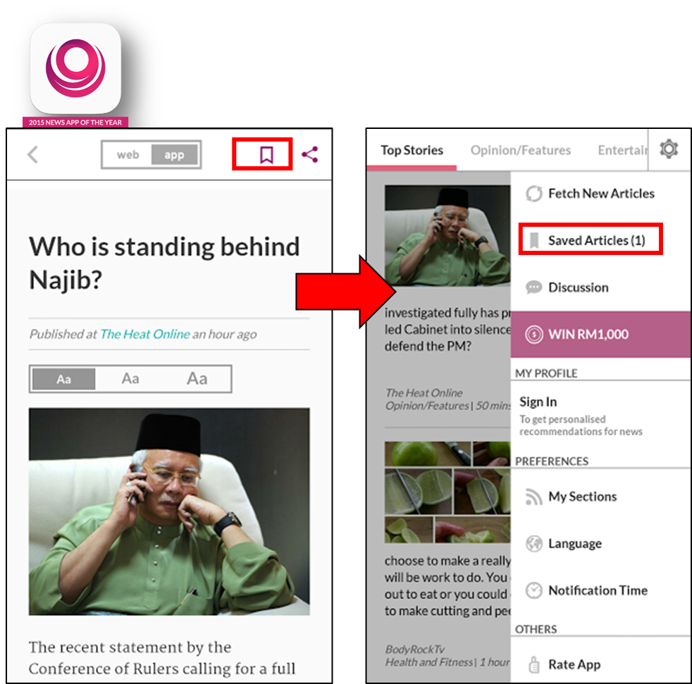
Spot News: The simple bookmarking function helps user to quickly bookmark. By accessing the side menu, users can easily allocate what they have bookmarked earlier
Both Flipboard and CNN have good bookmarking functions too; but Spot News had the upper hand due to its simplicity and efficiency. A good bookmarking experience will definitely help users that are living a busy lifestyle.
Sharing Process
Spot News is the winner again here because it is the only app to display the sharing icon at the article thumbnail, as well as within articles. Like most news apps, Spot News conveniently provides a wide range of sharing channels for users to choose from. And of course, doing themselves a favor too as they gain more awareness through social sharing of articles through their app. There’s nothing to lose by providing your users more options and control on how they would like to use the app after all.
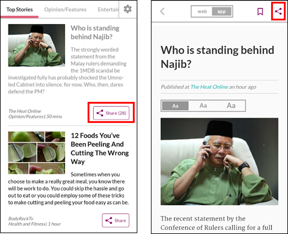
Spot News: Sharing function is up-front on article thumbnails. Sharing function (top right icon) within articles.
Now let’s have a closer look at their individual strengths and weaknesses:

Spot News
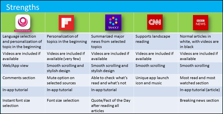
The language selection option in the beginning was really special and was most probably catered for Malaysia’s multicultural audience, as it is not seen in other apps. The instant text size selection within articles itself provide users more viewing options and convenience as well. Furthermore, there is a comments section at the end of articles that functioned as a platform for users to interact with each other.
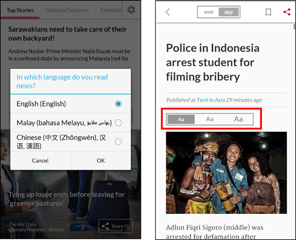
Spot News: Language selection after initial launch of app. Instant text size selection within articles.
However, some of the images aren’t in HD, which make the app appear less professional. Its transition during scrolling lags occasionally and the app has a relatively slow loading and refresh speed. The problems mentioned aren’t big, but these things do annoy users.
Flipboard is renowned for its unique and lag-free scrolling. Another feature that catches our attention is the option for users to mute certain sources. Articles from muted sources will no longer appear on the user’s personalized app. It’s a very unique feature, and will certainly provide users more freedom on using the app.
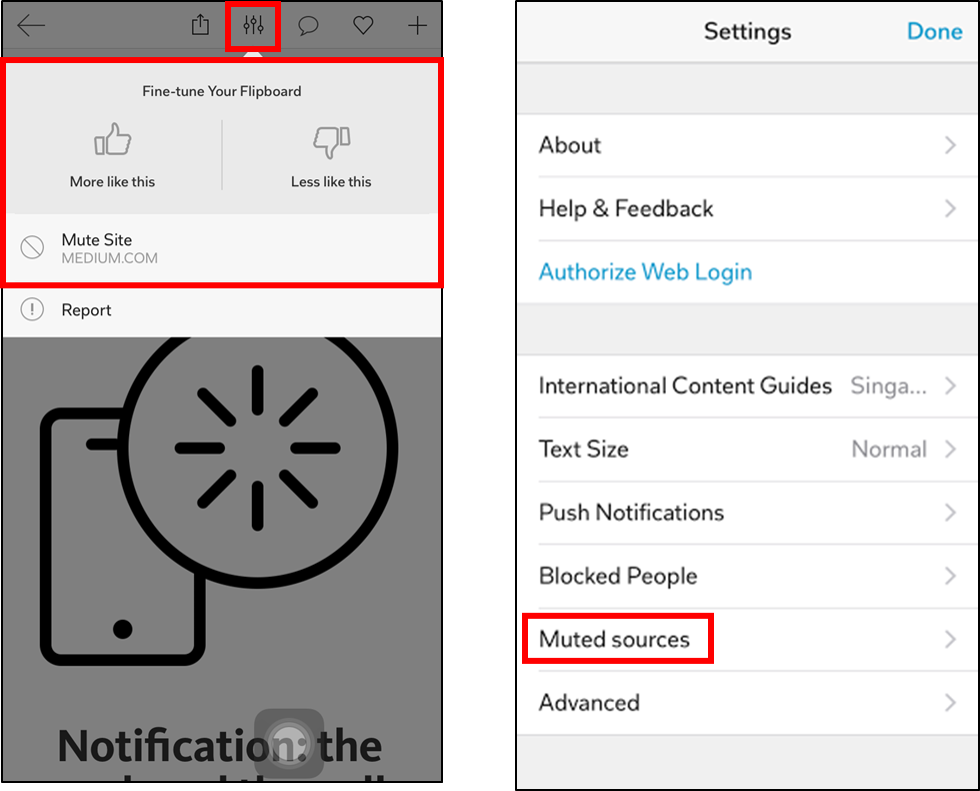
Flipboard: Function to mute the source of article. Check muted sources from settings.
Flipboard has lesser topics to personalize compared to the other news apps. It is also the least user-friendly in terms of personalizing. Users will need to spend some time to understand how to personalize this app.
Yahoo News Digest
Yahoo News Digest basically gathers one major news from each news topic for users to digest – hence the name. It’s really great for lazy users (like most of us) who just want a quick dose of daily news. Due to the limited number of articles, Yahoo News Digest is able to tell users what has been read and what’s not. The app also rewards users for reading all the daily articles by providing a quote/fact of the day at the end. This feature may help the app maintain a healthy usage rate, as it seems like a good way to motivate users to finish reading all the daily articles.
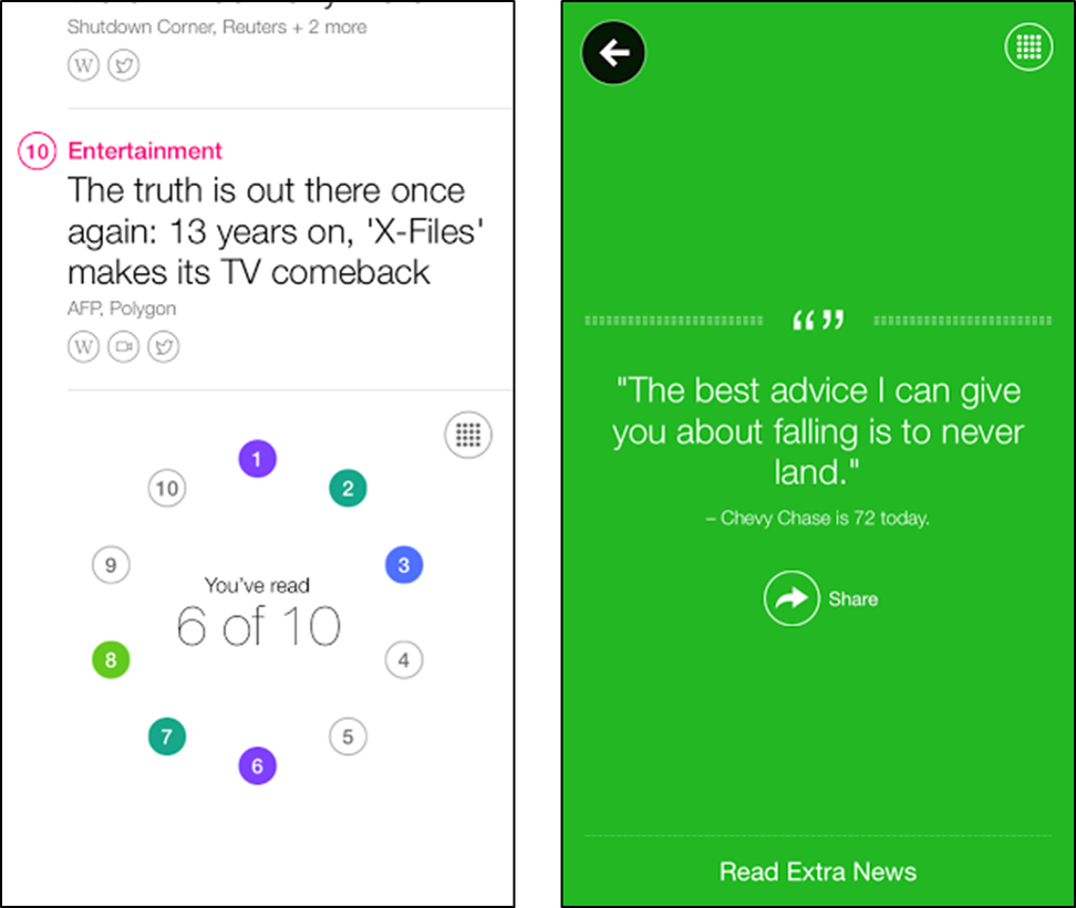
Yahoo News Digest: Presentation of the number of articles read out of the daily articles/topics. Quote of the day after reading all daily news articles.
Apparently, there is a cost in pursuing simplicity. Yahoo News Digest is publishing way lower amounts of daily articles compared to its competitors. This may not please the ones who want to find out more.
There are only very limited functions in the app. Functions like personalizing, searching and bookmarking are not available. Its sharing channels of articles are really limited too. Email, Facebook and Twitter are the only options.
CNN
CNN was the only one that provided the option to browse and read articles in landscape mode. Users are able to browse through the thumbnails of articles on the left side of the screen while reading a chosen article on the right when in landscape mode. Also, the CNN news app has a really unique app launch icon and music.
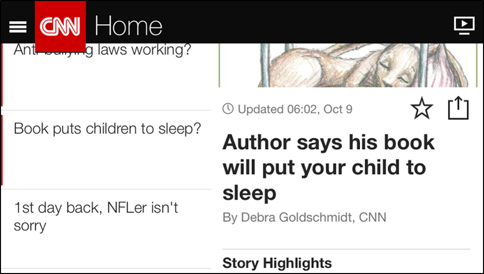
CNN News app: App available in landscape mode.
Similar as Yahoo, CNN did not have many topics for users to personalize. This news app was the only one not to include an in-app tutorial too.
BBC News
In BBC News app, users can easily differentiate articles that include or exclude videos. The thumbnails of normal articles are in white backgrounds and the ones with videos are in black backgrounds.
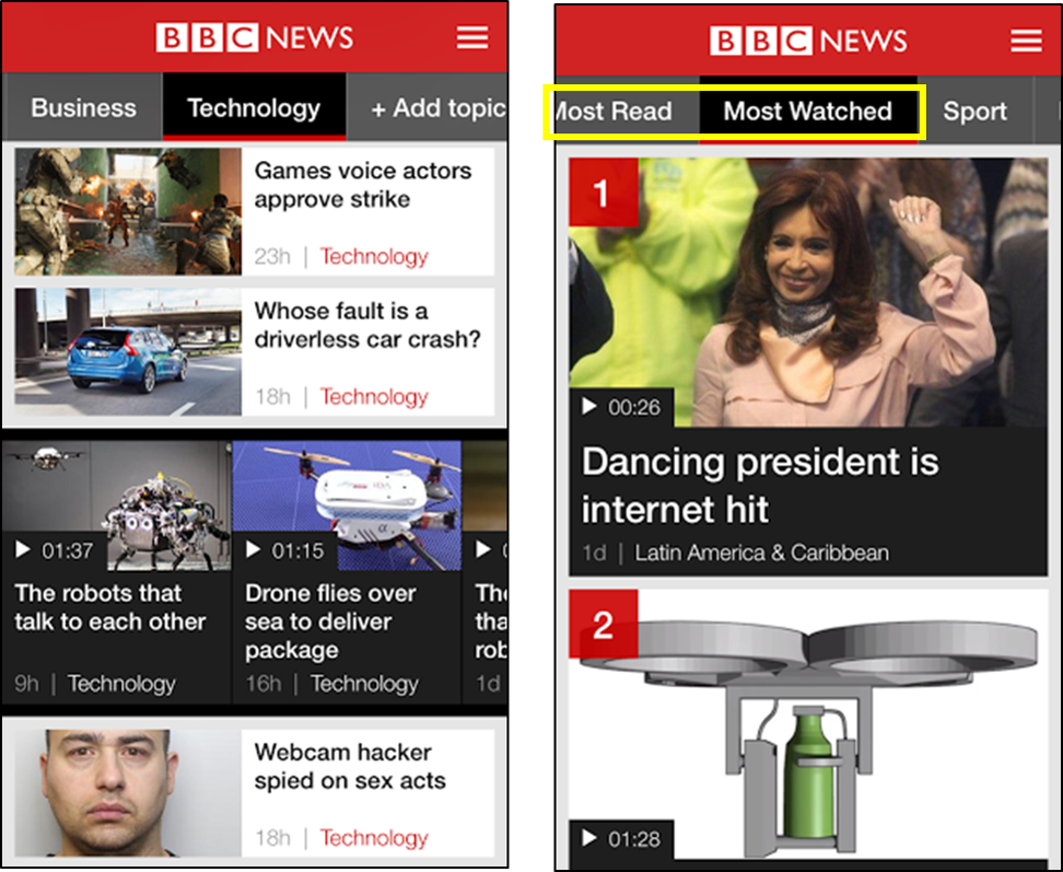
BBC News app: White background for news articles, black background for news videos. Discover trending news articles and/or videos under “Most Read” and “Most Watched” section.
This visual cue really helps users who are seeking for news videos to watch. They also have a “Most Read” and “Most Watched” section for users to discover what’s trending at the moment. They are the only app to have a “Breaking News” section.
One problem with this app is the inaccessibility of older news. The display of articles will eventually stop if users scroll past an amount of articles. As seen below, the last news displayed under the “Sports” section stopped at “Russell and Ford passed fit for Scotland” and is only 22 hours old.
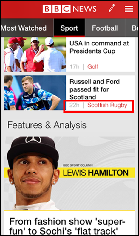
BBC News app: Inability to scroll down for more “Sports” news.
Here is a list of what is good to have in a news app:
- Clean and simple reading layout
- Easy editing and wide range of personalization options
- Good search functionality
- Convenient bookmarking experience
- Fast sharing process
- Breaking news section
- Most read and most watched section
- Read and not yet read filter
- Language selection
- Smooth scrolling and unique design
- Support landscape reading
- In-app tutorials
- Related news or suggested topics
- Include videos
- Readers’ reward
- Support both Mobile Operating Systems
Here is a list of what to avoid in a news app:
- Using low quality pictures and videos
- Lagging app experience
- Slow loading and refresh speed
- Limited topics for personalization
- Too complicated, not user-friendly
- Lack of functions
- Inaccessibility of older news
Of course, not all of the above mentioned is a must to fulfill in order for a news app to succeed. It is purely a summary of what we think should be included and avoided. Another important aspect to consider while building an app is constructing an identity for it.
Flipboard has marketed the Flipboard app as users’ personal magazine, Yahoo News Digest summarizes major news that users need to know, while Spot News is a Malaysian-friendly news app. By exploring and studying the above discussed with an original identity, you too can build a great news app.


