Most online services today have become highly interactive and are delivered via mobile devices. This means that user interface(UI) and user experience (UX) have an ever-increasing role to play in today's technical world.
While UX traditionally focuses on the experience that users have with a product and service, UI focuses on the ease of interaction with a product's interface.
What is UI/UX design?
UI/UX design revolves around a set of activities that seek to deliver a productive, usable, and visually satisfactory interactive tool.
These activities involve concepts and workflows that aim to produce an experience that is enjoyable and empathetic while remaining aligned with an organisation’s business goals.
UI/UX design activities typically encompass user research, product design, usability studies, information architecture, content strategy, user interface (UI) design, visual design, prototyping, and more user testing.
So, while UI designers decide how the user interface will aesthetically look, UX designers ultimately determine how the user interface will operate.
For more information, read this comprehensive guide on “User Interface.”
10 innovative user interface design examples
Drink Half Past
This innovative beverage company exploits a unique and dynamic visual colour palette on their website design to show a playful side of the brand.

It maintains a consistent colour match across every block of content for corresponding flavours.
This unique colour implementation strategy matches the flavour of each drink while reflecting the ingredients inside. In a way, this visually probes website visitors to experience the uniqueness of the product, even before making a purchase.
Pinterest’s icon UI delivers a waterfall effect to provide users with a seamless experience. In practice, each Pinterest card is given a subtle shade whenever it interacts with the mouse.
This can be aesthetically pleasing to users whilst giving the perception of “clickability”.

Headspace
Headspace provides accessibility options that are inclusive for all users. Users can flexibly choose colours, navigation options, sizing, and even readability preferences on the platform.

Furthermore, users can also exploit capabilities like text magnifiers, voice communication, and a virtual keyboard to access medication features.
Overall, this array of amazing accessibility and usability flexibility enables users to adapt the system to their preferences so they can comfortably use it with freedom and control. It results in a very enjoyable user experience, and in turn, repeat visits.
Pitch
Pitch is a collaborative mobile and web app for building and managing professional presentations. Hence, its website UI presentation has to somehow reflect its ethos.
Its website intuitively walks users through what their journey would be like if they actually used the application. With a clean and cohesive flow that avoids clutter, it does a great job of highlighting the primary product features of its offering.

Squarespace
Squarespace employs card carousels to display the templates within their application. This allows users to quickly scan through several options at once. Overall, its UI deploys a clean, straightforward design with minimal copy and a centrally aligned navigation.

It also keeps a consistent feel with the rest of the app, which enables users to learn it faster. For example, it provides a constant indication of the number of templates available, so users know where they are as they progress.
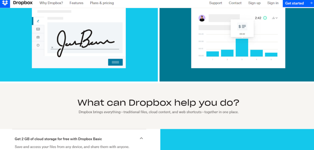
Dropbox
Dropbox employs responsive colours to great effect rather than employing a single symbolical colour. This colour dynamism helps keep users continually engaged as they navigate the Dropbox website.

Semplice Labs
Semplice Labs offers a beautiful but functional UI that features fluid animations and smooth transitions that are desirable to users. This company boasts a reputable WordPress portfolio created by designer Tobias Van Schneider, who is known for his work with Spotify, BMW, and Google.

Cognito
Cognito’s brilliant UI shines best after loading with unique illustrations that come to life to display sophisticated motions. This dynamism illustrates the brand’s offering at a glance whilst keeping users intrigued.

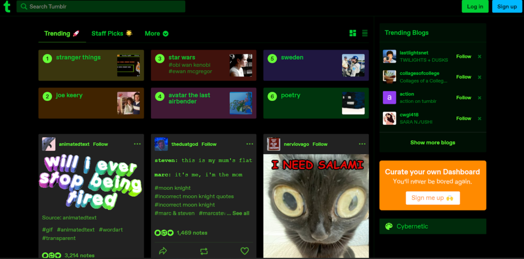
Tumblr
Tumblr’s UI design also enables users to customise their palettes and views in a manner that works for them.
For example, it provides various options to change page width and the colour palette with options like ‘canary’, ‘vampire’, or ‘ghost’.
As a result, the palette choice can support better readability, satisfy users’ aesthetic preferences, and enhance the speed of navigation.

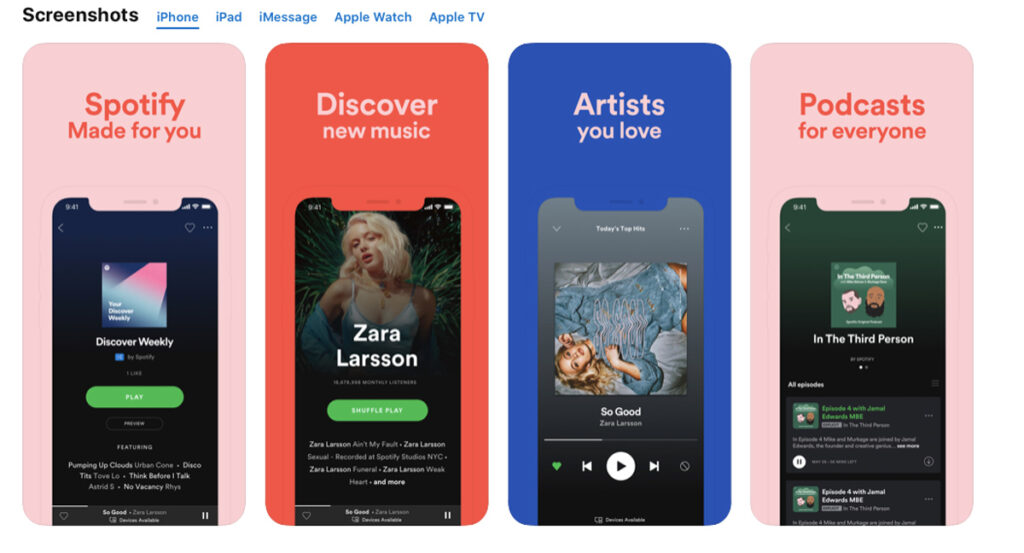
Spotify
This music streaming powerhouse’s website exploits colour gradients to convey emotions or highlight a specific feature of their offering. This allows its mobile application to be more engaging and fun to use over extended periods.

While these UI design examples provide a wealth of inspiration, translating them into functional and user-centered interfaces requires a strategic approach. Here's where partnering with a UI/UX design agency can prove beneficial. Their team of skilled designers and UI/UX specialists can take these design concepts and transform them into user experiences that not only look appealing but also function flawlessly. Agencies can ensure consistency across all design elements, conduct usability testing to identify areas for improvement, and ultimately deliver a polished user interface that aligns with your business goals.
Conclusion
An aesthetically pleasing design cannot really save a UI that’s confusing to navigate.
However, a well-thought-out user experience can be overshadowed by bad visual interface design that makes navigating an application unpleasant.
That being said, both UI and UX design processes need to be executed in tandem and perfectly aligned with user expectations to create a cohesive user experience. And when these elements align in perfect symmetry, the results can only be eye-catching!
While this article explores inspiring UI examples from various companies, understanding the usability heuristics covered in Top 10 Usability Heuristics for User Interface Design will ensure those interfaces are not only beautiful but also user-friendly.


