We often say that speed is of the essence, and it seems that Google couldn't agree more. Google announced on May 28th 2020, that they have designed a new ranking algorithm that will judge websites based on user experience.This means that if Google's algorithm thinks your website has a poor user experience, Google may not rank your website as well as they are now. Fret not, this update will only go live sometime in 2021, so there is still time to prepare and revamp your website to ensure it has a good user experience.
Why is Google going to rank your UX in 2021?
Through the years, Google has been conducting internal studies and industry research in evaluating page experience for a better web, they have gathered hard data that has supported their intuition that "speed matters" and that users prefer websites with great page experience.Google's Search Engine has been refining its metrics throughout recent years in adding a variety of user experience criteria such as page loading time and whether the website is mobile-friendly as vital factors for ranking results.In their experiments, they have found that the slowing down of search results page by 100 to 400 milliseconds has a significant impact on the number of searches per user, resulting in 0.2% to 0.6% in decrease of searches for changes that take less than half a second.While these numbers may seem small, Google states that a daily impact of 0.5% has real consequences at the scale of Google web search, this is because the cost of slower performance increases over time.Google is continuously running experiments in hopes of finding ways to improve our web experience, and so they have announced the Google Page Experience update.
Google Page Experience
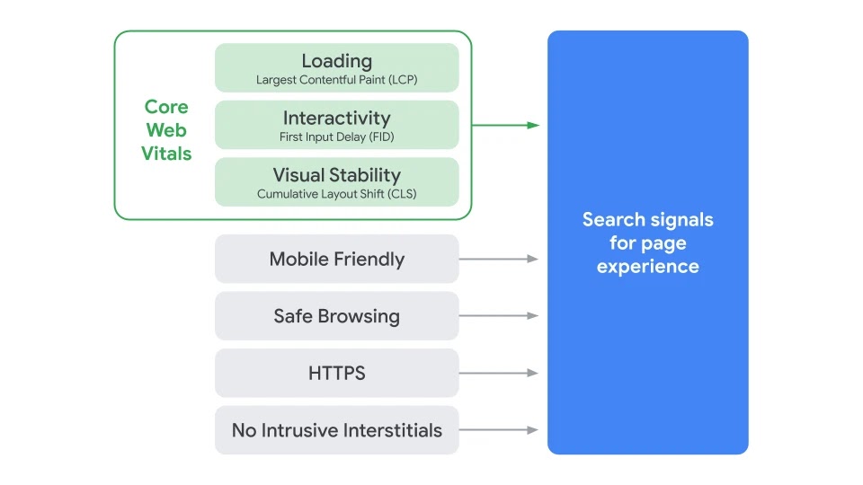
The Google Page Experience measures how users perceive the experience of interactions on a website, this set of signals include the existing Search signals: mobile-friendliness, safe-browsing, HTTPS, and intrusive interstitial guidelines. This now includes Core Web Vitals, and this update is set to go live sometime in 2021.[caption id="attachment_1116" align="aligncenter" width="960"]
Credit: https://webmasters.googleblog.com/2020/05/evaluating-page-experience.html[/caption]
Core Web Vitals
Core Web Vitals measures real-world user experience for loading performance, visual stability and interactivity of the page. These metrics will evolve over time, the current set focuses on three aspects of user experience and their respective metrics & thresholds.
1. Largest Contentful Paint (LCP)
[caption id="attachment_1117" align="aligncenter" width="384"]
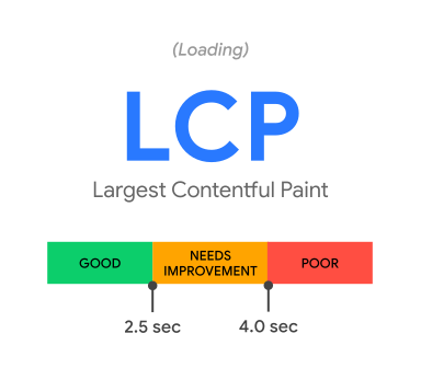
Credit: https://web.dev/vitals/#core-web-vitals[/caption]Largest Contentful Paint (LCP) measures perceived loading speed, marking the point when the page's main content has loaded. A fast LCP reassures users that the page is useful, the target speed for the LCP is within 2.5 seconds of when the page first starts loading.Let’s compare 2 examples to get a better understanding:[caption id="attachment_1159" align="aligncenter" width="1600"]
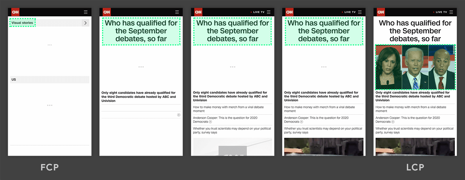
Credit: https://web.dev/lcp/[/caption]In this example, we can see that the largest element changes as the content loads with time as highlighted by the green box. The new content is added and this changes what element is the largest. This would be considered to be a slow loading speed for the LCP.Now let's take a look at the example below:[caption id="attachment_1158" align="aligncenter" width="1600"]
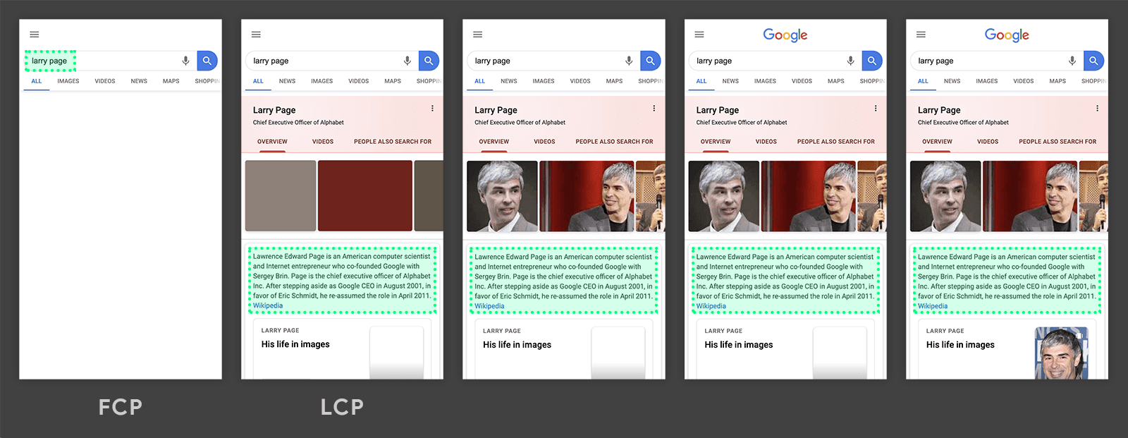
Credit: https://web.dev/lcp/[/caption]Here we see (highlighted by the green box) that the Largest Contentful Paint (LCP) is loaded before the page fully loads. The largest element is a paragraph of text, which is displayed before any images or logo is displayed. Since all the other elements are smaller than the paragraph, it remains the largest element throughout the process. This is considered a fast loading speed for the LCP.
2. First Input Delay (FID)
[caption id="attachment_1118" align="aligncenter" width="384"]
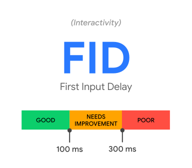
Credit: https://web.dev/vitals/#core-web-vitals[/caption]First Input Delay (FID) measures interactivity, also known as load responsiveness. This is an important user-centric metric because it quantifies the experience users feel when trying to interact with an unresponsive page.FID measures the time from when a user first interacts with a page to the time when the browser is actually able to respond to that interaction. To provide a good user experience, websites should have a First Input Delay of less than 100 milliseconds.This example below showcases a slow FID where the user clicks on a button, and the browser takes 3150 milliseconds to respond to that interaction.
3. Cumulative Layout Shift (CLS)
[caption id="attachment_1119" align="aligncenter" width="384"]
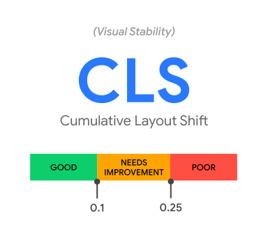
Credit: https://web.dev/vitals/#core-web-vitals[/caption]Cumulative Layout Shift (CLS) measures visual stability, this user-centric metric quantifies how often users experience unexpected layout shifts, the aim is to have a low CLS in ensuring the page is delightful to use.An example is when you are reading an article, you will not want any of the text or elements on the page to suddenly shift when you are in the process of reading, as this will make you lose your spot and need to figure out where you were reading before the shift. Another example is when you are clicking on a button, but the button suddenly shifts a few centimetres up on the screen, then you would have missed clicking on the button, resulting in a negative user experience. Unwanted movement of buttons/elements on web pages is fairly common on the internet today and it is likely that you have experienced it. You will want to try to minimize such layout shift as it is essential to scoring high in the Cumulative Layout Shift metric on Google PageSpeed Insights. This GIF is a great example provided by Google to explain what this looks like (and what we need to avoid):[caption id="attachment_1120" align="aligncenter" width="600"]
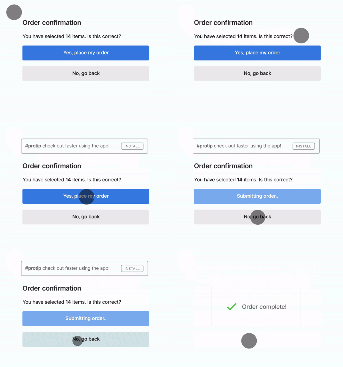
Credit: https://webmasters.googleblog.com/2020/05/evaluating-page-experience.html[/caption]Unexpected movements of page content occurs because resources are loaded asynchronously, CLS measures the sum total of all individual layout shift scores for every unexpected layout shift that occurs throughout the entire lifespan of the page. A good CLS score in providing a good user experience is a layout shift score of less than 0.1.
How do you calculate the Layout Shift Score?
The layout shift score is a product of two measures: impact fraction and distance fraction.
Layout Shift Score = Impact Fraction * Distance Fraction
The impact fraction looks at how unstable elements impact the viewport area between two frames.[caption id="attachment_1122" align="aligncenter" width="840"]
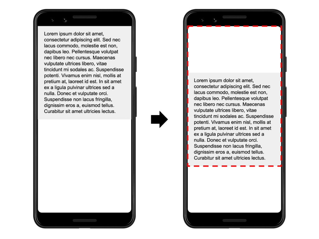
Credit: https://web.dev/cls/[/caption]In the image above, the element shifts down by 25% of the viewport height. The red, dotted rectangle indicates the union of the element's visible area in both frames, which is 75% of the total viewport, thus its impact fraction is 0.75.The distance fraction is the greatest distance any unstable element has moved in the frame (either horizontally or vertically) divided by the viewport's largest dimension (width or height, whichever is greater).[caption id="attachment_1123" align="aligncenter" width="840"]
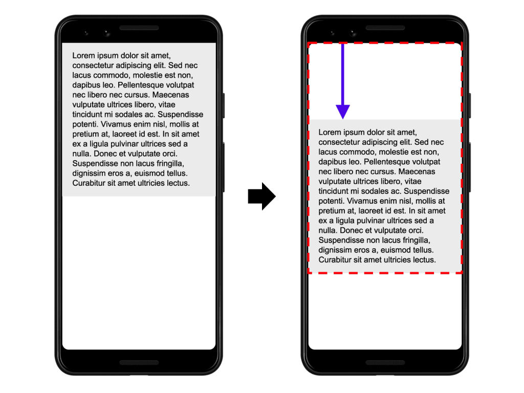
Credit: https://web.dev/cls/[/caption]In the image above, the largest viewport dimension is the height, and the unstable element has moved by 25% of the viewport height, which gives us a distance fraction of 0.25.Taking the impact fraction of 0.75 and the distance fraction of 0.25, the layout shift score is calculated as 0.75 * 0.25 = 0.1875. The layout shift score using the example above is 0.1875, which needs improvement. The aim for a good layout shift score is 0.1.
Quick Tips TO Get a Better CLS Score
- DO style fonts properly, improper font styling can lead to a flash of invisible text(FOIT) or flash of unstyled text(FOUT) that may cause the layout to shift
- DO try to animate transitions in a way that provides context and continuity.
- DO specify dimensions/size attributes for all your images, banner ads, embeds, video elements. Doing this ensures that the browsers can allocate a suitable amount of space in the document whilst the elements are loading.
- AVOID using any content that's injected dynamically
- DON'T insert content above existing content, the only exception is if it's in response to a user interaction
Let's Start Preparing!
Google has promised to give six months notice before this update goes live, with the aim to go live sometime in 2021. They have provided tools and documentation now to get us started in preparing for this update that will take effect.This means that there is still time to revamp your website in order to improve your user experience in preparation for the new ranking algorithm! If you would like to improve the user experience of your website, contact Netizen Experience to optimize your page experience.


