Selling perishable items like milk and bread online is not an easy business. Websites like Tesco and Redmart are redefining how groceries can be sold online
Selling groceries online is certainly not an easy business to start with and when you have perishable goods added to the mix, it’s going to be a tall order. But this challenge hasn’t stopped Tesco (Malaysia) and Redmart (Singapore) - two companies that we are reviewing - from trying.
The former while is a traditional brick-and-mortar company - already a giant in the grocery business, trying to march into the e-commerce battlefield, whilst the latter is a company who solely sells online. It is interesting to see how they differ in terms of their digital customer experience.
Here are some of things we found and discuss below:
- Search Function
- Product Information
- Checkout Process
Search Function: Let’s Find ‘Em
The search function is more important than you think. It is the saving grace for any website user. Lazy users will use it the moment they enter a website whereas the more hands-on users will use it as a last resort. Hence, it is essential that the function serves users well.
Redmart understood this point very well and placed much focus and emphasis on their search function. Their search bar is huge and they placed it right on the top of their website. You have to be blind to miss it.
As you can see from the video, their function is able to predict and suggest your search query even before you finish typing them. Tesco’s search function, although not as good as Redmart’s search function, works quite well to serve their customers.
Product Information: What’s in it?
It’s hard to find a good balance when providing product information – do you provide a lot of information about the product and make the product page look so cluttered that even teenagers would call it a mess? Or do you put too little information that even Sherlock Holmes couldn’t figure it out?
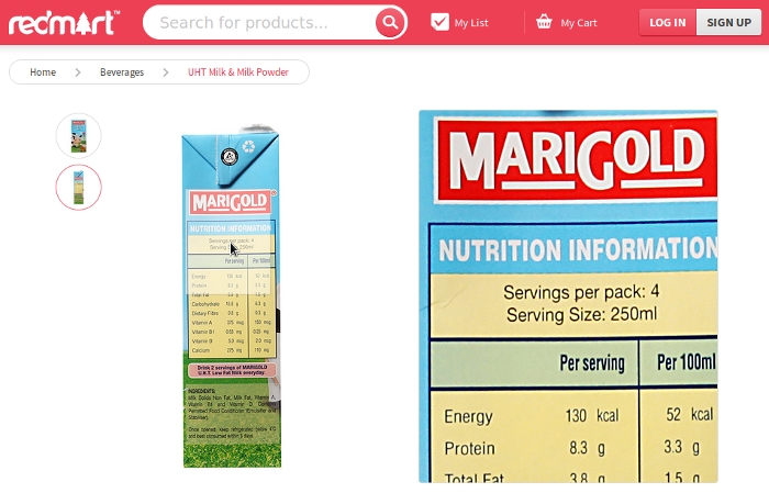
There’s one interesting feature in Redmart’s product pages that deserves praise here. The nutritional information of the products is in their high-res image which makes it quite easy to read. It may even be easier to read than holding the product in your hands since that information is usually in small print. It is a delightful experience for customers.

Screen grab from Redmart.com showing nutritional value of Marigold Milk, which can be zoomed
Checkout Process: Time to Checkout
A lot of dropouts come from the checkout process; if you make things hard to use, complicated and leave it with bugs to crawl on your customers, they are not going to buy from you.
We found a number of problems faced by users when testing Tesco and Redmart, but there’s one mistake that many e-commerce websites still make – asking customers to sign up as members before they could checkout.
Some e-commerce websites don’t even allow you to look at your shopping cart before you register as a member. Imagine yourself shopping at a grocer and suddenly, out of nowhere, a salesperson decides to cover up your shopping cart and said, “Sir, you have to be a member to look at your shopping cart” or “Sir, I can’t let you buy these milk and eggs without getting your phone number!” Two important words to learn here – guest checkout.
Conclusion: So how was it?
There are other issues that we found throughout the testing but we couldn’t review all of them; it would be too long. But overall, both Tesco and Redmart did quite well in serving their customers. We’ve seen far worse online retail experiences from other e-commerce websites. The key is to always put your customers’ needs before your own; your customers’ convenience rather than what your business or management wants.
If you would like to know how customers use your site, conduct some usability tests. It is a solution that will uncover user behaviour and explain why they are leaving your site. How about you giving these two e-commerce sites a try and let us know what you think? We would love to hear from you.
Picture for representative purposes only (Courtesy: Amy Walters /Shutterstock)


