Web development has progressed by leaps and bounds since the beginning of the World Wide Web. In the early days, website designers did not need to worry much about how their sites appeared to different clients.
This was because most users would access websites from standard desktop computers with similar screen resolution ranges.
However, today web technologies are upgrading exponentially as different devices are being used and developed to access the internet.
As a result, websites currently being developed and designed by web programmers are viewed and accessed by a large number of devices with disparate screen resolutions, orientations and views.
For instance, modern users can access the same website from desktop computers, laptops, iPhones, iPads, Notebooks, feed readers, and even smart TVs. Essentially, each platform presents the same page, with a unique feel from the others, depending on its size and viewing capabilities.
What is mobile responsive design?
Mobile Responsive design is a set of techniques and technologies that enable website creators to design websites that provide a desirable viewing experience for different device types.
In principle, mobile responsive design ensures that websites can automatically reshape themselves depending on various screen sizes, orientations, and resolutions. From the largest devices like smart TVs to the smallest ones like mobile devices.
Furthermore, mobile responsive design ensures a seamless flow of content based on the amount of device display space available. This helps to maximise brand impact while not dictating the development of a completely different site, or set of sites to accommodate new device makers that may come up with in the future.
Benefits of a responsive site
SEO friendliness
For the longest time, Google has prioritised responsive websites as most of its traffic comes from multiple mobile devices with dissimilar screen sizes. The search engine took this prioritisation further when they introduced a "Mobile-Friendly" label for sites that are responsive.
Generally, websites that are responsive typically emerge on the top of smartphone’s search results queries. This means that mobile responsiveness is a critical ranking factor for Google as they actually penalise sites that aren’t mobile responsive.
[caption id="attachment_2576" align="alignnone" width="500"]

Image by Diego Velázquez from Pixabay[/caption]
Reduced bounce rate
Bounce rate is a metric to represent the proportion of visitors to a particular website who navigate away from the website after seeing only one page. In practice, the goal of a responsive website is to ensure that visitors with different devices stay longer on the website.
A responsive website also makes it effortless for visitors to be more willing to click through and explore other pages on your website. This, in turn, decreases your bounce rate.
Better user experience
A responsive website results in a better overall quality of user experience. Whenever users find it challenging to navigate, or utilise your website because they’re forced to pinch and zoom-in continuously, they become frustrated.
However, if your site scales and reacts to the changes in screen size adaptively, visitors won’t have issues accessing menus, links, buttons or forms.
Increased mobile traffic
Statistics show that nearly 55% of all global web traffic emerged from mobile devices in 2021. With this statistic, it is clear that one cannot afford to compromise with responsive web design.
To substantiate this claim, consider examining just how many of your visitors come from phones, and how much time they spend on your site. Then subsequently, implement responsive design and critically compare the two statistics.
Afterwards, once your website adjusts to the viewport width, you will notice a significant amount of traffic increase from mobile devices.
More conversions
As we alluded to earlier, the more time users spend on your site, the lower the bounce rate. Responsive sites improve the user experience of your traffic, and thus help build good relationships and trust with users.
This optimal user experience and confidence results in better conversion rates, for newsletter subscriptions, product purchases, or even bookings.
Less loading time
Responsive websites load faster on all devices. However, for smartphones and tablets, they load fastest. Because of fluid grids and responsive images, responsive websites take a lot less time to load pages. And in turn, sites that load faster enjoy more conversions. For every second delay in mobile page load, conversions can fall by up to 20%.
[caption id="attachment_2577" align="alignnone" width="501"]

Image by Gerd Altmann from Pixabay[/caption]
Easy maintenance
There was a time when programmers were required to maintain two separate websites: one for desktops and another for mobiles. Consequently, this dictated maintaining two sites, which necessitated more resources.
With a responsive website, this effort is dramatically reduced as it takes less time to maintain and build a website. As such, companies can focus on more important tasks such as customers service, A/B testing, marketing, product, and content development.
How to achieve a mobile responsive website design?
Responsive websites maintain adaptive design to respond accordingly to visitors' devices or technology. However, en route to a functional responsive website, there are critical steps one must follow.
Scoping
This step involves understanding user objectives on different devices. In the past, many assumed that most mobile users were task-driven, for example, desiring to order a meal, or book a restaurant table quickly.
However, nowadays, users on any mobile device are as likely to leisurely browse the Internet before completing a task quickly. Basically, once you carefully understand user objectives, you can easily define and prioritise content for your site, regardless of the device a visitor is employing.
Scoping can help you make technical considerations regarding functionality and content. For example, if a complicated functionality only works on particular devices.
Though a responsive site only changes the CSS depending on the width, if it contains complex elements that rely heavily on JavaScript. Then they may not translate well on smaller devices, and it could be worth hiding these.
User Research
User research is a highly critical stage in the design process. This means that it’s worth a little extra consideration to research people who will be employing different devices.
Exploratory research can help extrapolate your assumptions on how different users may want to use your website on various devices. This, in turn, will enable you to decide what the priorities are for your project.
Wireframing
A wireframe is fundamentally the skeleton of a web page assembled using basic shapes, lines, colours, and styles. The central objective of a wireframe is to guide the design of a layout conducive to the content placement.
At the same time, wireframing helps developers to figure out functionality and navigation problems in an easily adjustable format.
For years web designers wireframed to fit computer screens. However, times have changed where wireframing now takes a mobile-first approach. This approach enables webmasters to prioritise some elements on the site when it is shown on a smaller screen.
Wireframing has an advanced element that involves responsive wireframes. Responsive wireframes are simple web pages built with HTML and CSS, that employ responsive web design principles to illustrate the layouts.
Responsive wireframes are very dynamic and require less effort to introduce changes. To introduce a change, all that’s required is a source code update of a page, then a page reloads in the browser.
Generally, wireframes are typically not in colour since they need to focus on the relationship of the various UI elements, not on the actual design. The web designer is the one to work on the colour and shapes once the wireframe has been fully established.
In summary, building a wireframe isn’t an exact science, and requires extensive iterations and numerous revisions to be performed. Because of this, it’s imperative to pay attention to the logic behind the wireframe layout to be able to see the rationale of your responsive design.
[caption id="attachment_2579" align="alignnone" width="500"]

Photo by Sahand Babali on Unsplash[/caption]
Styling
Think about keeping your styles more straightforward for your mobile version. The great thing about using CSS3 is you don't need many images to achieve great styled effects.
However, these still take some time to load. Also, carefully think through your font sizes to ensure that they are readable on each device.
Building the site
Once you have scoped, researched and wireframed your design, it's time to build your website. As you commence development, here are a few considerations:
- Constant communication: Website projects always go smoother when teammates speak to each other. This means that both the designer and developer need to have clear channels that enable them to discuss design problems and solutions as soon as they turn up.
- Image size impact: Your responsive website will need to load full-size images even if the CSS scales them down. So, try to keep your image sizes as low as possible.
On the positive side, you can employ some JavaScript scripts/workarounds to make the site run smoother. However, to avoid any degradation in performance, do ensure to load the smallest high-quality image size.
- Use advanced CSS: It’s mission-critical to use advanced CSS styles as they allow site styles to degrade as the browser capability does. Furthermore, advanced CSS enables you to keep site loading times low.
User testing of the website
Test, test, and test more! User testing starts as soon as you create your first wireframe. Generally, wireframe testing should occur on the relevant devices straight away. This will allow you to know early on if your wireframe is really functional for your needs.
Also, after building, user test early to identify any inherent issues, or elements of the wireframe that were not implemented appropriately.
Features of a responsive design
Fluid grid
Previously most websites were laid out based on a metric called pixels. However, now modern designers employ a fluid grid. A fluid grid essentially sizes the elements of your website proportionally, instead of making them one specific size.
This consequently makes it easy to size things for different screens as the elements respond to the size of the grid(screen), not the size set in pixels.
A fluid grid ensures that the website design is flexible and scalable as elements will maintain consistent spacing and proportion– adjusting to specific screen widths based on percentages.
Flexible images & text
A responsive design isn’t limited to dynamically changing the page layouts only. Another critical element of responsiveness is the ability for images to automatically resize proportionally.
Flexible text and images can adjust within a site layout width, according to the content hierarchy set with the CSS (stylesheet). Thus possessing the ability to scale, crop, or disappear depending on the content that is deemed essential to the mobile experience.
With a flexible design, text can be wrapped in the available space, and font size can be increased on smaller devices to make it more legible. However, flexible images can sometimes prove challenging due to load times on smaller device browsers.
Responsive layouts
With responsive layouts, webpages are no longer left to their own devices. Responsive layouts attempt to adjust site layouts to a great variety of screen environments.
Instead of working with the "most common" display dimensions and "average" users, a responsive layout adapts to disparate viewing conditions and user requirements.
In addition, by integrating alternate layouts tuned to each resolution range, developers can enhance the overall viewing experience.
Media queries
Media queries enable designers to build multiple layouts with just HTML documents. Media queries also allow designers to choose appropriate style sheets based on different criteria like the size of a browser, or screen resolution.
So, rather than look at a device type, it considers its implemented capabilities. Generally, working with media queries allows designers to alter much more than the simple placement of an image. For instance, media queries enable designers to fine-tune as pages resize themselves.
Furthermore, designers can flexibly increase the target area for links on smaller screens, or show or hide elements to ensure that navigation is more prominent.
Better yet, media queries can be employed to even apply responsive typesetting to optimise the reading experience for the display providing it.
Responsive design examples
GitHub
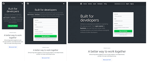
GitHub’s unique website offers a coherent and consistent experience across every device with commendable attributes like:
- Its signup form is a central focus, as it also presents only a call-to-action button on mobile. Furthermore, users must click the call to action to trigger the form.
- When transitioning from desktop to tablet devices, the field above the fold transforms from a two-column layout to a single-column layout. This occurs with the copy above the signup form rather than beside it.
- GitHub hides its search bar and menu behind a hamburger icon on handheld devices. This practice helps reduce clutter on mobile devices, where space is typically limited.
[caption id="attachment_2571" align="alignnone" width="512"]

Image Credit:www.github.com/[/caption]
Shopify
Shopify offers a fluid user experience across all devices as it constitutes only a call-to-action button, and illustrations change between desktop to mobile devices. On PC and tablet, its call-to-action button is from the right of the form field. However, on mobile devices, it’s beneath.
Illustrations are to the right of the copy on PCs and tablets, whereas they are placed beneath the copy on mobile devices. Impressively, despite employing image carousels to show off their customers, Shopify has managed its page load speed below five seconds.
[caption id="attachment_2572" align="alignnone" width="389"]

Shopify’s responsive mobile view. Image Credit:shopify.com[/caption]
Slack
The Slack website is well known for its intentionality and simplicity. This is demonstrated by its responsive design that consists of a flexible grid that easily adapts to viewports of all sizes and shapes.
For instance, while customer logos are visually presented in 1 horizontal line on a desktop view. As
Slack is using a flexible container whereby at certain screen breakpoints, the logos will automatically wrap and stack on top of each other to optimise for smaller screen views.
[caption id="attachment_2573" align="alignnone" width="512"]

Slack’s responsive mobile view. Image Credit: slack.com/[/caption]
Conclusion
Because internet devices and technologies are changing fast, there is a great need to continue adapting responsive web designs. Responsive design ensures that websites work across a diverse range of device and monitor types, browser and pixel depth differences.
The main advantage to this approach is simple: design once, deploy everywhere.
As such, companies don’t need multiple versions of one website for different devices. This consequently delivers a more unified and better experience for users while reducing redundancy, simplifying development and maintenance processes for web designers.
Reach out to us at Netizen Experience if you’re planning on a new responsive website or are in need to change your current one.


