Your website is the face of your business, the very core of all your online marketing. You have poured out so many resources into leads generation, sales and marketing, customer engagement, all into your website. But somehow, it isn't working. Why isn't it working? Is it your design? Or is it the usability?In our experience working with our clients, there are 5 common things that most business websites get wrong resulting in low conversion rate, but fret not, there are 5 easy fixes for each of them.
Problem 1: No call-to-action
Imagine your customers arrive on your website, but they don't really know how and where to proceed to. Every website needs a goal, and if your customers don't have a specific action to take, they will leave your website. Oftentimes, you're so close to the design of the website that the task seems obvious but it may not be obvious enough to your customers.The goal of your website should be crafted as a 'call-to-action' (CTA), this is a clear instruction to your customers to provoke an immediate response.FIX: Think about what the goal of your website is, make sure you design or redesign your website with this ultimate goal in mind. What is that one action you want your customers to do on your website? Is it to make a purchase? For them to give you their email address? With that in mind, design the website to funnel people to that ultimate and specific goal, this will increase the conversion rate.Let's take Netflix as an example. Their one goal is for customers to give them their email address. They have designed their website that customers know clearly that they need to enter their email address and click on that large red button that says 'TRY IT NOW >'. Also knowing that they can cancel anytime by placing 'Cancel anytime' right above the CTA, that reassurance boosts the level of signups.

Problem 2: Your website is all about YOU
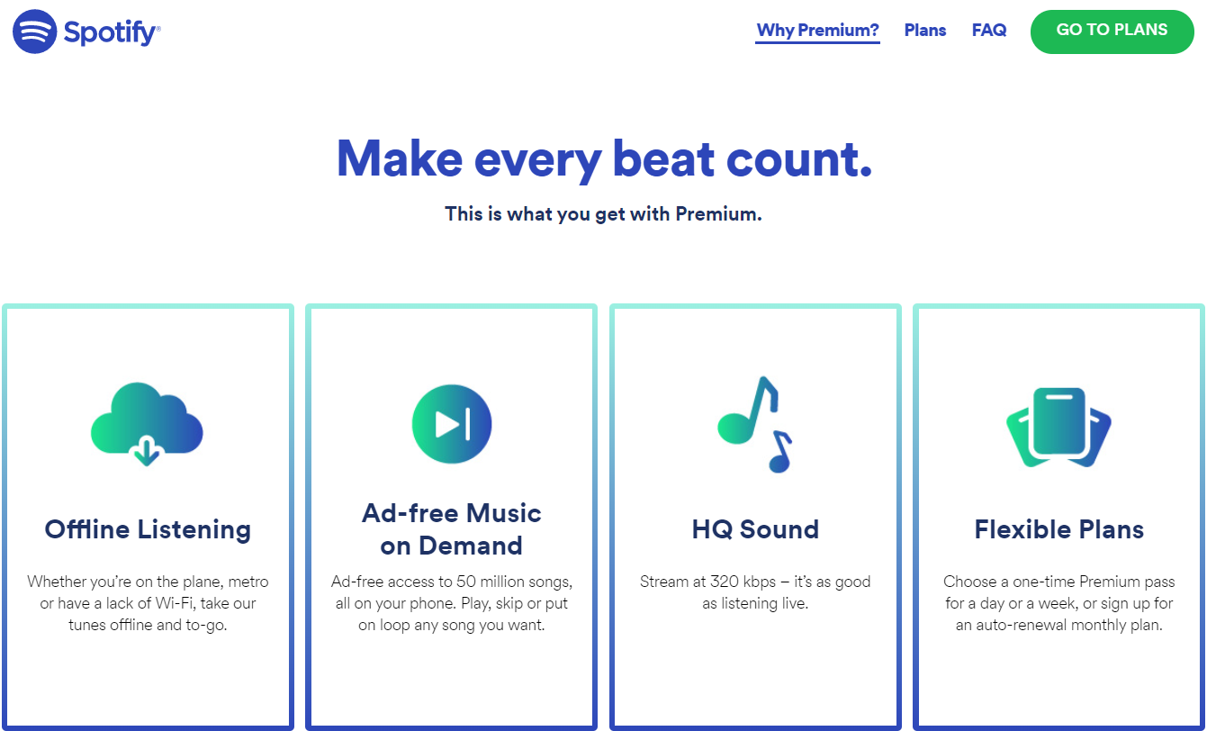
You're thinking, well of course the website is about you, that's what you're trying to sell. But the fact is, your customers care less about what makes you so great, they are much more interested in how you can help them. What is the value that you can provide them? Pivot your selling point from 'This is our business, here is what we do, who we are' to 'This is how we can help you, this what you get, and here's what it will do for you.'FIX: Instead of content that focuses on your business, speak and highlight how your business, whether it's a product or service, benefits your customers. Make clear what the benefits are, what your customers will get and how it helps them. This will help fix the low conversion rate, converting prospects into customers. Spotify is an example, we know their business model but they don't talk about what Spotify is as a business, how it started, etc but instead their website focuses more on the benefits of Spotify.
Problem 3: You're forgetting people who are 'just looking'
A majority of people coming to your website aren't ready to buy into your business, not yet at least. They are just looking, maybe they have seen your ads, or it was recommended by a friend, or just came across your website during their research. However, by going after a quick sale, you may be missing out on the long-term benefits. Give them a chance to think about, better yet, give them a reason to come back, and optimize the conversion rate.FIX: In addition to the main call-to-action, make sure you collect email addresses of those who aren't ready to commit. By doing this, you can stay in their minds throughout their decision-making process by marketing to them through emails or ads re-targeting until they are ready. Better yet, offer them an incentive in exchange for their email address, this will help to increase your conversion rate.Zalora does a good job in offering an incentive in exchange for email addresses, not only does Zalora effectively obtain their email addresses, but these incentives also provide a huge motivation for customers to utilise their free voucher. Fret not if your business can't give out such a big incentive, even if it's $5 voucher or 5% off, customers will think of it as 'free' money, which is better than nothing.

Problem 4: Old, out-of-shape, tired design
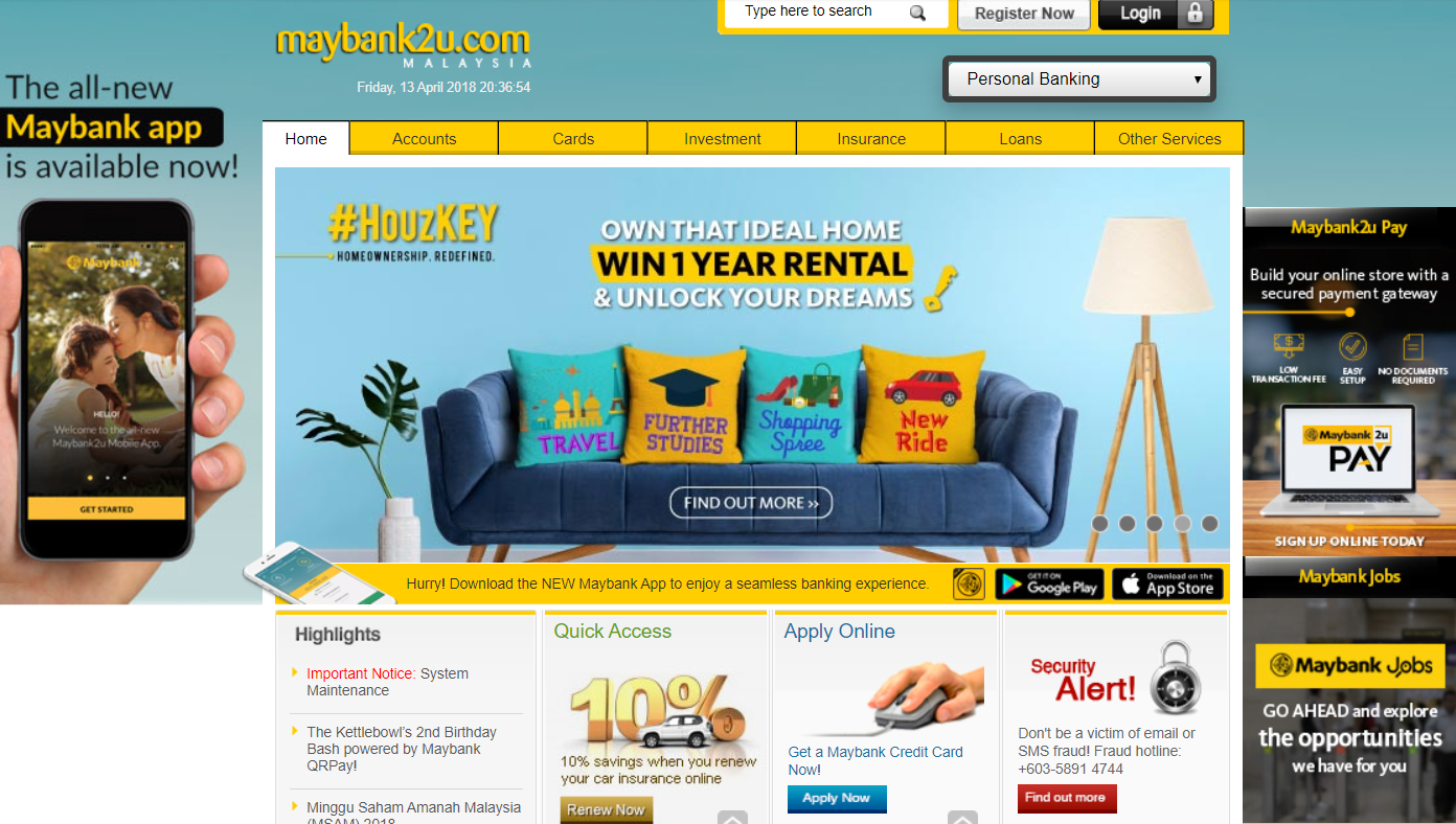
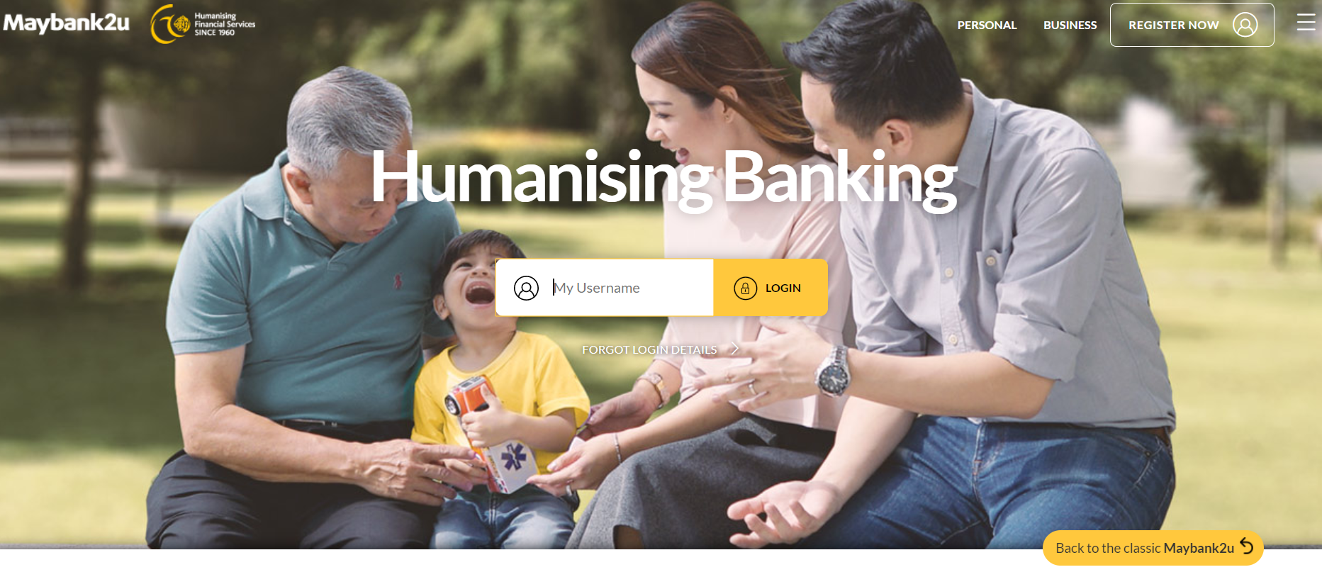
First impression matters, in fact they matter a lot! If your current website looks dated, or just plain tired or out-of-shape, it gives the impression that your business is the same. Remember, your website is the face of your business. If your business looks old and out-of-shape, your customers will not think you are credible or worth investing in.FIX: Time for a makeover - website revamp. Find a web designer or ux design agency that can do the job well, spend time in finding someone that has a great eye, especially in user experience. This ensures that your prospects find your website compelling and easy to use, increasing your conversion rates.Let's look at Maybank2u, which would you prefer to use?BEFORE
AFTER
Problem 5: Where's the trust?
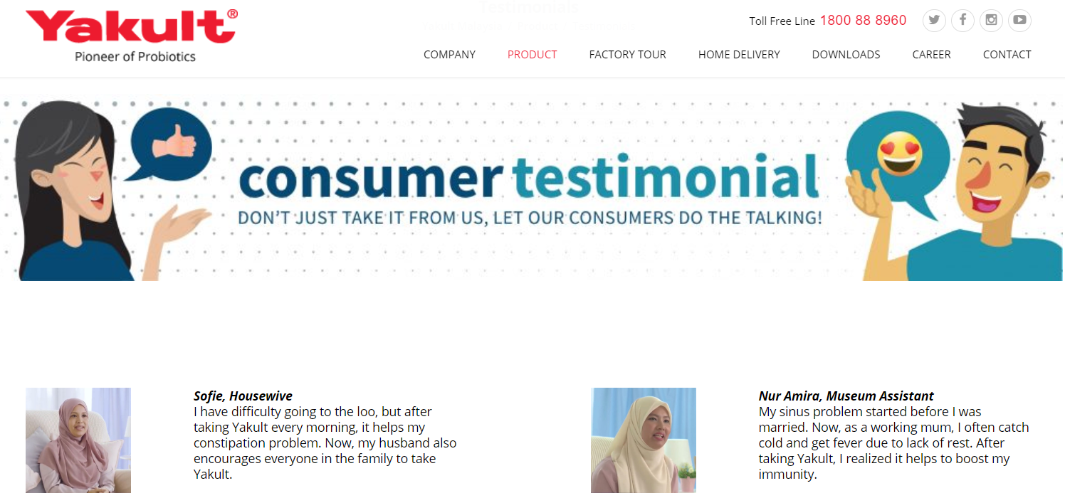
Intrinsically, we're wired to analyze and avoid risk. Especially with so many risks of internet scams, and lack of security, we're more analytical towards everything. Can your customers trust you?If your prospects don't think they can trust your business, they will look elsewhere. If your business website looks scammy, even if it isn't, your prospects will err on the side of caution and leave. Let’s improve that low conversion rate into a higher conversion rate. FIX: Have 'social proof' that your business is trustworthy, this can be in a form of reviews or ratings but make sure it's genuine. You can ask current customers for reviews and testimonials, you may provide them an incentive in exchange for doing so. If prospects see that others have gone before them and used your business to an advantage, it minimizes the perceived risk.Collect genuine reviews and testimonials from your customers and place them in a prominent area of your website, but don't go overboard as it'll give off an inaccurate impression of being fake. It's better if there's a real face to these testimonials, it could be a picture or even a video.
Key Takeaways
- Set one focused goal of your website, make sure you have clear call-to-action to funnel people to that goal.
- Instead of focusing on you and why your business is so great, focus on how your business can help your customers.
- Don't forget about those who are 'just looking', implement an effort to collect their email address to stay in their decision-making process.
- Make sure your website looks and feels current, an outdated website drains your credibility as a business.
- Minimize the risk, maximize the trust. Help prospects know that your business is trustworthy by showcasing reviews or testimonials.


