Online shopping is becoming increasingly popular by the day. Many people browse through e-commerce websites and search engines to find and purchase necessities, products and accessories. Online shopping provides various benefits such as convenience, variety, time saving, and the ability to make discreet purchases.
Thus, the usability of a website will be a very important factor, if not the only one that makes or breaks an online store. Without an ‘in person’ sales representative, an automated digital customer experience must be in place to enable customers to checkout by themselves with ease. Let’s check out where Zalora and Love, Bonito stand in regards to this.
The Big Picture
We live in the age of visual culture. Great images not only help market your product, but they also make your website look professional and appealing. If all a visitor of your website sees is a bunch of words and mediocrely-taken photographs, it is going to make them think you put little effort on your website.
People want to see what they’re getting. For each product you sell, show different angles and make them zoom-able. Here’s a snippet from MDG Advertising illustrating that the importance of product photos for e-commerce websites outweighs the importance of ‘product reviews’ and ‘product information’.

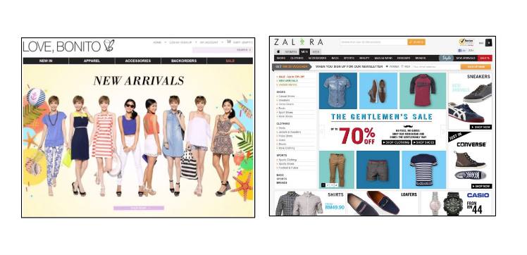
Left: Love Bonito. Right: Zalora
While large, detailed pictures of the products you offer are important, you still need to be careful with them. You don’t want too many images that will cause the webpage to take forever to load. Both Zalora and Love, Bonito have managed to hit the ball out of the park on this one.
Users found that both websites displayed high-quality and resolution images for their products. The main landing page caught their attention with brightly coloured images that were superimposed with attractive discounts that were on-going. There were multiple images provided for each individual product and images could be zoomed-in without diminishing its quality.
A Thorough Filtering Function
Making it easy for your users to search and browse through items from your website is important if you are to convert potential buyers into loyal customers. A filtering function that works impeccably not only provides users with the ability to narrow down their search requirements, but it contributes to one of the main reasons customers opted to shop online in the first place – to save time.
Zalora has a comprehensive filtering function which made it easy for users to search for clothing and accessories without any complications. Our female users were able to specifically look for maxi dresses with little to no problems.
Unfortunately for Love, Bonito, its filtering function came up short, in that it was not thorough enough. Users who were trying to find a maxi dress were forced to muddle through the entire range of dresses that were available.
Online retails have many products to sell and thus, filtering functions are a must if the goal of efficiency and convenience is to be fulfilled.
Redirecting to Cart Disrupts Users’ Flow
Both Zalora and Love, Bonito have fallen short in a minute area with respect to usability experience. One of usability’s “don’ts” is to not create unnecessary steps for users. At Zalora and Love, Bonito, users who added their accessory or apparel of choice to their cart were automatically redirected to their shopping cart webpage – an unnecessary step in a series of purchase operations.
Not only does this waste a significant amount of time for a user, but it disrupts the entire flow of a customer’s shopping experience. This is synonymous to a person shopping for groceries and after adding an item to his or her shopping cart each and every time, and looks into it to see what else is in there. When you waste a customer’s time, you test their patience, and when you test their patience, they leave.
The fix is simple, yet with positive and significant results – provide a pop-up or a simple notification that informs your users that the item has been added to their cart instead of redirecting them to their shopping cart page. A great example would be that of asos.com.

Adding a product to your shopping cart at asos.com
Conclusion
Both Zalora and Love, Bonito prove to be websites that care for digital customer experience. Despite both websites having many great attributes, like all websites, usability is a never-ending series of improvements.
There is a saying that “retail is detail”. Therefore, how your e-commerce site performs will directly influence purchase decisions. Usability testing must be carried out to observe how customers behave in detail.
Stay tuned for a future blog post of other e-commerce websites!
The post The UX Challenge: Who Sells Fashion Better? Zalora or Love, Bonito? appeared first on e27.


