Welcome to Uniqlo!
In 2009, Japan’s No. 1 clothing retailer, Uniqlo expanded their business into Southeast Asia by launching their first store in Singapore. The following year, they entered Malaysia with the largest store in South East Asia. At present, they have more than 20 stores in Malaysia and Singapore respectively.
During the end of last year (2014), Uniqlo finally launched its online store in Malaysia. As you know, shopping offline in the Uniqlo store is a good experience for Malaysians and Singaporeans, but how do the users find their experience online? We conducted usability testing on Uniqlo’s website with a total of 15 testers from both countries.
Homepage
Users like the clean simple interface of the homepage. While some users like the many pictures representing each clothing category presented on the homepage, most users commented that the homepage is too long and should be simpler. The rotating banner is also too distracting to some.
Things That Can Be Improved
1) Thumbnail
Two of our testers expressed dissatisfaction on the fact that clicking the thumbnails on the home page does not direct them to the specific product, and instead to the product category, causing the user to have to look for the specific product they were interested in.
https://youtu.be/XMocx163WUg
By clicking the picture of the model on the homepage, users expect to be directed to the clothes the model is wearing.
2) ’Hidden’ Coupon Discount
Uniqlo offers a coupon code that entitles customers with purchases over RM150, 10% off their purchases in the online store. Coupons are a good initiative for customers to buy more right? Yes, but only if the customers notice the existence of it. Based on our usability testing, about half of our testers did not realize Uniqlo was offering coupons, although the ad banner was at the top of the site.
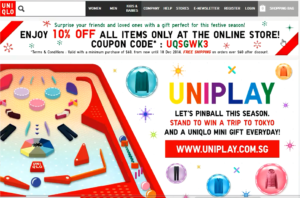
On top of that, it was designed with a Christmas theme which should have been eye-catching, but was not. There could be a few possible reasons for this:-
- It looks like an unrelated advertisement: This might be due to the position of the banner. Since it looks like an advertisement, many eyes will just skip it.
- The design of the banner: This might be caused by inappropriate choice of font, choice of colour, or choice of decorations. The font size might have played a role as well. Overall the banner blends into the background and failed to grab attention.
3) Uniqlo Mobile App Information
For some of the users, finding the mobile app information tab was a serious game of hide-and-seek. All our users found it in the end after much effort, except for one. He searched every category and even scrolled all the way down (which was where the mobile app information was) and still missed it. This could be due to:-
Position: The tab is too far down the bottom of the home page, where most people will not come across, because not everyone scrolls all the way to the bottom. So chances are most people will not notice that Uniqlo has a mobile application nor will they know where on the site they can find information regarding the Uniqlo application. Note: Even the search bar only works for searching product items.
https://youtu.be/K_tDWRy6uLQ
As you can see, the mobile app information tab was actually located at the bottom left. The entire bar will most probably go by unnoticed by many. i.e Very little people will be aware of Uniqlo Recycle as well.
For these users, they were informed during the test that Uniqlo has its own mobile app and tasked to find it out on the site, yet they found it difficult to find and one failed in doing so. It might be even more difficult for most people who are not aware on the existence of the app to find information about the app on the site.
However, it can be noted that Uniqlo’s main business objective is focused on selling apparel. So other things on the website, such as all the items at the bar below, may just be a sideline.
4) Semi-functional search bar
As noted earlier, the search bar only works for searching product items. This means when you try to search for anything other than products, such as return policy, shipping, or ___, it would not bring you the correct results. This could be a major pain point for users who like to utilize the search bar.
If Uniqlo intends to keep it this way, they should make it clear what users can search for, perhaps by stating ‘search product’ in the search bar.
https://youtu.be/4AHRVPa7OUU
5) If product unavailable, display label on thumbnail
Almost half of our testers state that it would be good if Uniqlo can label the unavailable products at the thumbnail on the collection page, to prevent them from wasting time clicking into it.
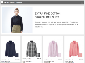
However in terms of showing product unavailability, Uniqlo did well in displaying their colours and sizes at their specific product page. This will be covered later under ‘Things that Work’.
6) Finding shipping and returns information
We tasked our users to locate the shipping and returns information, but some of them took a long time to do so. They expected it to be either at the menu bar or at the bottom of the home page.

However it was tucked under ‘Help’. These users did not locate the information at ‘Help’ as they may not relate shipping and returns to it. Instead they found it through the Terms and Conditions page.
Things That Work
Despite with all the usability issues mentioned above, there are things that work really well on the Uniqlo site.
1) Checkout process
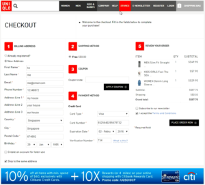
The checkout process is done in one page. Almost all our testers stated that the checkout is very clear, fast, and easy. The sequence is right and the organization of information is good. They especially liked that they could review their order list with pictures and their respective details clearly.
2) Detailed size chart
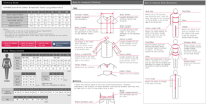
A lot of testers liked the detailed size chart. When shopping in a brick-and-mortar Uniqlo store, you have the advantage of being able to feel the clothing and try it on before purchase. Shopping online removes that interaction and to some, it may greatly lower the incentive to purchase clothes through online platforms.
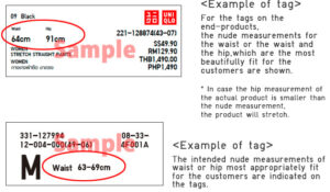
Good thing Uniqlo’s online store provides a detailed size chart that not only displays the measurement of the clothing but also include a size guide according to body measurements, methods to measure clothing and body dimensions, as well as how to read the tags.
3) Clothing size and colour
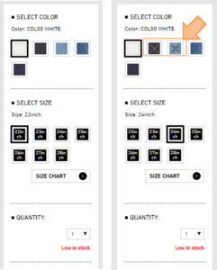
In the specific product page, when you hover on the sizes, an ‘X’ will be displayed in the colour boxes, indicating the colours that are unavailable for that size. This is a smart move by Uniqlo as it makes the user’s shopping experience easier.
Conclusion
From the usability testing result, we can see that Uniqlo website is doing quite fine in terms of usability, especially on the Checkout process, which is at the later stage of the online purchase journey. Uniqlo can certainly improve their product browsing experience to improve greater purchase conversion.
Note: Changes to the website may have occurred since UX Testing was done.


