In this Article
Prominently placed categories and swift checkout processes are strengths for Rakuten Malaysia’s website. What did they get wrong?
Rakuten is an international e-commerce company based in Tokyo, Japan. They have been rapidly expanding into many different Asian countries and recently opened shop in Malaysia in November 2012.
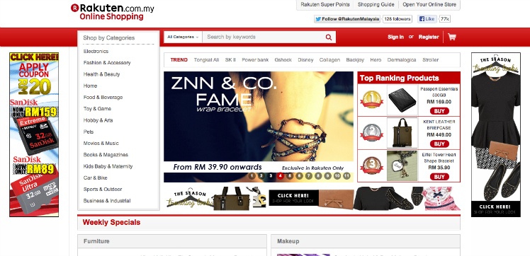
 Screenshot: Homepage of Rakuten.com.my
Hundreds of thousands of advertising money have been spent by them, monthly, to drive traffic to their website but the key question here is how effective is their style of design, layout and features for the Malaysian market? Are users having good shopping experiences or are they confused when navigating through the website?
To answer this very question, users were recruited to test Rakuten’s website. The user data collected from the tests were analysed to find out what users do and think about the e-commerce site.
If you are interested in improving user experience of your site, especially if you are in the e-commerce industry, here’s a review on Rakuten.com.my. We hope to illuminate your world as you continue on reading and provide you with some good UX practices for reference.
The Good
When visiting an e-commerce website, users should be able to find items that they want with ease and convenience. Rakuten Malaysia was able to segregate all their products into their relevant categories.
The menu for the categories was placed at a prominent location. This enabled users to quickly find items that they were looking for. The website also allows users to checkout without signing in as a member.
Such ease and swiftness from the checkout process would certainly create a positive impression on their customers. Positive impressions are the key to generate returning customers.
The Bad
You do not have a salesman to entice your customers when they visit your website. Hence, the outlook of your homepage or landing page is very important.
Much to our surprise, when testers were using Rakuten website, they did not like the design or the items that was put on the homepage. Users were confused by the way Rakuten showcased the product details – information that were not related to the product were mixed together with the product details without proper or clear segregation.
The Ugly
So here’s the juicy bit or the ugly bit as the header suggests. What went wrong with their website, in terms of usability?
If it was ten years ago, the way this search function works would have been acceptable. But since then worldwide users have been pampered by Google. Now we don’t even have to finish typing in the search bar in order to search for what we want (it auto completes!).
The search function that this e-commerce site has just doesn’t cut it for today’s users; and they have limited filtering options for users to sort out their search items. What made it worse is that the search bar is displayed persistently on top of every page of the shopping site and it attracts a lot of disappointing usage.
There are many things that Rakuten could do to improve the usability but if there’s one thing that they should focus on, it would be the search function. It is the single item that really quashed the user experience on their website. A better search function could encouraged more sales because the users are able to discover the items they want quicker and easier.
Note: Changes to the website may have occurred since UX Testing was done.
The post The Good, the Bad, the Ugly appeared first on e27.

