Microsoft Edge is the phoenix rising from the ashes that was Internet Explorer, and a lot of people who are wary of Google’s privacy issues have opted to move over to Microsoft Edge and have actually found that they prefer the user experience!
Microsoft Edge is a cross-platform web browser developed by Microsoft and it’s actually built on the same open-source Chromium that Google Chrome uses. Microsoft Edge’s new UX is winning over Google Chrome for a number of reasons, the main draw that first entices users to move to Microsoft Edge is the rising of privacy concerns of Google Chrome.
Why Microsoft Edge’s New UX Is Winning over Google Chrome
Data Privacy & Security
With everyone spending more time online, there is a growing concern from users about their data privacy and security. Many users have started to complain about how accurately they are being targeted by ads based on what they have searched or visited. This is where Microsoft Edge is upping its game in addressing these pain points that many users face.
Google’s business model is to collect data in order to display suitable ads to their users, although they are transparent in their data collections, a lot of users aren’t comfortable with their data being collected. Whereas Microsoft has a different business model whereby they don’t rely on advertising on Edge.
Furthermore, Microsoft Edge has an intelligent screening system incorporated into the browser that protects its browsing database. Compared to Google Chrome’s database protector, Microsoft’s screening system offers better protection not just in terms of phishing and malware but also supports hardware isolation on Windows 10 because Microsoft Office and cloud security are integrated with Windows.
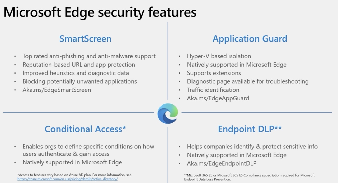
Credit: Microsoft Ignite
Users of Microsoft Edge have full control over selecting three levels of tracking prevention: Basic, Balanced and Strict. All of these options block potentially harmful trackers that websites use, in order to collect data for browsing behavior such as the content you click on and why it feels like the same ad keeps following you around.
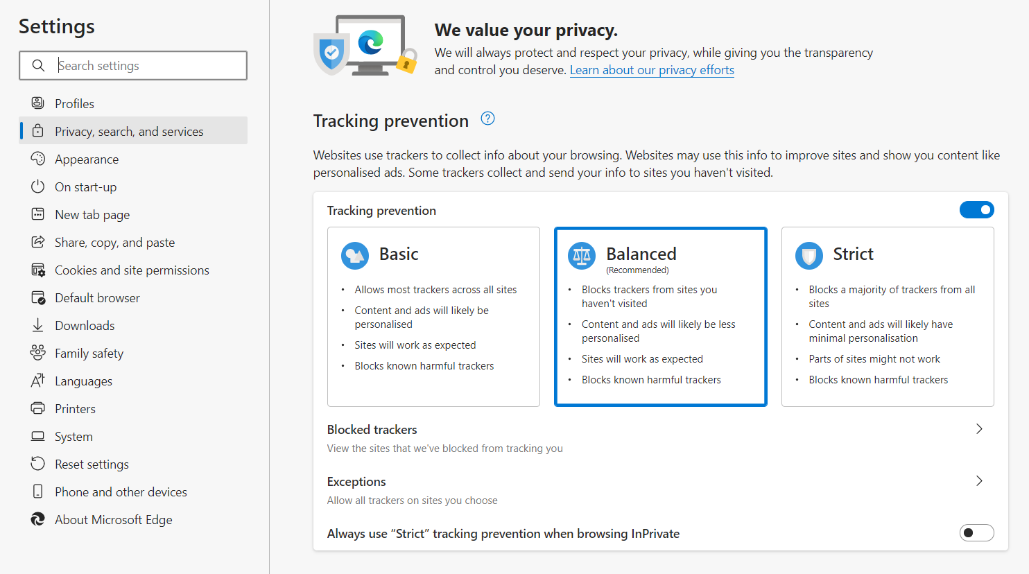
Balanced is selected by default, and users can choose any level that suits them best:
Basic: Blocks potential and known harmful trackers. But allows trackers for personalized content and ads.
Balanced (Recommended): Blocks potential and known harmful trackers, as well as trackers from sites you haven’t visited. Content and ads will be less personalized.
Strict: Blocks potential and known harmful trackers, most trackers across all sites. Content and ads will have minimal personalization, and because so many trackers are blocked, parts of sites might not work.
Data breaches happen, and they sometimes happen to the best of us. When we find out our data has been breached, we quickly change our passwords and hope that everything is okay. But by the time we find out about a data breach, it’s old news because companies take time to sort out their PR messaging and alert their users. In fact, sometimes we end up finding out about data breaches from social media and friends instead.
Easy Transition & Extension Support
Microsoft Edge is built on the same open-source Chromium as Google Chrome and Opera, this means that the move to Microsoft Edge can be a seamless transition where users don’t notice too much of a difference after the move. The feel and functionalities are similar and even the extensions are fully supported.
Furthermore, users wanting to transition from Google Chrome to Microsoft Edge can easily do so by importing their browser data, selecting what they want to import and what they don’t want to import over. This creates a seamless user experience where users can automatically and effortlessly make the move over.
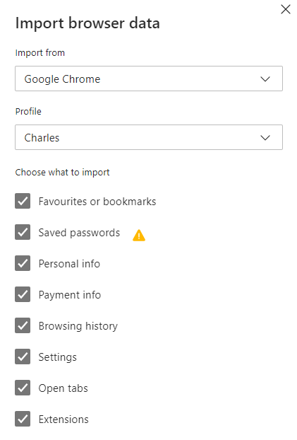
Note how extensions can also be imported from Google Chrome to Microsoft Edge. Because it’s based on the same open-source Chromium, all the applications for extension support are also available on Microsoft Edge.
Built-in PDF Reader
Microsoft Edge has a built-in PDF reader that allows you to open local pdf files, online pdf files, as well as files embedded in web pages. This is something a lot of other browsers may also offer but Microsoft Edge takes it a step further.
Users can add notes to their PDFs, and they can conveniently search for files directly from the address bar of the browser
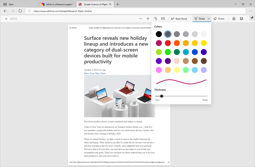
Inking is also available on Microsoft Edge’s built-in PDF reader that provides users with the capability to use colour and stroke width to add colour to the PDF file, which doubles as a feature for signatures. The ability to highlight text is also available, and users can add text notes to the file for easy referencing. This reduces the need to exit from the browser to do annotation in another PDF reader software.
Vertical Tabs
You know when you have a lot of tabs open and it sometimes gets so much that you can’t even see the titles anymore?
![]()
The user experience is flawed because users need to go through each tab to find the correct one, wasting time and effort. For a lot of us that are working or studying, we tend to have a lot of tabs and windows open at once. Time is precious and spending time looking for the right tab can be a frustrating user experience.
Microsoft understands this, and in order to reduce the friction of searching through numerous tabs that are open, they have come up with a feature that allows users to browse tabs vertically.

Users are able to see all the open tabs at a glance and switch from one to another seamlessly. Users even have the option of opening a new tab with a single click.
Once users are done glancing at the open tabs, they can choose to collapse the panel to focus more on the website. If the users want to look at tabs again, all they need to do is hover over the collapsed panel. Simple and efficient user experience!
Sleeping Tabs
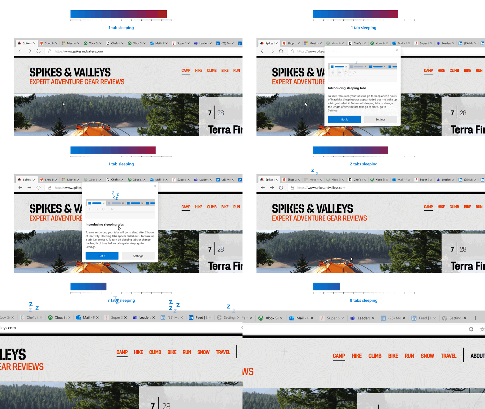
Microsoft Edge takes its tab game a step further by introducing sleeping tabs. Users can choose to opt into sleeping tabs to save resources, setting a specified amount of time that puts inactive tabs to sleep.
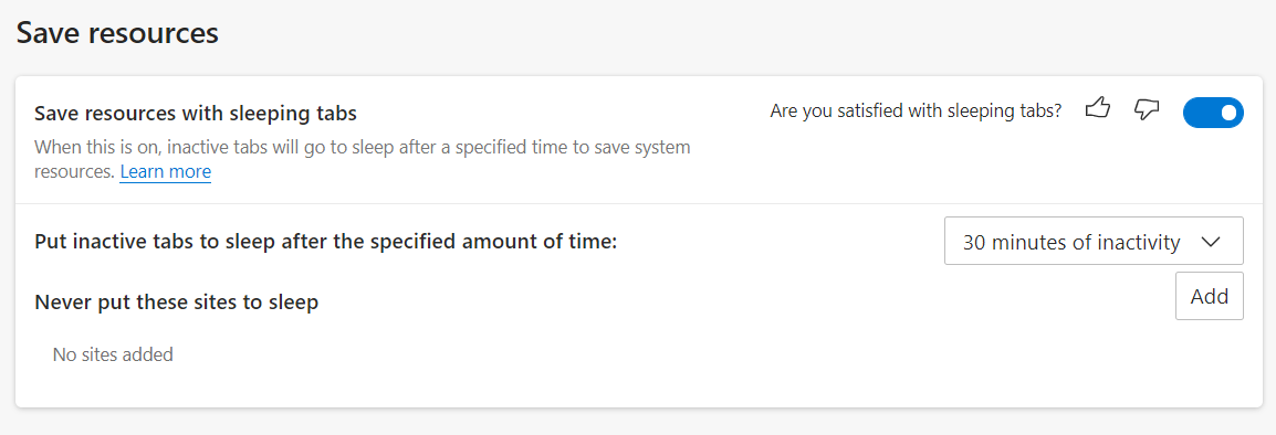
By allowing users to put inactive tabs to sleep after a certain amount of time, it helps users save system resources, improving memory and CPU utilization of the browser. This allows better performance and speed compared to Google Chrome.
To cater to users’ needs, users can also easily add sites that will never go to sleep in the settings option. This provides users with a lot of control and flexibility over their tabs, choosing which ones to never put to sleep, and how long of a time interval they would like to set before inactive tabs are put to sleep.
Microsoft’s internal research suggests that sleeping tabs reduce the median memory usage by 26%, which provides a better browsing experience and these resource savings also result in saving battery and processing burden on our devices.
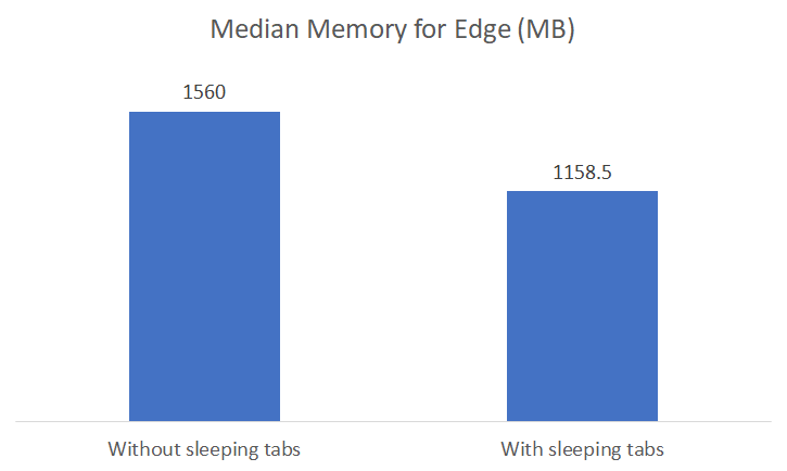
Credit: Introducing Sleeping Tabs Experiment: Improving Memory Usage in Microsoft Edge
Compared to closing and opening an inactive tab which requires users to load the entire page again, sleeping tabs provide the flexibility of being there, not taking up as much processing power and memory but ready to be awakened at any moment.
Sure, some people may say that Google Chrome has an extension that one could install to provide sleeping tabs, but that is another step that users would need to manually take compared to the function being readily available in Microsoft Edge.
Immersive Reader
To add to the growing list of why Microsoft Edge’s UX is winning over Google Chrome, Microsoft has taken into account the user experience of readers stemming from many different backgrounds.
The immersive reader function on Microsoft Edge allows users to choose reading preferences, grammar tools, text preferences, and for the content to be read aloud to them. This feature isn’t yet available to all websites but I’m sure Microsoft is working on this.
Reading Preferences
Users can turn on this feature and select how many lines they would like to focus on whilst reading. Doing so helps to tune out unnecessary distractions and helps the user to focus on the content line by line, either 1 line at a time, 3 lines, or 5 lines. The rest of the website is darkened, a bit like the cinema effect to focus the user’s eyes and attention.
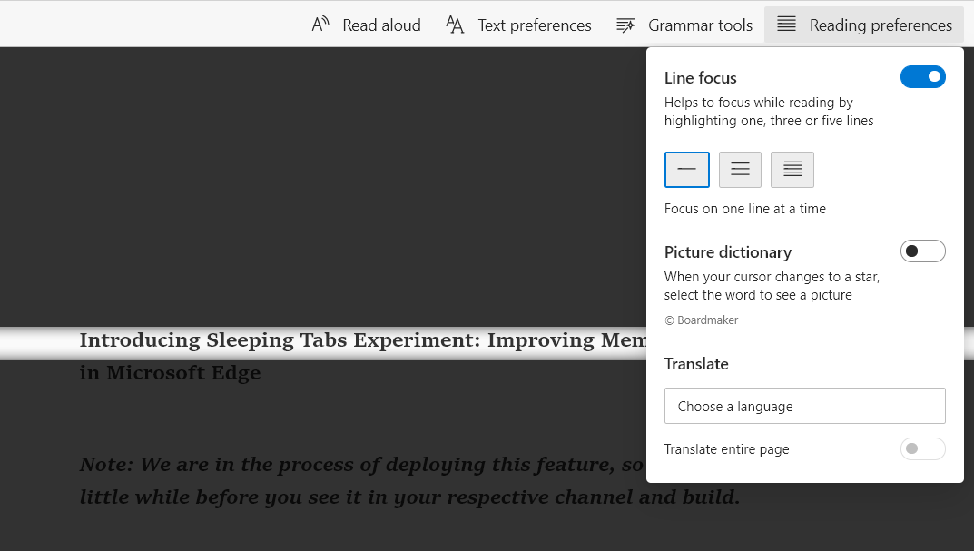
Aside from this, users can also turn on the picture dictionary, and when the cursor changes to a star, an illustration of the word pops up with a click. The illustrations are very simple, but this function is helpful for those who are still learning and are unfamiliar with certain words. Furthermore, users can choose to translate the text into any language of their choosing.
This considerate user experience caters to users who are multilingual, who are still learning new words and languages, and to users who really want to focus on the content at hand.
Grammar Tools
Taking considerate user experience a step further, users can opt to turn on grammar tools.
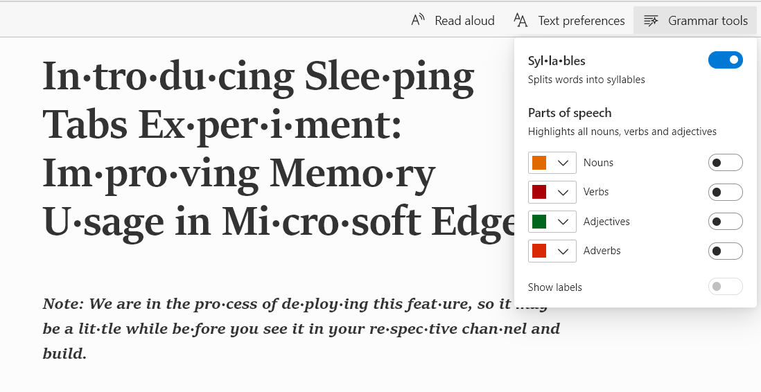
The flexibility of this feature is quite impressive, it allows users to split words into syllables. Again, especially helpful for those who are young, learning to talk, or those learning a new language.
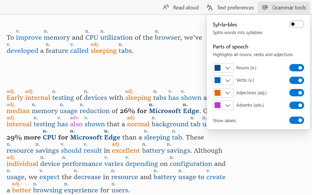
Nouns, verbs, adjectives, and adverbs can also be highlighted, and users can control what colour each of these highlights look like. And if the user wants to see all of these at a glance and lose track of which colour is which, they can opt to show labels signifying whether the word is a noun, verb, adjective or adverb.
Text Preferences
We are quite familiar with adjusting text size to suit our eyesight and preferences, and this in-built feature in Microsoft Edge allows users full control over how small or how large the text size is.
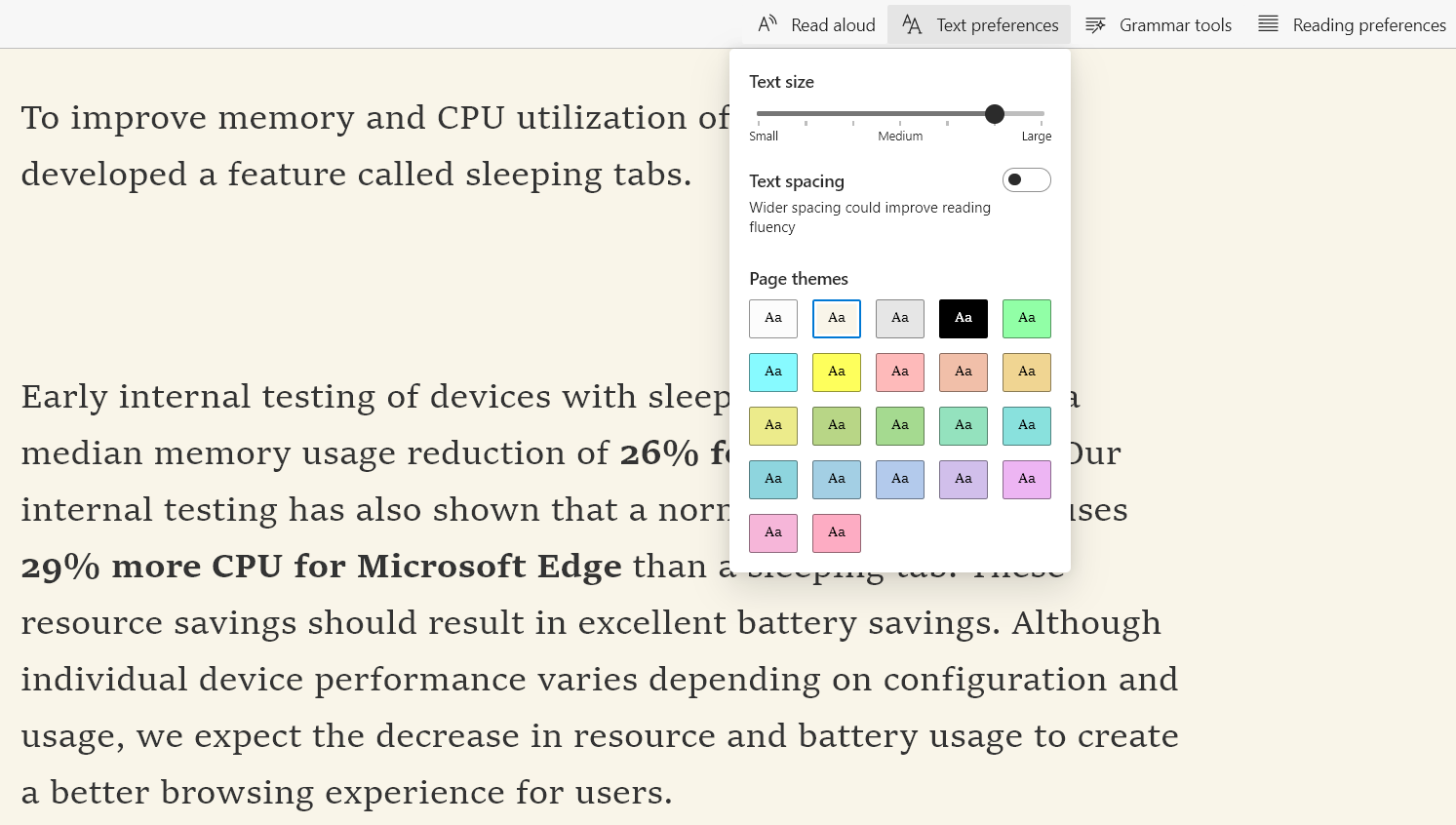
In addition, users can opt to turn on text spacing which spaces out the text a little to improve reading fluency. As well as changing the page themes to improve the readability of the website to the users’ liking.
This helps to cater to the user experience of readers stemming from various age groups and backgrounds and it’s all customizable with a click.
Read Aloud
Sometimes, we get a little tired of reading and want to be read to. Sometimes, we don’t have the time to sit down to read and would rather have it read aloud whilst we multitask.
Microsoft Edge has chosen to cater to the users’ needs by allowing users to opt into this function with a click of a button. When the user clicks on ‘Read Aloud’, the main text on the website is read aloud to them.
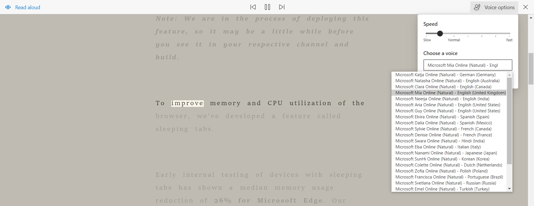
Users can pause, go back to the previous paragraph or read the next paragraph, it doesn’t allow users to choose which point the reading starts but this function offers a lot of other flexibilities.
Users can select a pace that suits them, adjusting the pace to be slower or faster. In addition, users can choose a voice that they identify with the most, and the choices of voices available are quite extensive.
Summary
Microsoft Edge’s new UX is winning over Google Chrome, not just because they value your security and privacy more and they allow users control over this. But also because they have taken user experience into the heart of what they do, ranging from their impressively immersive reader features to the simplicity of vertical tabs.
