JobStreet has grown to be one of Asia’s leading online employment platforms, with the vision of connecting businesses with talents throughout Asia. JobStreet is committed to continuously improving the values it provide to jobseekers and employers by constantly improving their platform to better match jobseekers to employers.
Recently, they have launched a new user interface for the employer users. Our user researchers shadowed and interviewed our human resource coordinators to find out what they thought about the new user interface and its usability.
Right off the bat, all our HR coordinators agreed it is harder to use the current re-vamped site compared to its previous counterpart. Let me walk you through the job posting flow. So once you log into the employer page, you are greeted with a giant calendar, you then either choose to look at your job postings or search for potential talents. Clicking on job ads will lead users to the job ad listing page where one can see all current and past job ads. Then, if you click on a job ad all candidates that applied to the job post will be shown.

Issue #1: Unable To Deactivate Ads That Were Posted Before Revamp
We noticed that the deactivate button does not work for job posts that were posted before the re-vamp. We personally had to contact a person from JobStreet to resolve this problem, and they managed to deactivate the job post for us relatively quickly. However with that being said, if the button is available it should be clickable, but that was not the case. Transition needs to be planned and tested so that your existing users are not left with a roadblock and affected negatively.

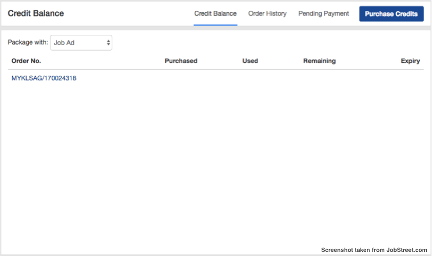
Issue #2: Unable To Check Credits For Internship Posting
Where do you go to check for internship credits? You can check credits for standard job posting clearly, but at the time of writing this article, we are still lost on where one should go to check for internship credits. All credit types should be visible at all times so that employers are able to keep tabs on when they should purchase more credits. Again, transition needs to be planned and tested.
Issue #3: It Takes Longer To Review All Candidates
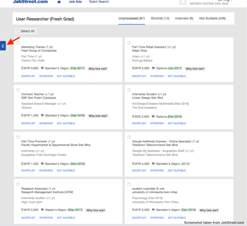
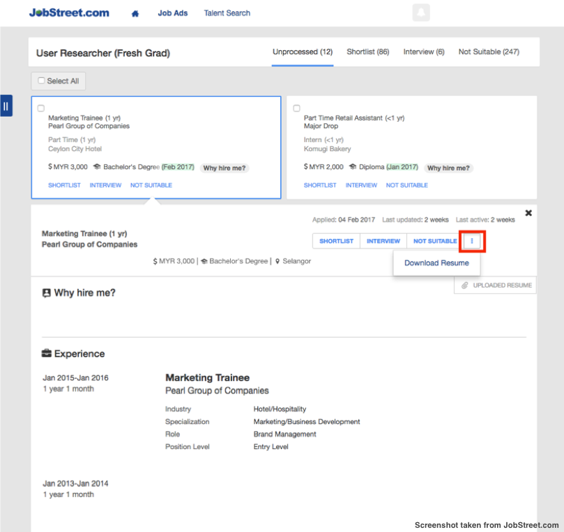
When an employer clicks on a job posting, he/she is directed to a list of candidates who have applied. Firstly, we noticed that JobStreet had opt for a card design, which may be the latest trend but proof that sometimes ‘old is gold’. Although it may look more organised, it reduces efficiency. An employer can only view a total of 10 candidates per page, if you had about 200 candidates you’d have to go through about 20 pages of candidates and that is if people stop applying for the position. One needs to research and understand the HR personnel workflow to design an efficient user interface so that employers can process candidate application quicker.
Now the above scenario clearly depicts the need of a filter of some sort, but the filter menu is hidden to employers. Hiding the menu bar makes it harder for the employers to filter potential candidates based on certain criteria. It is not conventional to use ‘2 lines’ at the side of the page to signify the filter menu, one would only figure out it was the filter option if clicked on. The convention for filter button is usually a funnel shaped icon.
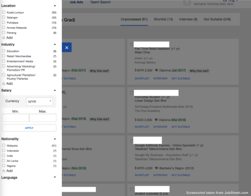
Issue #4: The Filter Isn’t Extensive Enough
In addition to that, employers can’t filter candidates extensively. The filter menu only allows you to filter candidates based on location, industry, expected salary, nationality and language. There should be more options for employers to filter out potential candidates such as the date candidate submitted their application, qualifications, age etc. Having a good filter will help make the process less tedious. Again, user research on HR personnel will inform the product design team on what filters will be helpful for employer.
Issue #5: The Absent Search Bar
With the new re-vamp, the search bar has been removed, thus employers are unable to search for a specific candidate by their name. In the previous design, the employer was able to search for a candidate based on their name using the search bar. The removal of such feature is making the vetting process much harder. In order to find a particular candidate, one has to go through each and every page to search for him/her.

Issue #6: The Hidden Résumé
Finding an uploaded resume can be quite challenging. Although the current JobStreet candidate page does contain adequate information, there’s nothing like reading a personalized resume to get to know a potential employee better. In the previous design, the download button was fairly visible however in the new design the download button is hidden. The button is hardly noticeable, this makes finding it very challenging.
With that being said our HR coordinators were delighted that they could view a candidate’s basic information without leaving the page. Compared to JobStreet’s past design where you would be taken to a different page if you wanted to view basic information this helps to speed things when sorting candidates.
Moral Of The Story...
Revamping an entire site is a huge task and normally done with the intention to help the users. However, as we have seen from the above, sometimes improving on something that works fine may bring about more harm than good. The importance of getting insights from users and understanding their workflow is crucial when planning for a revamp. We all can learn a thing or two from this, never forget engage with your users because what you think may be a problem may not be one in the eyes of the users. You should also conduct usability test with your users to detect critical usability issues before it is launched.


