The idea of UX design is to make users’ lives easier through the use of exceptional design. This means aspects such as design, functionality, usability all contribute towards the overall website or app.These UX design fails show you that not even some of the best companies out there can do this well 100% of the time, avoid these UX design fails for better user experience.
UX Design Fails You Need To Avoid For Better User Experience
1. Using the Wrong Tools for the Job
In this example, the user is trying to order a pokebowl on GrabFood and the user wants to select their preferred sides. Now, what happens if the user wants to select two portions of the same side?

The user is unable to do so because a checkbox has been used as the control element, using the wrong tool for the job. It limits users in their choice, if the restaurant allows their customer to order two sides of edamame, the UX design needs to cater to this accordingly.Instead, users should have the choice to choose the items they want, and the amount they want in order to provide them with a pleasant user experience.Checkboxes should be used to allow users to choose between options (ie.hot or cold), whereas when it comes to selecting quantities, there are several tools that can be used to cater to the necessary requirements. A drop-down selection may be suitable, otherwise, a toggle with a '+' and -'-' may also be suitable for users to select their desired quantity.

2. Mandatory Country Codes for Local E-Commerce
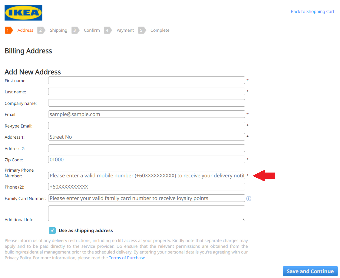
If you wanted to buy a new Billy bookcase or some fancy Swedish furniture, you might be tempted to go onto the IKEA Malaysia website to have a look. Happily you fill your cart full of your dream home décor and proceed to check out.As you fill-up the form, IKEA Malaysia makes it mandatory for you to enter the telephone country code in order to successfully fill-up the form. Now, this could be understandable for e-commerce websites that cater for international deliveries. However, IKEA Malaysia only delivers to Malaysian addresses. The common etiquette we see in e-commerce forms is to make it as easy as possible for users to fill up the form to reduce the friction and to have as many successful transactions as possible.The norm would be that the phone number would be a local phone number. By forcing the user to type out '+6' before typing out their phone number, it causes a small annoyance to users. But even though it's a small annoyance, it is very easily comparable to other e-commerce platforms that have a better form function and smoother checkout process.This UX design fail causes an obstacle to the checkout process and isn't convenient, creating an unpleasant user experience.[caption id="attachment_1887" align="aligncenter" width="1123"]

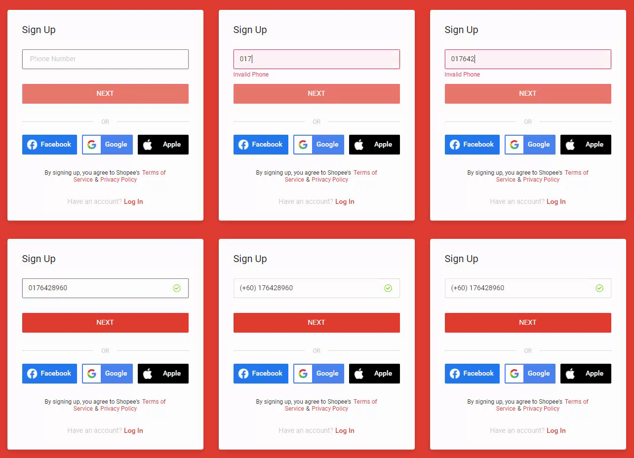
Credit: https://checkout.my.ikea.com/en/checkout/billingaddress[/caption]Consider instead not to make it mandatory for users to fill up the country code for local deliveries, and if it's necessary to ask users for the country code, use a dropdown selection in which users can type out their country name or country code for easier selection.An alternative would be to automatically detect the phone number and add on the country code, we can see here how Shopee takes the Malaysian phone number and automatically adds on the telephone country code:

3. Lost in Translation
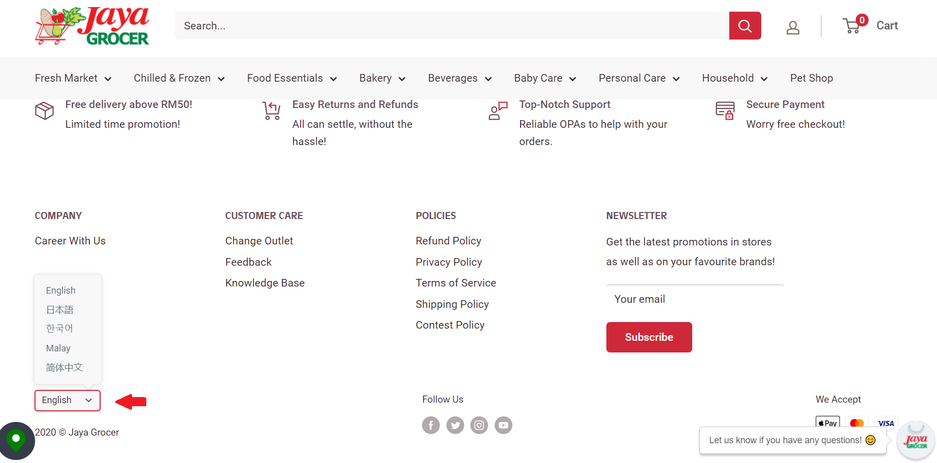
It’s quite common and even expected for websites and apps to give users the option to select a different language, especially for countries where there are more than one widely spoken language.

In the example above, the language option is a hovering drop-down option at the bottom of the page! Users aren't going to scroll down the entire page in a language they don't understand, if the language option isn't immediately noticeable, the user will assume there isn't one.Think about it, if you visit a website and it's in a language you don't understand, the first thing you would look for is if there's a language option available. Which is why, if a language option is available, the best practice is to position a toggle for users to select a language at the very top of the page, the top right of the page is often recommended.Make sure that the language option is clear and noticeable early on in the user journey to improve user experience.
4. Bad Readability
The use of colours to draw attention predates electricity itself, and modern designers have taken that into the digital space with gusto, some however, don’t even think about it at all. In this example below, it’s a digital space for promoting a new development property – Kenwingston Skyloft. Interested parties look through, get more and more excited and call up to ask.

However, it's already 100% sold. It may not be in a pop-up message or in the banner, but it's on the website. It's at the very top of the website even.

See it now?This important piece of information for any prospective buyer is hidden in such a way that practically no one has a chance of finding it. The entire website is dedicated to draw attention from potential buyers and provide them with information but by not making it obvious to potential buyers that the units are already 100% sold, it leaves a risk of leaving a bad impression on users.Thoughtful businesses leave a good impression on users, they may not be a customer now but they may be in the future. Bad readability leaves the impression that the business has not chosen to be considerate in their UX design, and therefore won't be considerate to their customers.Readability is an important usability consideration, the background colour of your website or app affects the readability. Some businesses have even opted to include dark mode UX to their products to enhance the readability options to users.Principal: If it’s going to be a struggle to read something, users just won’t read it. When choosing colour, theme or other interfaces, make sure its readability is good. Don’t fall into the trap of form over function.
5. Autoplay Videos & Audio
If you use Netflix, you know this well. When users hover their mouse over something for a few seconds, a trailer of that movie/TV series will start to play.[caption id="attachment_1029" align="aligncenter" width="1844"]

Credit: https://www.netflix.com[/caption]This would be helpful if the action is intentional, however so much of Netflix's page is taken up by videos, that a casual flick of the mouse will likely land you on a video and suddenly a trailer starts to blare out over the screen by accident.Furthermore, users may just want to hover over to read the details but instead are met by an unexpected loud montage of the trailer.We see this happen in so many websites to this day where users choose to browse through a website, and suddenly, there's audio playing or a video that has chosen to autoplay without the user's consent.

By forcing audio or videos to autoplay, it not only eats up the users' bandwidth and slows down the loading speed. It also causes an annoyance to users because they have not chosen to click play on a video or to click on an audio track to listen.
6. Notifications and Deleted Messages
WhatsApp has enjoyed much success internationally, especially in Southeast Asia where almost everyone chooses to communicate using WhatsApp. However, even in an application as popular as this, there are still problems.We as humans make mistakes from time to time, we may have a typo in the message or have sent a message to the wrong person. WhatsApp allows users to delete the message, but it leaves a very noticeable notification that a message has been deleted.It causes a bad impression to the person who sees this, possibly even arousing suspicion to the 'guilty' party. The choice to display this is quite an inconsiderate design decision.

Summary
Failures are lessons we can learn from, and these UX design failures don't just happen in South East Asia. We see how international companies such as Ikea, Netflix and WhatsApp may experience some UX design gaps. Each country may have cultural preferences, but one thing that we can definitely agree on is the importance of user research. The best way to understand your users and to design effectively for them is to conduct user research. If you are targeting different markets in South East Asia or Asia Pacific (such as Malaysia, Singapore, Thailand, Vietnam, Hong Kong, Philippines, Indonesia, Taiwan, China, Australia and New Zealand), it will be prudent to conduct cross-market research to understand the local insights. In order to validate your design with real users, we recommend doing usability testing to work out which part of the design works well, which parts don't and needs improvement in order to design an effective user experience. To understand more about usability testing, take a look at this article: Usability Testing 101: What, Why, How?[/et_pb_text][/et_pb_column][/et_pb_row][/et_pb_section]


