Shifting to an e-commerce platform meant a few things for the consumers: a quicker, easier, and often a more affordable shopping experience. Having a solid UX design becomes critical considering that assistance is not readily available like it is in a physical store. Coupled with a longer purchase funnel, any friction in the online shopping experience may cripple sales.
Selling online also opens the doors for businesses to explore new ideas and styles that could improve customer engagement. Having the right designs not only enhances usability and branding; it’s also a creative and personal way to differentiate yourself from competitors.
Here are the top 8 UX design trends that would continue to facilitate a seamless online shopping experience in 2022:
1. Omnichannel UX
Before we go into anything fancy, let’s get one thing straight: e-commerce has and will always be an omnichannel, multi-device experience. The majority (68%) of retail traffic comes from mobile devices, with 54% of sales happening via the same channel. Despite accounting for the majority of e-commerce sales, mobile conversation rates still lag behind their desktop counterparts, indicating a disregard for the mobile experience.
The increasing trend of mobile dominance in e-commerce will not lose its relevance, and marketers even expect it to be the endgame for online shopping. Optimizing the UX design for phones and tablets to offer a similar, if not a better online shopping experience has become a necessity for online retailers to stay ahead of the game. And the same will apply as we move down this list.
Here’s an article on how you could create a well-orchestrated omnichannel UX.
2. Visual Engagement
The lack of physical visuals remains the largest gap in an online shopping experience. Plain texts and simple graphics alone may not suffice in replicating the senses, and this is where e-commerce platforms can take advantage of interactive visuals to engage their customers better.
Any advanced visuals are about giving more information on what to expect from the products, and the sky’s the limit when it comes to options (consumer-generated media, interactive content, engaging videos, etc.). Before diving into fancy visuals, one must also consider their practicality and relevance to the business and its products.
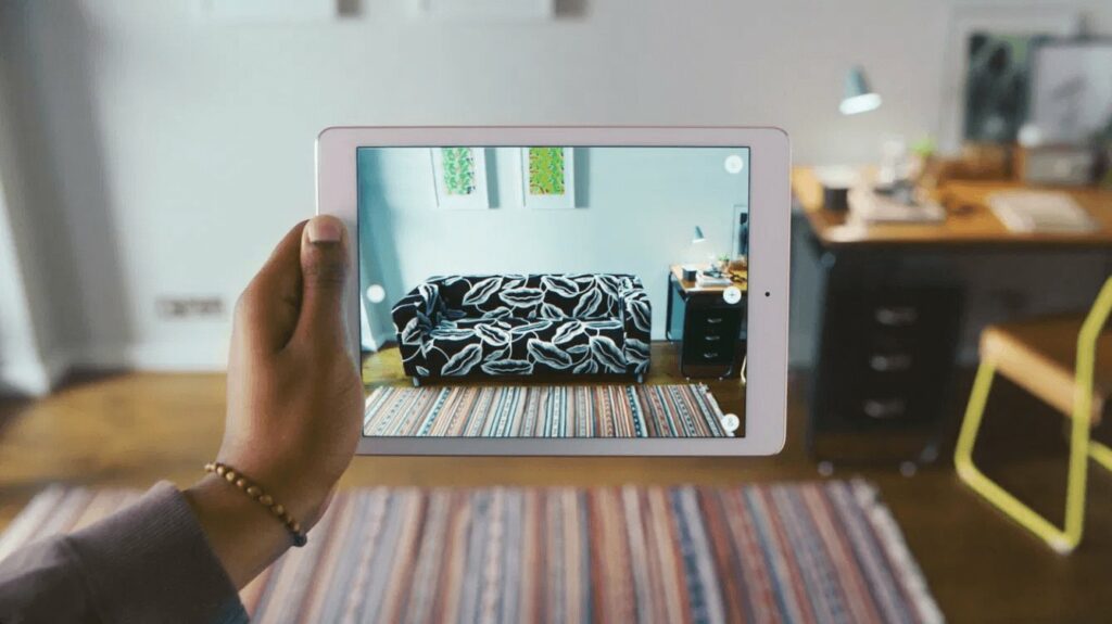
A good example would be the IKEA Place app, which is IKEA’s take on augmented reality (AR) as a replacement for its physical browsing experience. IKEA Place allows its users to visualize a product within a space through accurately-scaled 3D renders, paving the way for AR try-before-you-buy apps. The app was ranked the second-most popular ARKit free app in less than a year, putting it ahead of many popular apps.
While it may seem appealing to hop on this bandwagon, it’s important to remember that advanced visual technologies like AR is not a one-size-fits-all solution. Depending on your business, a simpler 3D product visual might just do the trick.
3. Advanced Configurators
Adding on to utilizing advanced visuals on your e-commerce website, having a product configurator is another way of helping your customers make a better decision. Giving your customers the freedom to modify the products individually goes beyond replicating a physical shopping experience; it’s a level of customization that is unique to an online shopping experience.
Automotive manufacturers like BMW have excelled at providing a 3D configurator, and the fashion industry has started to follow suit. If an interactive configurator works for your products, why not?
The Build Your BMW configurator that allows users to visualize different exterior choices.
Converse’s “Customize tool” that allows users to explore their creativity from a blank sneaker.
4. Embracing the Dark Side
Dark Mode is here to stay, and as more browsers and apps begin to adopt it, customers will grow to expect Dark Mode to work on sites they visit. Aside from being less strenuous on the eyes, Dark Mode works best with a visual-based interface with minimal text, which is often the case for e-commerce platforms. Dark palettes also invoke a perception of elegance and prestige, which would bode well with luxury offerings.
As with the rest of the list, Dark Mode would only work well in the right context for the right businesses. Unsure if Dark Mode works for you? Here’s an article to help you decide if dark mode suits your business.
5. Keeping it Personal
While it’s harder to engage with customers through a screen, online retailers are now given the opportunity to compensate for it by personalizing their online shopping experience. By understanding your customers’ preferences and habits, your e-commerce website could help your customers make better and quicker decisions — a win-win for both the seller and the buyer.
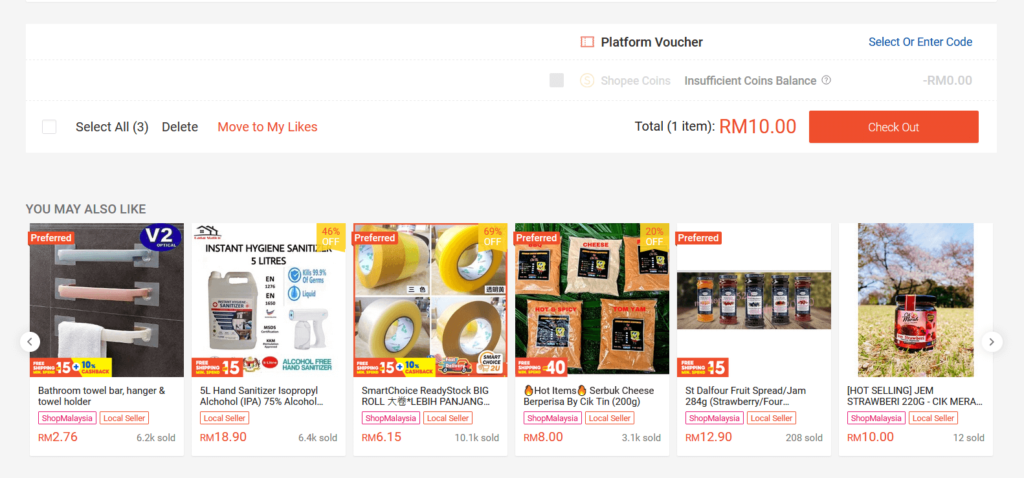
Personalization is all about telling your customers that you care through product recommendations, dynamic content, and personalized offers. Getting it right would not only make your online shopping experience more engaging, but also guarantee healthier conversion rates. Common examples include displaying seasonal content and products, cross-selling similar products at checkout, displaying location-specific delivery information upfront, the list goes on.
Here’s what the numbers tell us:
- Online retailers with personalized web experiences see an average 19% increase in sales.
- 71% of consumers express some level of frustration when their shopping experience is impersonal.
- 44% of consumers will likely become repeat buyers after a personalized shopping experience.
6. Fun Filters
Filters have long been an integral component of any online shopping experience, allowing customers to get to what they want quicker. However, there’s been an increasing UX design trend of “fun” filters that break away from generic drop-down menus.
While it may ease the search experience only by a small margin, having interactive filters is an entertaining and effective way to make a memorable impression on visitors (as long as it does not come at the expense of practicality and efficiency).
7. Retro is the New Black
Incorporating a creative and personal design attracts not only a larger audience to your website, but also the right audience that would ultimately make up your customer base.
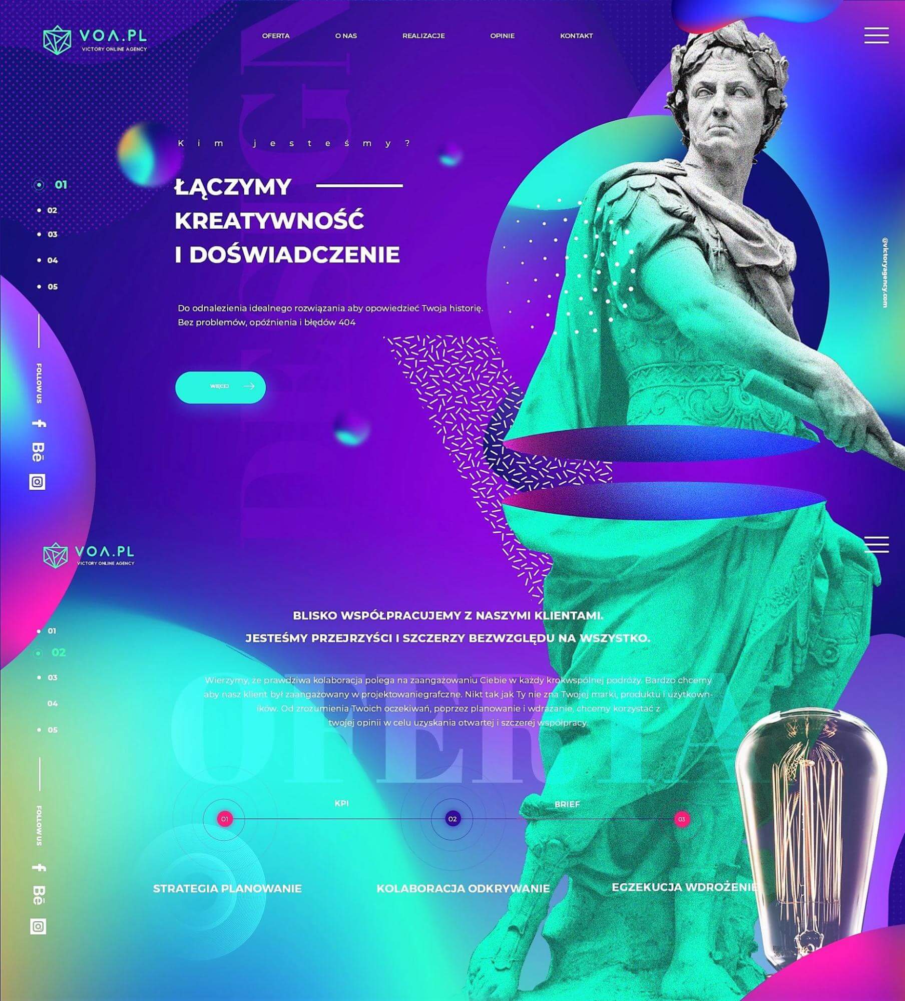
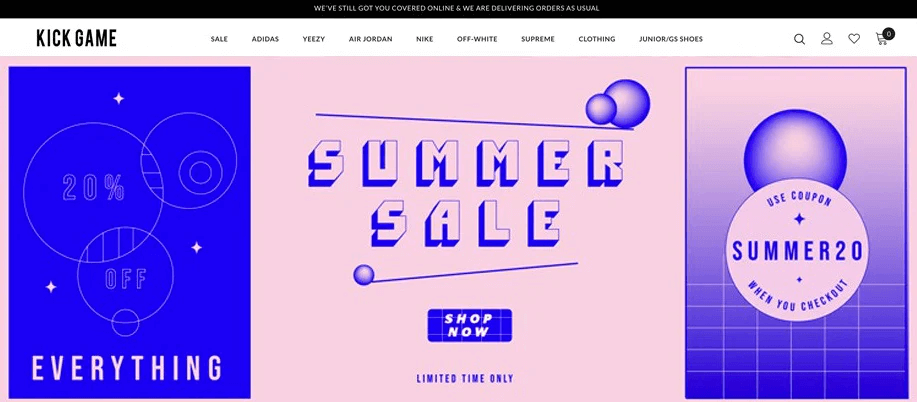
Vaporwave is a returning retro trend that has evolved to embrace nostalgia, surrealism, and futurism in the form of retro pop culture visuals. Vaporwave aesthetics usually feature a bright color palette, neon elements, and references to old-school Internet reality.
The Vaporwave aesthetic trend has been making a comeback in 2021, growing from cult status to mainstream pop culture. Depending on your primary audience, it’s a style worth considering for your e-commerce brand. And if it comes off as too bold, you can always pick and choose the elements that work.
8. Neutral and Minimalistic
Find Vaporwave a little too flashy for your brand?
Fret not, minimalistic UX designs with neutral palettes are still largely in trend (perhaps to contrast the vibrancy of other trends). This combination of minimalism and a neutral palette helps keep the users’ attention on the elements that matter on your e-commerce website, like your product visuals and navigation tools.
A neutral and minimalistic tone is meant to provide a soothing user experience for your audience, but you may run the risk of turning your site overly passive. Hence keep in mind that there will be a need to adopt strong visuals and clear call-to-actions if you plan to go down this route. Large typography further complements the style by maintaining the focus where it’s needed.
Wrapping Up
It has long been established that e-commerce is here to stay; the Covid-19 pandemic has only accelerated its use. It’s a great year to be creative, and online retailers should take this as an opportunity to show off their technological capabilities and creativity through a well-designed e-commerce website.
At the end of the day, the viability of each UX design trend depends on the business and its customers. What works well for one business might not work for another, and a better understanding of your primary audience would go a long way. Investing in UX research to validate your UX design helps you launch new designs that would help your customers' experience.
Stay ahead of more UX design trends by signing up for our newsletter.


