In this article, we’ll start by covering key principles of good website user experience before diving into the most common user pain points—and, more importantly, how to fix them.
What makes a good website user experience (best practices)?
- User-centered Design: Put the user first. Prioritize user needs with easy navigation, clear CTAs, and a simple yet effective layout.
- Intuitive Navigation: Users should be able to find their desired information without having to go back and forth multiple times. This can be done with clear labeling and prominent calls to action (CTAs) to help users find what they are looking for.
- Fast Loading Speeds: Ensure the design elements of the webpages are optimised for them to load quickly, allowing users to access the content without waiting for too long.
- Clear and Concise Content: Most website visitors are on their mobile devices, and they prefer to quickly scan through the content rather than read lengthy paragraphs to find what’s important/valuable to them. Thus, content should be easy to read and understand.
- Responsive Web Design (RWD): With more users accessing websites on their smartphones and tablets, ensure that your website is responsive to all screen sizes and device orientations.
- Accessibility: Accommodate for ALL users, including those with disabilities. Implement best practices like alt text for images, high-contrast colors, and keyboard-friendly navigation on your website.
Read: The Importance of Accessibility in UX Design - Consistent Branding: Use the same font styles, colours, contrasts, and design elements across all pages for a unified and professional look. This enhances user trust and recognition.
- Feedback and Interactivity: Users should be able to interact with the website and provide feedback freely. This can include features such as comment sections, contact forms, and social media integration.
Top 11 User Pain Points & Fixes for Better User Experience
1. Small-Sized Text
Video and animated content have grown in popularity, yet most online information remains text-based. Small text is a huge pain point, as readability and legibility are essential for a good user experience. Users should be able to read everything with ease.
Tips & Recommendations:
- The body text should be at least 16 px and above, so that the text is legible at a viewing distance without needing to zoom in. Larger screens may require bigger font sizes to enhance readability.
- The line height should be either 1.5em or 1.6em for optimal readability. The spacing helps the user to easily distinguish the lines they are reading.
- The line length should be 50 – 75 characters per line to improve reading comfort and comprehension.
- Always test designs on actual devices to ensure text adjusts appropriately across various screen sizes and resolutions.
2. Tiny Click Targeting
Oftentimes, websites are mainly designed for desktop use, which may not translate well to mobile devices, while human fingers are not as small as a cursor, users will struggle to tap accurately.
The smaller the interactive elements (e.g., links, buttons, and other UI controls), the larger the likelihood of making mistakes, and users have to look high and low for it.
Tips & Recommendations:
- Make buttons easy to find and tap. Ensure touch targets are finger-friendly to cater for mobile web design.
- The average size for the touch target should be 9 × 9 mm. Google’s material design suggests a minimum of 48 x 48 px.
- Add padding around each touch target and keep enough space between buttons to prevent accidental taps. Microsoft recommends 10 mm between each touch target to cater for stubby fingers.

3. Unexpected Layout Shifts
Imagine that you have found what you are looking for on a page, and you’re ready to click on to proceed. But as you click, an ad suddenly pops up and you’ve clicked on it. It redirects you to a completely different page and you’re having to find your way back again—frustrating, right?
This is an unexpected layout shift, where visual elements on a webpage move around as the page loads or as a user interacts with the content. These shifts disrupt the entire user experience, especially when they cause unintended actions like clicking on ad banners.

Tips & Recommendations:
- Style fonts properly. Improper font styling can lead to a flash of invisible text (FOIT) or flash of unstyled text (FOUT) that may cause the layout to shift.
- Specify dimensions/size attributes for all your images, banner ads, embeds, video elements. Doing this ensures that the browsers can allocate a suitable amount of space in the document whilst the elements are loading.
- Use placeholders, empty containers, or skeleton screens for dynamically loaded elements.
- Don’t insert content above existing content or shifting elements downward by adding content above them. The only exception is if it directly responds to a user action (e.g., a dropdown menu).
4. Unclear Calls to Action (CTAs) Button
Imagine browsing an online store, ready to buy, but the ‘Add to Cart’ button blends into the background, or looks like plain text instead of a clickable button. Confused, you scroll around searching for it, then you give up and leave the site—resulting in a lost sale for the business.
Unclear or poorly designed CTAs (e.g., Learn More, Download Now, Sign Up) confuse users, leading to lower engagement and conversions. If buttons lack clear labels, contrast, or visual prominence, users may struggle to take the desired action.
Tips & Recommendations:
- Use clear, actionable text. CTAs should describe the exact action (e.g., ‘Add to Cart’ instead of a vague ‘Submit’ for purchasing).
- Design buttons with proper padding, hover effects, and a distinct button shape to indicate interactivity.
- Use A/B testing to experiment with different button styles, placements, and wording to determine the most effective CTA.
5. No ‘Back’ Button
According to Jakob Nielsen’s 10 Usability Heuristics for User Interface Design, user control and freedom is an important usability heuristic. It describes how users can mistakenly perform actions and need a clearly marked exit in order to leave the unwanted action without having to go through an extended process.
Making it easy to undo actions provides a sense of freedom and control, the confidence to go back, and avoids feeling stuck or frustrated. A ‘Back’ button is that emergency exit. Users need to know they can leave if they don’t want to proceed further.
Tips & Recommendations:
- Ensure every page has a clearly visible ‘Back’ button. If a ‘Back’ button isn’t feasible, consider breadcrumbs, a home button, or a clear exit path as an alternative.
- If you’re concerned about losing data if a user clicks on the ‘Back’ button, prompt users by asking them “Are you sure you want to go back? All changes will be lost” and provide options to proceed with ‘Yes’ or ‘No’.
6. Insufficient Feedback
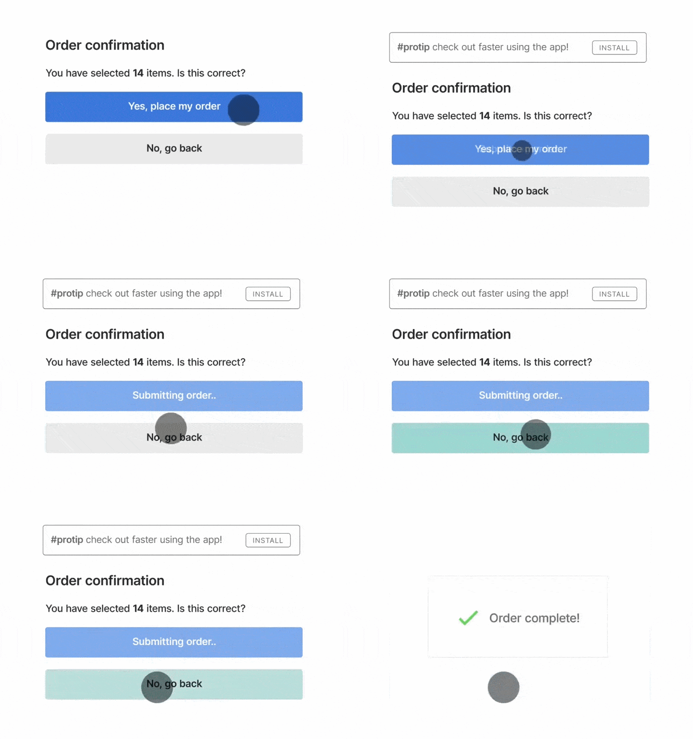
Feedback messages help users understand the result of their actions, whether it’s a successful submission, an error, or a system process in progress.
Without clear feedback, users may feel lost and unsure if their action was registered, or frustrated when things don’t work as expected. A lack of feedback can lead to repeated actions, or even abandonment of a task.
Tips & Recommendations:
- Provide instant visual cues such as animations, color changes, or button states (e.g., dimming after clicking) to indicate interaction.
- Display success or error messages clearly. If an action fails, provide specific and helpful messages (e.g., ‘Incorrect password. Try again.’ rather than generic ‘Something went wrong.’)
- Show users’ progress. For loading times or background processes, use spinners, progress bars, or step indicators.
7. Sign-up Walls
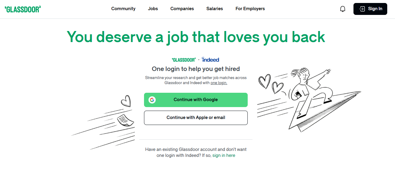
A sign-up wall, as you could imagine, is a compulsory requirement for users to sign up to a service before being able to use it. It completely stonewalls the user’s ability to explore the service and the website.
This pain point is a common problem that users encounter, we click on something interesting and suddenly hit a sign-up prompt:

The user is now unable to proceed further without having to sign up.
All software, including websites, should follow the ‘Try Before You Buy’ principle by making sign-up optional at first. Users are free to explore, test, and form opinions before committing. For example, news sites can allow limited free articles before prompting a subscription, keeping users engaged and wanting more.
Tips & Recommendations:
- Allow users to explore freely, the sign-up feature shouldn’t block access but act as an added service for users to enhance experience. For example, by signing up they get to enjoy additional features or save their progress.
- Use subtle reminders or soft prompts after users have engaged with the content instead of an immediate sign-up wall.
- If your service is a premium service that requires users to pay, consider allowing users to have a free trial before committing.
8. Autoplay video WITH SOUND
Simply put, users don’t expect audio to play without consent. In fact, while users who are patient enough will find a way to mute it, many will leave the website immediately if a video autoplays with sound. In the end, the user’s time and effort are wasted to identify the sound source instead of focusing on their user journey.
Moreover, not all users are in a situation where they can play video with sound on, such as those on public transport, as it would cause disturbance to others.
Tips & Recommendations:
- Mute videos by default and allow users the option to unmute the video.
9. Slow Website Loading Speed
Extensively long load times can be a big turn-off and can frustrate users and make them abandon the website or, worse, move to a competitor site.
Tips & Recommendations:
- Run a web page loading speed test to identify slow-loading pages.
- Optimise website speed by reducing the image and video sizes, compressing files, and minimising the number of HTTP requests.
- Use a content delivery network (CDN) that caches content closer to users’ location to improve load times.
10. Poor Navigation
Poor website navigation can lead to user confusion and abandonment. Navigation isn’t just about menus; it includes the sitemap and page structure, ensuring users can locate content easily. A disorganized sitemap and weak hierarchy make it difficult for users to understand their current location and where to go next.
Tips & Recommendations:
- Keep primary navigation in expected location (e.g., top or side menu) and visible across all pages.
- Group related content and structure pages logically to make browsing intuitive and reduce the number of clicks needed to reach key pages.
- Use card sorting techniques to understand how users naturally categorize information and design navigation.
- Provide a search bar to help users quickly find the content they are looking for.
11. Non-responsiveness Web Design
With smartphones and tablets being essential in daily life, websites must be optimized for all screen sizes. A non-responsive design is a website layout that does not dynamically adjust to different screen sizes and devices.
This leads to usability issues like small text, tiny buttons, and misaligned content across devices, leading to a cluttered layout. Additionally, websites that are not optimized for different devices can discourage users from staying longer on the site and increase bounce rates.

Tips & Recommendations:
- Use responsive design techniques, such as responsive typography, layout scaling with fluid grid layouts.
- Include a viewport meta tag in HTML to control the layout on mobile browsers, so that the viewport scales appropriately on different devices.
Read: Viewport meta tag – HTML: HyperText Markup Language | MDN
While do-it-yourself fixes are tempting, addressing complex user pain points often necessitates a user-centered design approach. Partnering with a UI/UX design agency can provide the expertise needed to translate user research into effective solutions. Agencies can leverage their design thinking skills and knowledge of best practices to deliver an improved user experience that tackles the identified pain points.
Reach us at Netizen Experience for UX web development services.


