User experience is defined as a person's emotions and attitudes when they use a product/system/service. Understanding human behaviour is critical in addressing users' needs and providing them with a good user experience.
In this article, we will look at the various principles of psychology that you can apply in enhancing your user experience design.
1. Hick's Law
Hick's law, also known as Hick–Hyman law, states that the more choices and complexities there are, the longer it takes to reach a decision. If a decision requires too much effort and time, it can lead to users not choosing anything at all and abandoning the process.

You may feel the same way when you look at a restaurant menu and you're overwhelmed, unsure what you want to order because there are just too many choices! And the worst thing is, it's all listed alphabetically, no grouping at all! The 'chicken wings' is listed right above 'coffee', and so you need to go through each item one by one.
When it comes to applying Hick's Law to user experience design, it isn't about reducing the number of options but aim to avoid overwhelming the users with too much. To call this website below overwhelming is an understatement:
[video width="1280" height="624" mp4="https://cdn.netizenexperience.com/wp-content/uploads/2020/11/User-experience.mp4" loop="true" autoplay="true"][/video]
The key to Hick's law when it comes to user experience design is grouping and filters. This helps the user browse a lot easier, allowing them to narrow down the number of items they have to choose from. Consider removing any unnecessary elements such as images, text, links, buttons, etc to avoid distracting the users.
Think about Netflix & Lazada, there is an abundance of choices and it's definitely overwhelming for users if they have to go through the entire selection one by one. The information architecture is vital in providing all the navigation options immediately, allowing users to start off with broad categories, channelling down further subcategories to reach their destination easily.
[caption id="attachment_1506" align="aligncenter" width="1850"]

Credit: Lazada[/caption]
By offering a clear path, it reduces the navigation time and bounce rates because users aren't faced with too many choices and complexities, and can instead take more manageable and simplified steps.
2. Von Restorff Effect
Also known as the Isolation Effect, the Von Restorff Effect states that when there are multiple similar elements, distinctive items will stand out the most and are most likely to be remembered.
This distinction is noticeably different in terms of visual, context or experience. Emphasize on important items by altering the light, colour, image, font, animation, words and sounds. It makes it easier for users to process when their attention is called to important design elements.
If you want a certain button or element to stand out, design it so that it looks different but not too different that it looks out of place. The Von Restorff principle is to be used in moderation, making too many things stand out will overwhelm the users and cause them to lose focus.
[caption id="attachment_1511" align="aligncenter" width="1233"]

Credit: AIG[/caption]
In the example above, the elements that stand out the most are the orange action buttons, it helps the user to focus on what to do next, encouraging them to select a plan of their choosing and to click on the button.
3. Serial Position Effect
The Serial Position Effect is a combination of the primacy effect and recency effect. The primary effect states that items that are placed first are better remembered, and the recency effect states that the same is true for items at the end.
Similar to the Von Restorff Effect, it aids in bringing attention to the most important elements and helps the users remember them. For user experience design, utilising the serial position effect could mean featuring elements at the beginning and the end of the page. For example, the 'sign up' button is frequently seen at the very top of the page, and repeated at the end of the page.
4. Fitt's Law
Fitt's Law proposes that the time it takes to move to a target area is the function of the size of the target and the distance to the target. Fitt’s law meant that fast mouse movements and small targets result in greater error rates. Also, the distance between a user’s attention area and the task-related button should be kept as short as possible to reduce time spent. Plainly, Fitt's law suggests that by placing buttons closer & larger to the expected mouse location, it decreases the interaction time.
Applying Fitt's Law to your user experience design means making sure that the action buttons are sufficiently large and close to where the user's attention/mouse location is. This is an important concept to fulfil because the time required to take desired actions affects the conversion rate.
Users shouldn't have to search high and low for a button that should be conveniently placed within reach to access easily. We see Fitt's Law utilized in many e-commerce website where the 'add to cart' button is large and placed very near to where the user's attention and mouse location is. In the case below, the ‘add to bag’ button is placed right next to the product information.
[caption id="attachment_1512" align="aligncenter" width="1595"]

Credit: Zalora[/caption]
5. Pareto Principle
Otherwise known as the 80/20 rule, the Pareto principle suggests that 20% of work is responsible for 80% of the results achieved. In other words, only a little needs to be fixed in order to gain a lot of positive results.
Attempting to tackle all the usability issues at once will yield diminishing returns, consider applying this principle to your user experience design process by prioritising your efforts on the top 20% that will have the biggest impact.
Once the first 20% has been addressed and resolved, we can iterate and focus on the next 20% to fine-tune all the details in due course.
6. Dual Coding Theory
Dual Coding Theory suggests that learning and memory has two distinct yet interconnected systems: verbal and non-verbal information. Both visual and verbal codes are used when we recall information, like the concept of 'cat' conjures up the word 'cat' and the visual image of a cat.
Applying this to user experience design could mean pairing words with images to reinforce learning and memory, and to focus on the design of the content itself and not just the layout to ease the learnability in creating a good user experience.

Coding a concept in two different ways (visual and text) increases the audience’s chance of understanding and remembering its meaning compared to only explaining a concept using one type of code.
7. Visceral Reactions
Visceral Reactions is the instinctive response to a stimulus or experience created by the chemical messengers in our brain. Users tend to make split-second impressions for a product/system/service as soon as they see it, if it isn't appealing to them, they won't be staying for long.
The aim is to create a pleasant visceral reaction for users, generating a positive behavioural reaction which helps to encourage loyalty and support from users.
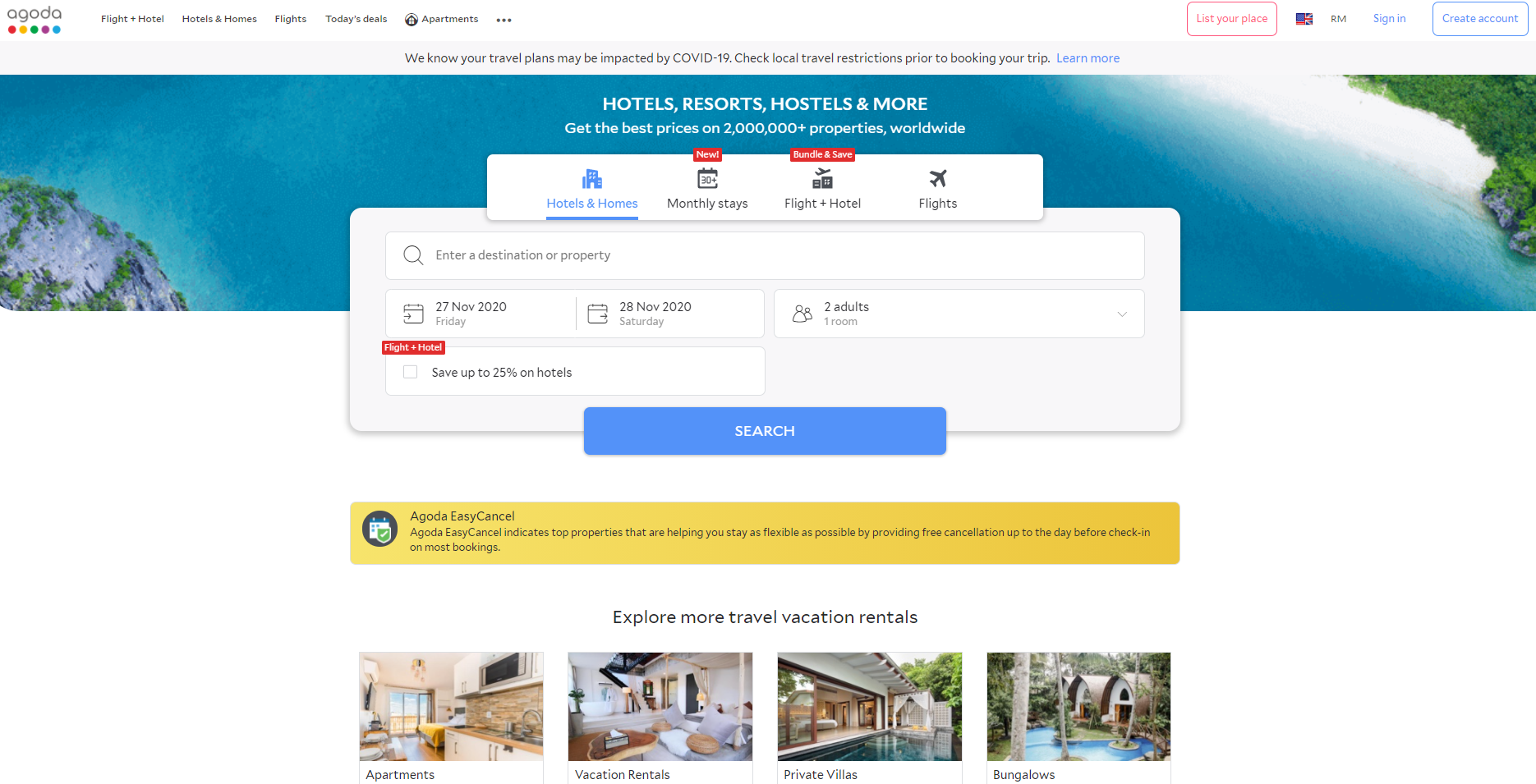
Design elements like fonts, imagery, colour and icons all play a role in the overall feel, affecting the way users form their opinions.
[caption id="attachment_1513" align="aligncenter" width="1870"]

Credit: Agoda[/caption]
Take Agoda for example, the imagery used is of calm blue waters, open-spaces with a large living room, kitchen and swimming pool, the fonts and colour stand-out but is still subtle. The website evokes a visceral reaction of calmness and wanderlust encouraging users to feel at ease.


