When the worldwide pandemic was announced by WHO, most countries started to close their borders and restrict the movement of their citizens to curb the spread of the virus. Southeast Asian countries such as Singapore, Malaysia, Indonesia, Vietnam, Thailand, Philippines took the same action as well.
As Experience Research practitioners and frequently conduct UXR activities in South East Asia, we kept an eye on how food and delivery businesses started to innovate by listening to their users.During that time, it was unclear to the public whether restaurants and food delivery services were still allowed to operate, and if so, people were wary of whether they could get sick from ordering food. The concept of contactless delivery had not yet come to fruition, let alone the user experience of contactless delivery.Businesses were left in a place where normality had been disrupted, there were no lunch crowds coming in from their offices, no Friday night drinks and catch-ups at the mamak. Their users were uncertain whether food could be delivered, and if so, would it be clean? Would they get sick from food deliveries? There was definitely a problem.How should businesses respond to the change in their users' needs?
1. Listen to your users
In South-East Asia, the three main food delivery services that were quick in announcing that they will remain operational throughout the pandemic lockdown and restrictions: Foodpanda which operates in Malaysia, Singapore, Thailand, Philippines, Cambodia, Laos & Myanmar.GrabFood (under Grab) which operates in Malaysia, Singapore, Thailand, Indonesia, Philippines, Vietnam, Cambodia & Myanmar.GoFood (under Gojek), which operates in Indonesia, Vietnam & Thailand.For GrabFood and Foodpanda, in response to their announcement, their users started asking them questions:[caption id="attachment_865" align="aligncenter" width="533"]
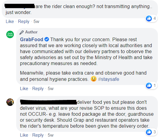
Excerpt taken from GrabFood's official Facebook page, the names of the users have been censored to respect their privacy.[/caption][caption id="attachment_864" align="aligncenter" width="524"]
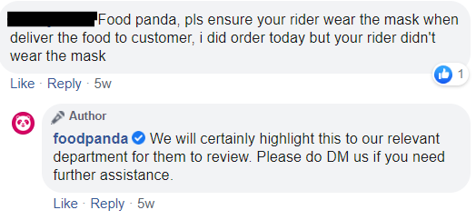
Excerpt taken from Foodpanda's official Facebook page, the names of the users have been censored to respect their privacy.[/caption]Worries, comments and feedback were flooding in, and they chose to listen to their users.
2. Adapt
GrabFood, GoFood and Foodpanda listened to their users' needs and adapted to the problem by introducing Contactless Delivery. Thus began the user experience of contactless food delivery.By sending announcements on social media and through email, their users were provided with step by step information, and visuals to understand better.In ensuring their users were well informed and putting measures in place, they prioritized the user experience of contactless delivery.McKinsey research on the changing market for food delivery suggests that customers drawn to new online food delivery platforms have a different set of needs and expectations. During this pandemic, a new set of customer needs and expectations has emerged.Food delivery services know that implementing measures will help them retain customers, even win over customers from their competitors who aren't responding well.This all comes down to understanding their users' needs and implementing a good user experience of contactless delivery. Knowing what the customer’s fear was and addressing it is the key to continued business.[caption id="attachment_945" align="aligncenter" width="960"]

Security checking for Gofood driver upon entering a restaurant (L) and Grabfood’s contactless delivery campaign (R). Photos courtesy of Gojek and Grab Indonesia[/caption]
The Iterative Process of UX Design
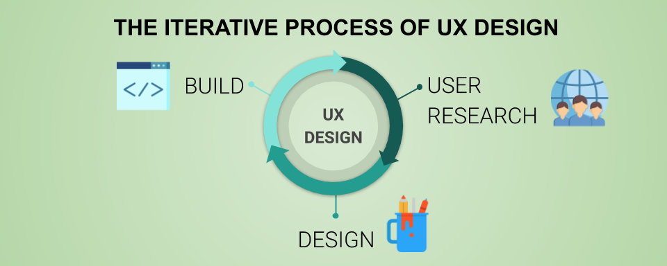
Following the Process of UX Design, GrabFood and Foodpanda did the best they could in remote working. This pandemic has taught us that despite not being able to do things the 'normal' way, there are in empowering remote work.
User Research
Due to the Movement Control Order (MCO), the in-person way of doing user research, conducting user testing and user interviews isn't feasible right now. Luckily in this situation, the problem was evident enough with sufficient quantitative data: volumes of users speaking out and voicing their concerns straight to the businesses. Even though users were not familiar with the concept of contactless delivery, they knew that they wanted the delivery riders to have proper safety measures, leaving the food packages at the doorstep or the lobby of the users' home.It was now up to the businesses to design a solution.
Design
Despite the limitations of working from home, they came up with a simple design for users to easily opt in for contactless delivery. Luckily, contactless delivery wasn't a foreign concept for food delivery services, in other parts of the world that were facing the problem before South East Asia, food delivery services such as Deliveroo had already made the switch.The design was simple and straightforward, they knew this wasn't the time to experiment, and there wasn't enough time for extensive user research and testing before launch. Time was of the essence. So with the key customer’s pain point, they came up with designs and settled on a design. The next thing to do was to build.
Build
GrabFood and Foodpanda implemented their design into their apps, it was an additional quick step within their customer journey map. They were careful in not disrupting the user experience but instead to enhance the user experience of contactless delivery.
GrabFood's User Experience of Contactless Delivery
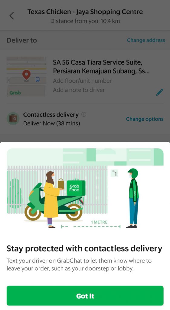
GrabFood designed and built a pop-up message that appears once the user has compiled their food order, letting users know that they can message their driver on GrabChat to let them know where to place their order for contactless delivery.
Foodpanda's User Experience of Contactless Delivery
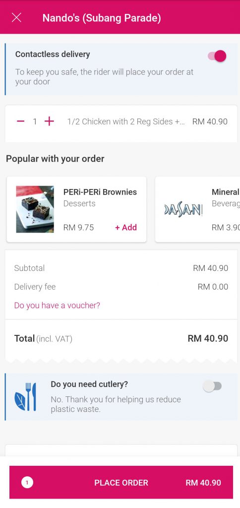
Foodpanda on the other hand, designed and built a toggle to appear above the users' order summary.
Worthy Mention: McDonald's User Experience of Contactless Delivery
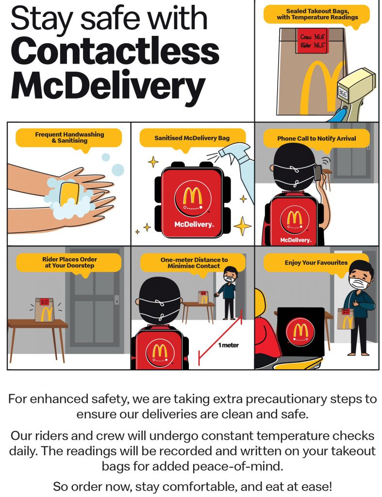
McDonald's user experience of contactless delivery includes safety measures of sealing the takeout bags and writing down the crew and rider's temperature readings.
UX Essentials for Food Delivery Apps
From Grabfood, Foodpanda, GoFood and even McDonalds, we can conclude that there are several important points that all food delivery apps need in order for them to succeed and challenge their competitors in this market.
Easy Onboarding Process
The onboarding process should be quick and simple from the get-go. Standard protocol in which a profile is created and payment made at the end should suffice. Remember that delivery apps shouldn’t be too complicated - users should not have to spend a long time creating and activating their account.
Ensure Restaurant and Menu Search is Easy
This is one of the most important aspects of food delivery apps. As food delivery apps are actually mobilising the restaurant and dining out experience, the browsing experience should be clear, just as how users would browse a menu when they are in the restaurant. Restaurants and their menus should be presented clearly and incorporate descriptions and visuals. A simple search bar should be provided to look for nearby restaurants. Depending on your preference, categorization of menu items may help customers navigate better and thus, give better UX for users.
List Delivery Cost and Times Clearly
Delivery times should be listed next to the restaurant and should be adjusted accordingly based on time needed by the restaurant to prepare the food and the actual time needed for the delivery rider to send the food. This will ensure that users are able to choose the restaurant according to their schedules and time constraints. Delivery costs should also be clearly shown. Users should know if there are reduced delivery charges if a certain amount is ordered. Transparent pricing is part of good UX, ensuring that users are better able to make informed decisions.
Include a Meaningful Rating System
Just like how customers are able to check reviews before deciding to go to a restaurant, food delivery apps should also have an easy to use and view rating system. Many of these apps use stars to rate the restaurants as well as the delivery riders. To go a step further, our UX researcher found that it will be helpful to include the rating of the quality of takeout food. Restaurant rating is no longer reflective of the food quality for delivered food as customers are actually eating them after a period of time being delivered. Knowing which dish is higher rated for delivery can help users to make better decisions when ordering.With many restaurants and eateries having to turn to food delivery apps during this season, the main takeaway in terms of UX is to ensure that the whole process is quick and simple for the user. The app should be able to accomplish its purpose regardless of the user’s tech knowledge or experience.


