These top 10 usability heuristics for user interface design are general principles that support effective user interaction. User interface design focuses on the users' needs and anticipates what the users might need to do next.
This helps to ensure that necessary elements in the user interface are easily accessible, understandable, and easy for the users to use in order to reach their intended goal.
User interface (UI) design and user experience (UX) design are often used interchangeably but they are actually different. We've written an article about this, it's a quick read that gives you a straightforward understanding of the differences between the two: UX Design and UI Design – What Is the Difference?
When it comes to design, whether it's for user interface or user experience (UI/UX), it's normal to default to the professionals like UI/UX Design Agency/Firm. Even if you might be considering leaving things to a professional UI/UX design agency, it is still a good idea to know these simple principles to gain a better understanding of your users. So without further ado, let's begin!
Top 10 Usability Heuristics for User Interface Design
1. Match the System to the Real World
The user interface design should speak the users' language. If technical jargon and terms are thrown at the user, they wouldn't be able to understand the language.
For this usability heuristic, the principle is to use words, concepts and phrases that are familiar to the user. Don't use internal or technical jargon, instead use real-world conventions and ensure that the information appears in a natural and logical order that makes sense to your users.
It's important to note that your users in Malaysia aren't always the same as your users in Hong Kong, Singapore, or Indonesia for example, or that your users will behave the same way as your competitors' users. They may share similarities but it's important to first understand your users and then design accordingly.
This is a common challenge that many businesses face when entering South East Asia markets. In reality, each South East Asian market speaks different languages and has slightly different attitudes towards products and services. Therefore it is important to invest time to understand the users in your target country within South East Asia to form your UX strategy.
A great way to understand your users is to conduct various user research such as user interviews, diary study, customer journey map, and the like. As we like to say at Netizen Experience: "Good design only comes when it is informed by good user research."
Understanding how your users think and speak will help you and your team form an understanding of how to match your system to their real world, how to best localize your design. Terms, concepts, images, and icons that seem to make perfect sense to your colleagues and yourself might be lost on your users.
To ascertain whether your system is speaking your users' language, consider carrying out usability testing. This form of user testing puts to test whether your system is usable to your users because we test your system with your real representative users. The pain points and feedback from the real representative users can help to lead your team down the right path to improving the system.
When your design matches real-world conventions and by following the natural mapping of the user’s decision-making process, it makes it easier for the users to understand and learn how the user interface works, as a result creating an intuitive user experience.
Tips:
- Don't assume that your understanding will match those of your users
- User experience research (UXR) helps to reveal your users' familiar terminology and mental models
- Make sure that your users can understand the meaning without having to look up the definition
2. Error Prevention
Following the usability heuristic above, it's important to remember that your users are humans and humans make mistakes.
Providing good error messages is important but it's just a start. The best designs prevent problems from occurring in the first place, either by eliminating error-prone conditions or to check them and provide users with a confirmation before committing to an action.
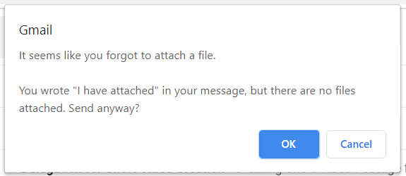
In one of our articles, we looked at Error Prevention In UX Design: How Gmail, Google Chrome And Facebook Get It Right. One of the best examples that I go back to for error prevention is the confirmation message that pops up on Gmail when we try to send an email without an attachment:
[caption id="attachment_505" align="aligncenter" width="575"]

Source: Gmail[/caption]
By implementing this, we prevent the user from making an error. This also helps the user feel secure like the system has their back.
This example above is a slip, which is an unconscious error caused by inattention. Another type of error is a mistake, which is a conscious error that is brought forth by a mismatch between the users' mental model and the user interface design.
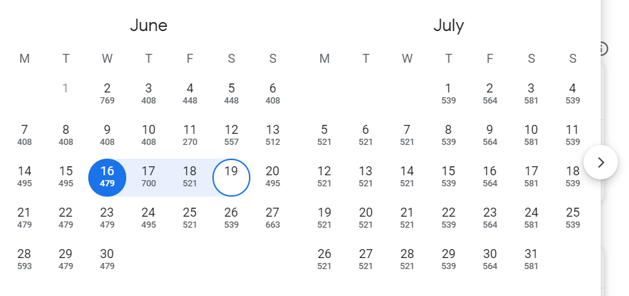
Helpful constraints can also be put in place to limit the users’ choice to avoid errors. This could be greying out and disabling a button to submit something before the prerequisites are complete, greying out and disabling dates that have passed so that users are forced to pick a valid date range.
[caption id="attachment_2056" align="aligncenter" width="553"]

Source: Google[/caption]
In addition, colours can be subtly used to provide context, helping users to see which fields they have selected instead of burdening their memory. Confirmation messages that detail the users’ choices can also help to remove the memory burden for users, the key is to make it easy for users to undo any action or to warn them before taking action.
Tips:
- Prevent slips by providing helpful constraints
- Avoid mistakes through the removal of memory burdens, and support ways for users to undo an action and ways to warn users
- Prioritize your effort by preventing high-cost errors first, then tackle the minor frustrations
3. User Control & Freedom
Users can often unintentionally end up on the wrong page, and it's important to provide users with a clearly marked 'emergency exit' to allow them the control and freedom to leave without having to go through the entire extended process.
Digital spaces need quick and simple 'emergency exits', very much like how physical spaces do. In fact, for physical spaces, it's a legal requirement.
When we make it easy for users to exit and back out of a process, or to give them the option to undo an action, it creates a sense of freedom. Easy exits hand over control of the system to users, and it helps to avoid having users getting stuck and feeling frustrated at the user experience.
Tips:
- Ensure that the exit is clearly labeled and easily seen
- Display a clear way to exit the current interaction, like the 'Cancel' button
- Provide ways for users to undo or redo
4. Visibility of System Status
Good user interface design always keeps users informed on what's going on through suitable feedback that is conveyed to them within a reasonable timeframe.
When users are aware of the current system status, they can learn about the outcome of their prior interactions and best determine the next steps. Having predictable interactions fosters trust in not just the system but also your brand.
Visibility of the system status could be as simple as a loading screen to inform users that the page is loading, or displaying a status to show users that the item they are browsing is out of stock to save them the effort in trying to add it to their cart just to be disappointed that it isn't available.
[caption id="attachment_2057" align="aligncenter" width="531"]

Source: Love, Bonito[/caption]
Communication creates trust, and when the user understands the system's state, they feel in control and a sense of reliance on the system. When your users are able to trust your system, it helps them to be able to trust your brand.
Tips:
- Clearly communicate the system's state to users
- Provide feedback to users as soon as possible, if not immediately
- Foster trust through continuous and open communication
5. Consistency & Standards
Your users shouldn't have to pause and wonder if the words, situations or actions in your user interface design mean the same as what they think it means.
Don't try to re-invent the wheel, there are platform and industry conventions widely available to ensure that your design follows standards and has consistency.
Your users aren't just using your system, they are spending most of their time using digital products other than yours. Their overall experience in the digital world sets their expectations and they expect to be able to have the same standard and consistency.
Failing to maintain consistency may increase the users' cognitive load because they have to learn something new. Check out this article we wrote on How To Have A Consistent User Experience (UX)
Tips:
- Maintain internal consistency within a single product or family of products
- Establish external consistency by following established industry and platform conventions
6. Flexibility & Efficiency of Use
Shortcuts make life easier, and this is the same for the digital world. Shortcuts may speed up interactions for users, especially expert users, all the while the design can cater to both inexperienced and experienced users.
It's important to understand that new users can often use some guidance when it comes to an unfamiliar system because they have yet to develop a mental model of how the system works. Novice users rely on clearly labelled menus whereas expert users may prefer to have faster alternatives to completing a frequent action.
Accelerators such as touch gestures and keyboard shortcuts are especially helpful for expert users who already have a well-established mental model of the system.
[caption id="attachment_2058" align="aligncenter" width="559"]

Source: Premium-graphic[/caption]
It's important to implement flexible processes to cater to your new users and expert users so that things can be completed in different ways and users can choose whichever way works best for them.
Tips:
- Implement accelerators such as keyboard shortcuts and touch gestures into your user interface design
- Create ways for customization that allows users to make selections on how they want the product to work
7. Recognition Instead of Recall
Users shouldn't have to recall information from one interface to another, minimize the memory load on users by ensuring that elements, actions and options are clearly visible so that users can go by recognition instead of recall.
When it comes to user interface design, menu items or field labels should be easily retrievable or clearly visible. When the system promotes recognition rather than recall, it reduces the amount of cognitive effort.
An example of promoting recognition in user interface design is to provide easy access to pages that are most popular, or display tasks to users that they have left incomplete in order for them to easily resume. Doing so promotes recognition because the user won't need to recall anything but instead recognize it.
Tips:
- Reduce the amount of information the users need to remember
- Implement ways for users to recognize information in the interface rather than having to recall it
8. Help Users Recognize, Diagnose & Recover From Errors
The usability heuristics above for error prevention is important but it's also imperative to ensure that error messages displayed to users are understandable to them.
This means using plain human language and not use error codes in the description.A good error message indicates precisely what the problem is and provides suggested solutions to resolving the problem, as opposed to showing the error code which the user most likely does not understand. The key is to be helpful to the user.
[caption id="attachment_1614" align="aligncenter" width="457"]

Source: AIG Travel Insurance[/caption]
Tips:
- Make use of traditional error message visuals such as bold, red text
- Inform users what went wrong using language that users will understand - avoid technical and internal jargon
- Offer suggestions and solutions for an easy way for users to resolve these errors
9. Minimalist & Aesthetic Design
Any extra unnecessary information in the user interface design would compete with relevant information and diminishes their relative visibility because there is simply too much information for the user to digest.
Interfaces shouldn't have irrelevant or rarely needed information on the main pages, ensuring that the content and visual design are focused on the essentials to support the user's primary goals.
Tips:
- Don't allow unnecessary elements or information to distract users from their task or the information they really need
- Prioritize content and features to support the user's primary goals
- Keep the content and visual design of the user interface design focused on the essentials
10. Help & Documentation
It's best if the system doesn't require any additional information but sometimes, it may be necessary to provide documentation to assist users in understanding how to complete their tasks.
Help and documentation content should be easily available to users, easily searchable, and focused on helping the user in a concise manner.
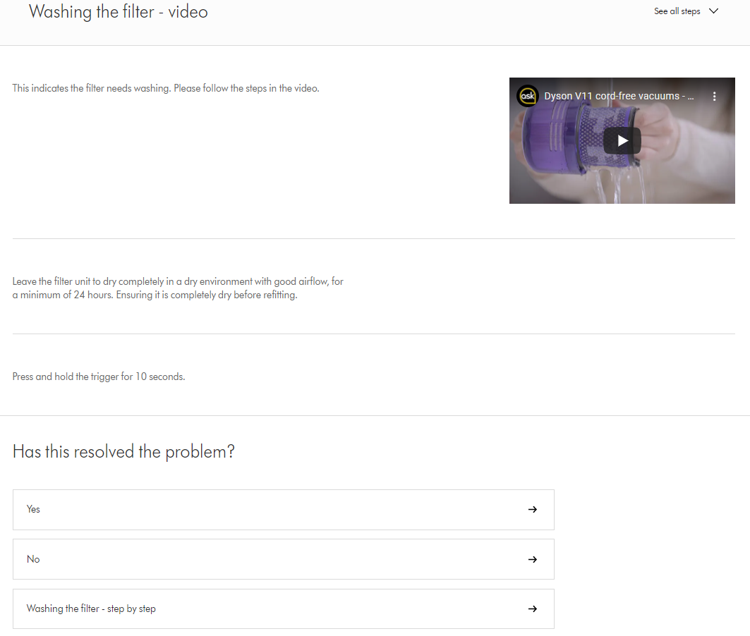
Dyson has an extensive help and documentation section for their customers to troubleshoot their machine, including step-by-step instructions as well as video tutorials. Not to mention, they also ask the customer whether their problem has been solved in order to provide additional relevant support.
[caption id="attachment_2059" align="aligncenter" width="1063"]

Source: Dyson[/caption]
Tips:
- Ensure that the help documentation is easily searchable
- List concisely and concretely the steps to be carried out
- Whenever possible, present the right documentation at the moment that the user requires it
Summary
These top 10 usability heuristics are simple principles that can elevate the user experience of your website or app. These pillars would help to hold up the user interface design and improve on the delivery of pleasant user experience for your users.
Once you've grasped the core usability principles outlined in this article, dive deeper into User Interface Design Guidelines for a comprehensive set of best practices to elevate the form and function of your UI creations.
If you're looking to create a truly exceptional user experience for your business, consider partnering with a UX design agency for expert guidance throughout the design process.


