Your customers interact with your business through various channels: website, online chat, phone, kiosks, smartphone and tablet apps, social media and by visiting physical locations. Regardless of how they choose to interact with you, your customers expect to have a useful and pleasant user experience.In order to create an optimized omnichannel user experience, it's important to understand how each channel plays a role in the user journey and to design according to each channel's context in creating an omnichannel user experience for the user. Let's look at what this means.
Context of Use
Before we go into the importance of an optimized omnichannel design and how to create an optimized omnichannel user experience, let's first understand what makes up the context of use. There are 4 elements to understanding the context of use:
- The most important and common tasks for users
- When and where users complete these tasks in terms of typical setting and environment and point in time
- What devices and channels they use to complete these tasks
- The strengths of each device and channel and the most common context of use for each
Most of the elements above are very much related to users and it's easy to find out this information and more through user research. While the user-related contextual elements are subjective to your business and to your services/products, the device-related contextual elements are more generalised and applicable across many organization types.
Channel Strengths
Every device has its own strengths in which determines why and how users would choose to use them to interact with your company. For example:
- Smartphones are highly portable and can be used frequently throughout the day. There are unique strengths built into the phones such as GPS and fingerprint authentication. On the other hand, sessions are often interrupted by external events and users tend to be distracted because they are often on the go and require access to target information quickly.
- Desktops and laptops have a larger screen and are usually used with efficient input devices like a keyboard and mouse. Desktop users are likely to have multiple tabs and software running, are aiming to be productive, efficient and probably exerting effort and energy towards completing complex tasks.
To optimise the customer journey, we need to be considerate of each of these devices' strengths and common contexts. This enables the design experience to be tailored to include easy to use elements, meeting customer expectations and needs on various devices during their omnichannel user experience.We've created a table to outline devices and the respective channels that are commonly associated with them, along with their respective strengths and assumptions that can be safely made in the context of use on these devices.
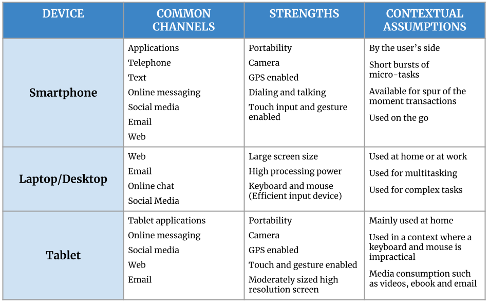
How to Create an Optimized Omnichannel User ExperienceEach device has associated channels with individual strengths and unique context of use. Optimizing these channels individually will optimize the overall omnichannel user experience, so let's look at how to optimize these channels:
Smartphone and Tablet Channels
- Emphasize on content and features on the go
For example, most smartphones and tablets have a built-in GPS feature, and when this feature works together with apps and websites, it detects the customer's locations and can provide personalized content based on that information.The content provided based on GPS locations can be local promotions or points of interests near your customer. For food delivery apps and websites, the available restaurants that can deliver to the customer's location or nearby pick up locations can be shown to customers for convenience.
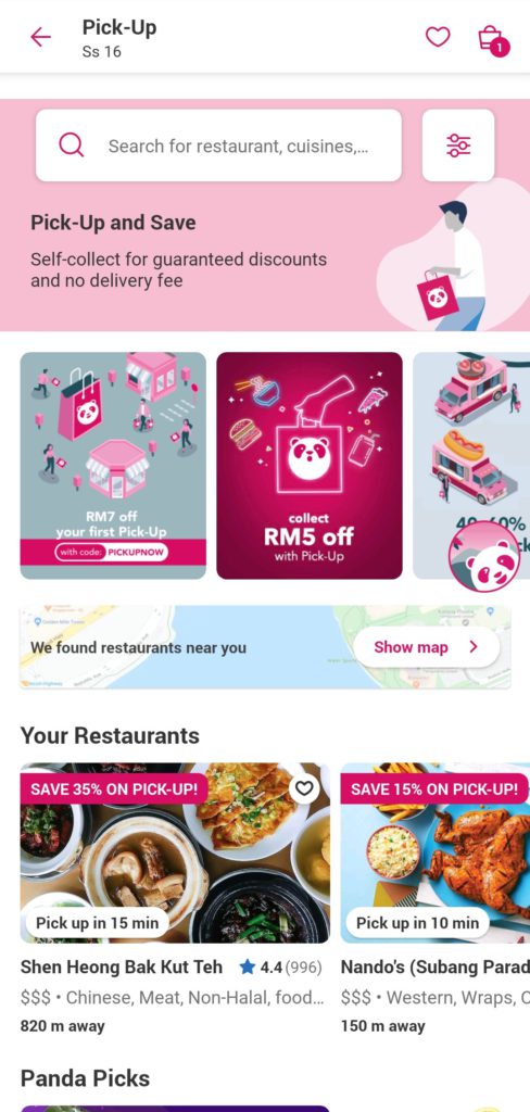
Foodpanda's app makes the most of the smartphone's strength by taking the user's current location and presenting a feature where the user can look at restaurants near them to pick up their food to save on delivery fees. When users see 'We found restaurants near you', they can click on 'Show map' to see a map and list of surrounding restaurants. This makes it so convenient for users to visualize how close the restaurants are to their current location and to see all the available restaurants in their vicinity.
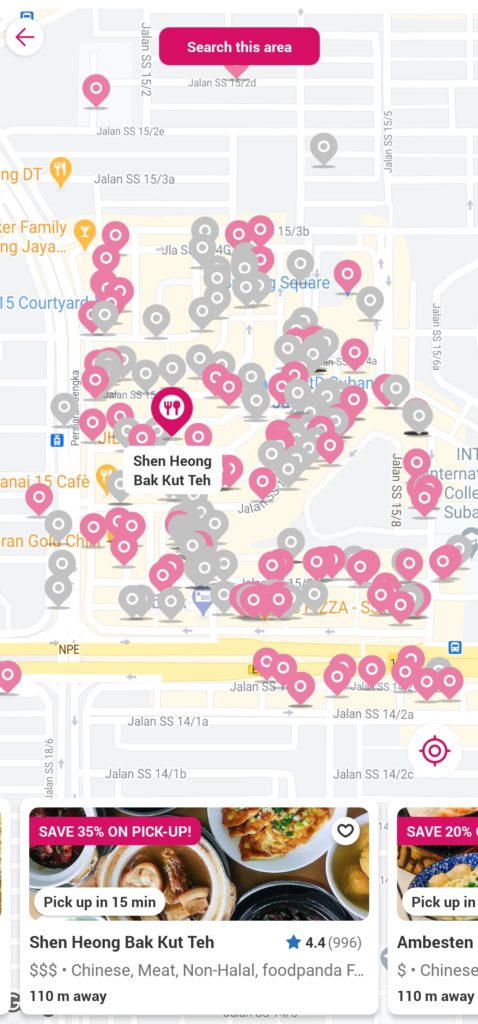
Furthermore, Foodpanda takes the user's GPS location and is able to tell them how far away the restaurant is to them to give them a better idea of the distance and users may prefer to drive if it's too far to walk. Customers can also save a certain percentage when they opt to pick-up, and the estimated wait time for picking up is also shown to manage the customer's expectations.Once the customer chooses to place an order for pick up, the order receipt is displayed on the user's phone, which they can easily retrieve at any time to show to the restaurant to pick up their order, making a seamless transition from the digital world to the physical world.
- Provide layered and consumable chunks of information on mobile screens
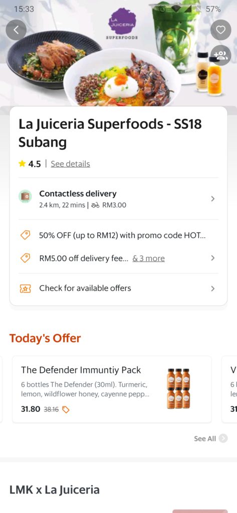
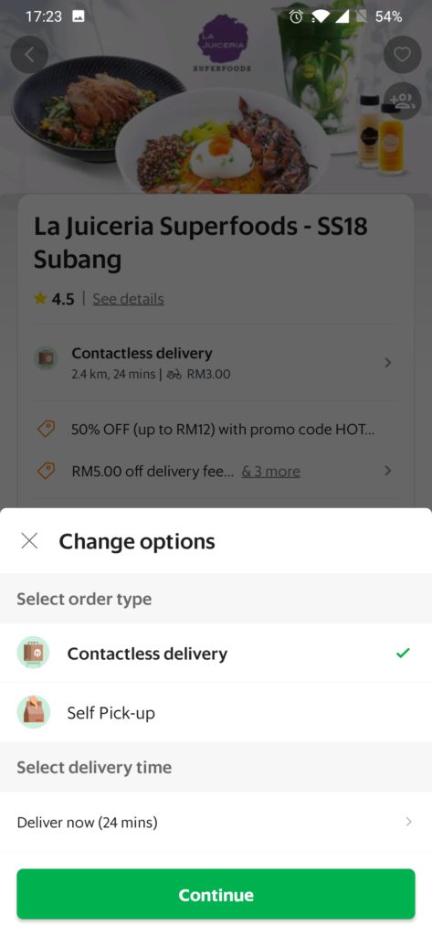
Mobile screens are small and so sessions are shorter and more prone to interruptions. Because of the nature of smartphones, it's important to condense mobile content into layered and consumable pieces to optimize for context.This can be done by prioritizing primary information first, and then delegate second information to secondary views. Let's look at GrabFood for this example, their layered information makes it easily consumable on a small-sized screen.On the main page, their list of available services are arranged clearly with a label of each service. Arranging it this way makes sense for a smartphone due to the small screen size, it doesn't crowd the page and it's easily consumable on a small screen.
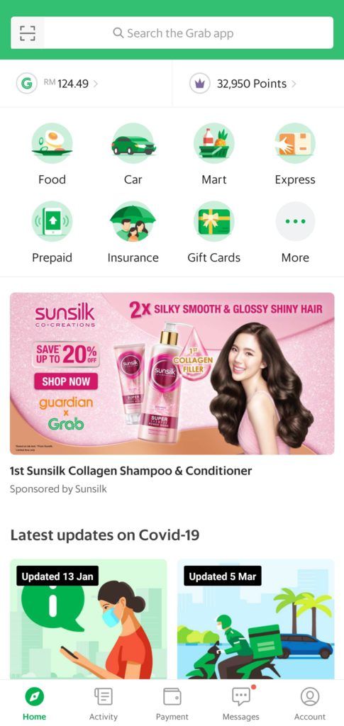
GrabFood has implemented a layered approach to managing their content in allowing users to look for their primary target first and then to dive further into each page as they explore. This significantly improves the user experience on smartphones in making the rich content more manageable due to the limited screen size.
- Integrate channel capabilities
Smartphone and tablet devices both have unique capabilities such as built-in cameras, GPS and text capabilities, this can be leveraged to deliver contextual and convenient experiences on mobile and tablet channels.Maybank sends alerts in the form of text messages to customers in hopes of preventing potential fraudulent activities. You may be wondering why not emails?The distinct advantage of text messages is that it's much more immediate and accessible on smartphones compared to emails. Text messages are lightweight, quick, actionable and doesn't rely on internet coverage.Emails on the other hand take a bit more time to arrive because it requires more data. In addition, users may not have notifications on for all their emails and will need to open their email application and check their emails in order to locate it. Furthermore, an important email may get hidden in the pile of other emails and go unnoticed.Text messages are a much more effective channel for the purpose of reaching users who are on the go and are busy. Through the phone's messaging capabilities and utilizing text to push urgent communications to users, the experience for the context is optimized for the customer journey and for the device that most users have when they're out and about.Take for example, Maybank sends out text messages to alert their customers when a transaction has occurred. Users are immediately made aware that a transaction has been made using their account, and if it's fraudulent, they are able to take immediate action.

- Emphasize media consumption for tablet
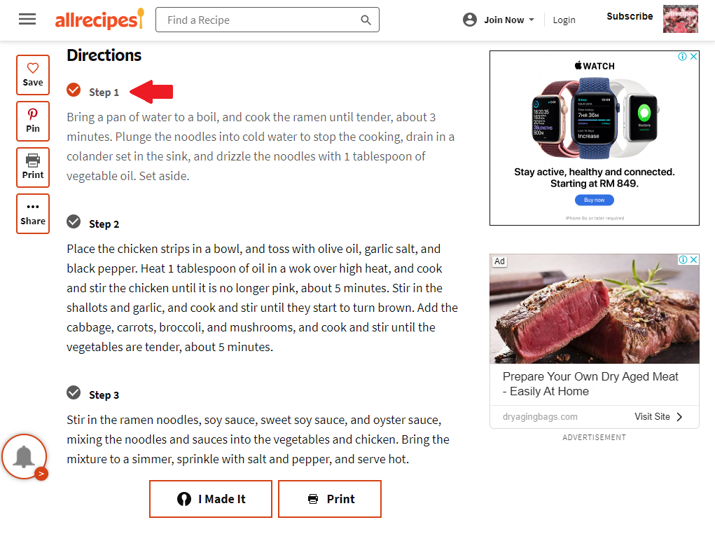
Tablets are portable but aren't commonly taken on the go for users compared to smartphones. Tablets are more commonly used for reading, watching videos, and even as a convenient recipe reference in the kitchen.Tablets are a medium-sized screen and should be designed to suit the screen size accordingly, emphasizing media content and creating immersive experiences.For example, Allrecipe's website on tablet is optimized to aid meal preparation. This can be seen through the use of large fonts which can quite easily be read from a distance and the page layout allows users to easily scroll through the page to access the ingredients list and directions.Furthermore, the website takes advantage of the touchscreen capability of tablets in allowing users to check off items or steps as they move along the recipe in helping users keep track. After the step has been checked off, the content is also greyed out slightly to help users focus on what's next.
Optimizing Omnichannel User Experience for Laptop and Desktop Channels
- Support complex tasks
Laptops and desktops have a big screen size, suitable for complex tasks such as organizing spreadsheets, making large purchases, or filling out long forms.Laptop and desktops have unique strengths in which makes these devices suitable for activities that are more complex. With the large screen size and convenience of typing on a keyboard, there is also fewer interruptions and chances for making mistakes.
- Provide rich and readable content
Users tend to resort to using laptops or desktops to really investigate and explore due to the large screen size. This is especially true when users are looking to make a big purchase and want to find out all the necessary information to help them make their decision.When users conduct research on the early stages of their customer journey, they commonly use desktop websites. This channel is meant to provide detailed information and content in order to support decision making.Optimize your omnichannel user experience by providing rich and readable content on laptops or desktops, take for example Samsung's website that's been optimized to allow users to compare between their products. All the detailed information is easily accessible to users and is organized in a way to allow a direct comparison between products.
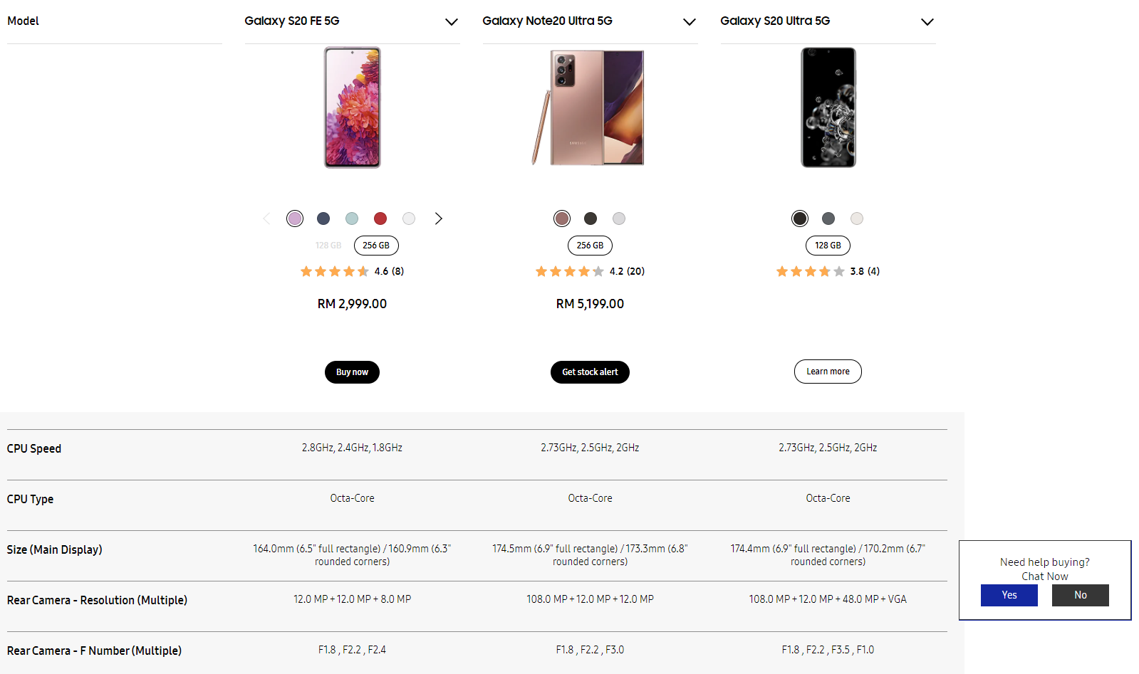
The website has been optimized for desktop and laptops, having rich and informative content regarding the products and services they offer, as well as easy access to 'buy now' or 'learn more', to allow users to get alerted when there is stock available and even to chat with someone if they need help.
Optimization versus Consistency
Optimization and consistency are two of the five key components to creating an effective omnichannel user experience. To read about how to create a consistent omnichannel user experience, read this article: How to Create a Consistent Omnichannel User ExperienceTo gain a better understanding read about the importance of omnichannel user experience, we recommend reading this article: The Importance of Omnichannel User ExperienceOptimization and consistency are two important components and are very distinct from each other. Optimizing for a device or channel is to uniquely tailor an experience to that channel, and sometimes this requires foregoing cross-channel consistency to a certain extent.Consistency, on the other hand, is to establish a consistent look and feel across all channels. Especially a consistent core functionality in creating a cohesive and efficient experience across all the channels.This doesn't mean that the same exact experience is provided on all channels. The aim is to provide core consistency and to make necessary compromises in order to optimize the experience when it's suitable.Up next, we'll be exploring How to Create a Seamless Omnichannel User Experience. Seamlessness is the third key component to creating a successful omnichannel user experience.


