In a previous article we wrote about colour psychology in user experience (UX), we looked at the colours of green and red, and how they signify proceed and stop respectively. It got us thinking about obeying the traffic lights when it comes to user experience and inspired the topic of this article.
No matter which country we live in, whether we drive or not, traffic lights are understood universally. It helps us navigate the roads we're travelling on and keeps us safe, and this is actually applicable to websites and apps. Likelihood is, you wouldn’t have noticed it because it’s meant to be intuitive and natural.
The Traffic Lights of User Experience
Think of the user journey as a route, users want to get from the point of origin to their intended destination. Along the way, users have steps and actions to take and the traffic lights of user experience helps to smoothly guide the user through their journey. Applying the concept of traffic lights to your design can elevate the user experience, creating an intuitive and pleasant experience that users enjoy.
The Red Light of User Experience
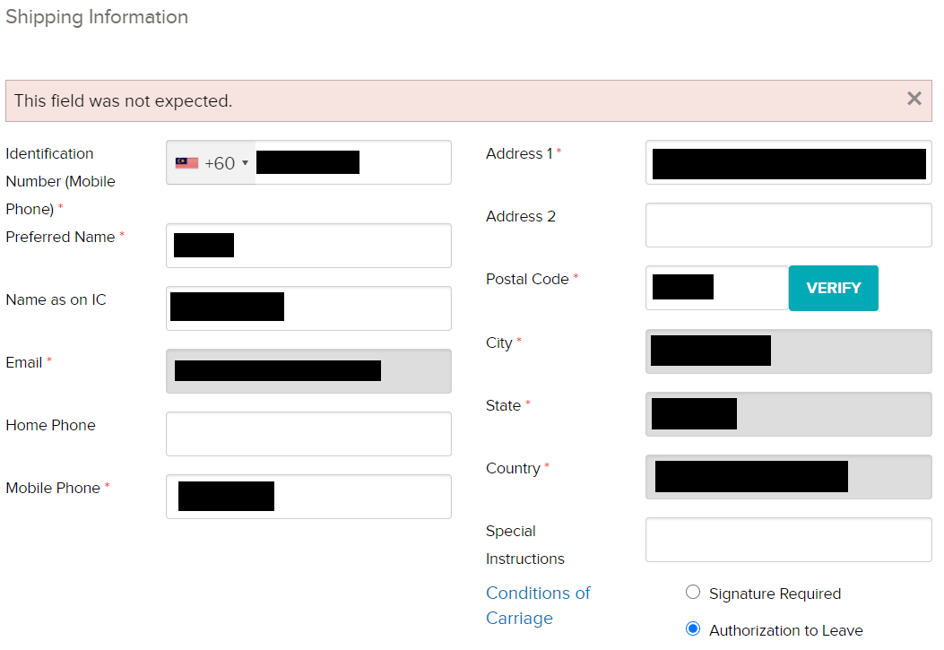
Have you ever been in a situation where you’re trying to complete a transaction, maybe to sign up for something or to check out to complete your order and you’re just not able to proceed? Chances are, this has happened to you as it’s happened to many of us. We grow in frustration as we try out different ways of trying to proceed but to no avail.
After trying, and trying again, nothing changes. Furthermore, there is simply no information to enlighten us on why we can’t proceed. Or there’s an error message that is just gibberish or not helpful at all.

In the example above, the user is not able to proceed even after filling up all the mandatory fields. The error message that is shown does not provide any useful information that helps the user understand the error and how to resolve it in order to proceed. The user ends up being stuck and leaves feeling frustrated, abandoning their order altogether.
This results in not just losing the sale, but potentially the customer and possibly their lifetime sales altogether, in addition to any referrals to their friends and family.
If at any point in the user journey or flow where the user can’t proceed, implementing a red light in your design means informing users about it and how they can proceed. The red light can be at the beginning, middle or end, anywhere that has a stop or a pause in the flow.
Ensure you are addressing the red lights by conveying useful information to users and how the red light can be rectified in order to proceed in your design. This helps to create a pleasant user experience for users when they can be informed and are aware, and are able to proceed.
Using the same example as above, instead of providing users with such a generic error message, consider providing specific information as to which field is causing an error and how the user can resolve the error in order to proceed.
The Yellow Light of User Experience
The yellow light can either be a warning or an indicator. If the user is going to experience a break in the flow, they should be warned ahead of time and to include an indicator on how users can proceed.

Google does this by alerting users when they are running low on their storage space, it’s important to note that the alert is prompted before users run out of space. By warning users ahead of time, it allows the users to take necessary action to avoid facing potential problems in the future. Furthermore, the alert shown provides potential solutions to the user, saving them the time and trouble in searching for a solution.
Addressing the yellow light in user experience helps to provide your users with a feeling like you’ve got their back in saving them from experiencing issues down the road. Informing users that they may hit a dead-end helps to prepare users, allowing them to plan their user journey better.
The Green Light of User Experience
Applying the concept of the green light to user experience is to provide indications to users that they can proceed. As the user goes through the journey, there are steps and requirements they need to complete in order to proceed. This could be adding to cart, completing the form, signing up, etc.
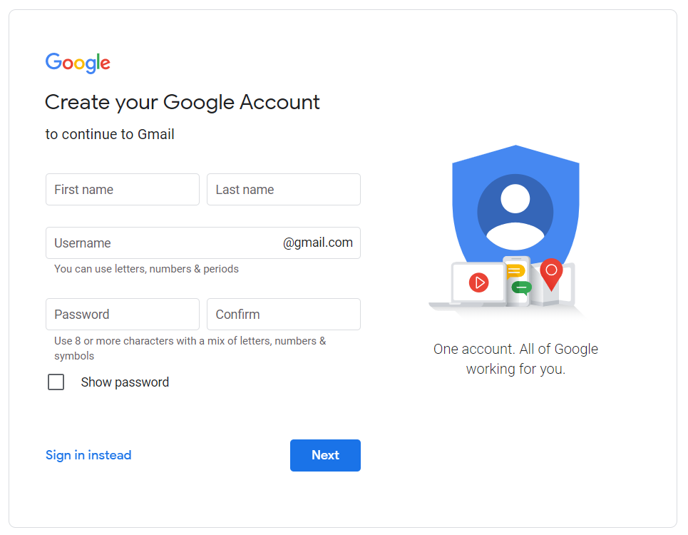
Giving users the green light doesn’t mean carelessly allowing them to proceed no matter what, but to create a pleasant user experience in subtly informing users that the necessary steps are done and that they can proceed. Here’s an example to further elaborate my point:

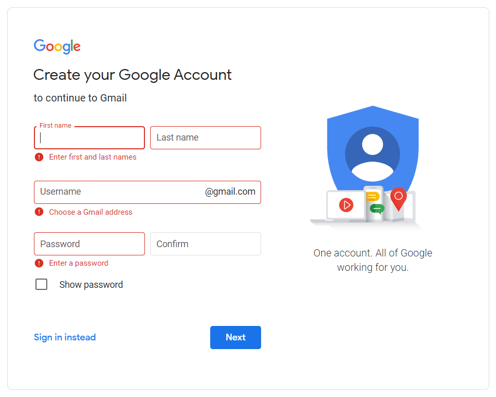
Here we can see that the ‘Next’ button is clickable, despite the fact that none of the fields are filled. All the fields are mandatory in order to create a Google account but the Call to Action (CTA) “Next” button is already clickable, giving the user the green light to proceed but in reality, they can’t proceed without completing the form.

If the user decides to click on the active CTA without completing the form, they receive error messages, creating a negative user experience.
However, if the CTA button is disabled before the form is completed and is only enabled after the form is filled, it notifies the user with a green light to proceed.
There are several ways to apply the green light in your design, you could disable any CTA until the necessary information is fulfilled, alternatively, progress indicators are a great way to inform users of their progress. Progress indicators can be a green tick icon that is shown next to successfully filled fields or a progress bar indicator to show users the steps they have completed and the steps ahead.
[caption id="attachment_1753" align="aligncenter" width="1805"]

Credit: https://www-424.aig.com.my/details[/caption]
Applying the Traffic Lights of User Experience in Design
Look through your user journey in detail and markdown any instances where the user could benefit from a signal, whether it’s red, yellow or green. It helps to make it easier to enhance your design in order to provide a pleasant and intuitive user experience.
If you’re unsure or too close to the project to identify these instances, a great and affordable way to do this is have an UX audit. UX specialists like Netizen Experience can help you conduct an UX audit on your website or app, pointing out which areas can be improved and how it can be done, saving you the headache of doing it yourself or conducting user testing where the users will tell you the problems they are facing but may not be able to provide you with a suitable solution.


