Meeting users' expectations is a vital endeavour for every company, this is especially true for e-commerce user experience; to create a seamless mobile shopping experience for users.
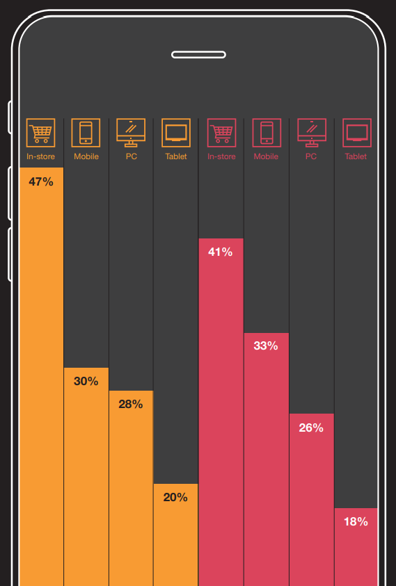
PWC's 2021 Global Consumer Insights Pulse Survey reports that 'mobile shopping is gaining on in-store shopping'. In fact, PWC states that despite in-store shopping being consumers' channel of choice during the Covid-19 pandemic, mobile shopping has steadily accelerated as other types of shopping, including in-store shopping, decline.
[caption id="attachment_2090" align="aligncenter" width="569"]

Credit: PWC's Global Consumer Insights Pulse Survey 2021 (2020 in yellow, 2021 in red)[/caption]
The use of mobile phones is on the rise, there are more people than ever using their mobile phones to shop. With the surge of mobile phone usage, customers' expectations continue to get higher and they expect good user experience. So much so that Google has designed a new algorithm to judge websites based on user experience, and this will affect the website's rank.
If you would like to know more about how your user experience will affect your website's rank in search results, check out this article: Google Search Engine Will Rank Your User Experience in 2021
User experience is an important quantifiable factor, and it's crucial to have good e-commerce user experience in retaining customers and gaining new customers.
15 Quick Tips for Good Mobile-First E-Commerce User Experience:
1. Showcase Trust Marks
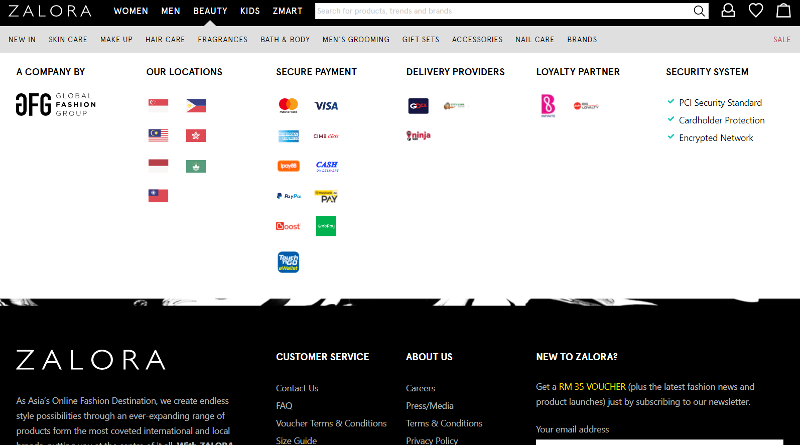
Trust marks indicate how your information is safely transmitted and stored, it provides a sense of security to customers. You can showcase trust marks by displaying logos of security software on your website, this assures customers that the website is protected.
Zalora's trust marks:

Want to know how else you can build trust with customers? Check out this article: 9 Ways To Build Trust With Customers For Fintech Companies
2. Optimized Search & Filter Functions
The search function of an online store makes a massive impact on the e-commerce user experience, especially because browsing is more challenging on mobile phones due to the screen size.
Optimize the search and filter functions of your e-commerce to make it easy for users to find what they are looking for, thus helping them to complete their task with ease.
3. Get Rid of On-Page Distractions
For mobile-based shopping, distractions are the enemy for business. It's important to eliminate as many distractions as possible for the user to focus on completing their checkout. For example, a lot of up-sell and promotion during the checkout process.
The more distractions there are, it reduces the likelihood of the user completing their checkout. Get rid of on-page distractions, and don't overcomplicate the sales process.
4. Speed Up Your Page
Websites that load fast offer a better e-commerce user experience and helps you rank higher, your website should load within 2 seconds. The ideal website load time is between 2 to 5 seconds.
Each second beyond 2 seconds results in greater bounce rates. In fact, 40% of polled internet users report abandoning a site if it takes longer than 3 seconds to load.
Speeding up your website will keep customers for longer, which eventually increases the conversion rate. Customers who spend more time on your website and have a good e-commerce user experience will increase the likelihood of them buying from your website again.
5. Increase Visual Stability
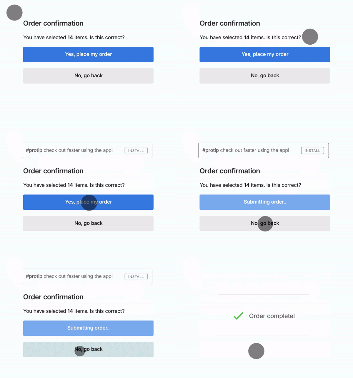
Imagine you're about to click a button but then suddenly something else loads and the button suddenly shifts a few centimetres up the screen, you would find that quite annoying wouldn't you?
[caption id="attachment_1120" align="alignnone" width="600"]

Credit: https://webmasters.googleblog.com/2020/05/evaluating-page-experience.html[/caption]
Improve your e-commerce user experience by reducing any sudden and unwanted movement of buttons or elements on your website, this may happen because resources are loaded asynchronously.
6. Optimize Your Content with Large Fonts & Short Sentences
It's difficult to look at our mobile phones for too long, so it's good to reduce the strain on customers to make it easier for them to use your website. This can be done using images, and videos and by optimizing your text.
Make use of larger fonts, keep the description short, informative and conversational. Small changes like these can boost the e-commerce user experience of your website.
7. Clean Up Your Design
Don't bombard your customers with too much. Consider trimming the copy, and the amount of images to prevent overwhelming the customer.
Clean up your design by reducing unnecessary information, make use of design elements such as carousels, a toggle to show & hide content sections, pop-ups, or a tool-tip feature.
With these features, it minimizes excessive scrolling and it highlights key points that keep customers engaged, resulting in a higher chance of a successful sale.
8. Make It Easy
The screen size of mobile phones is a restrictive factor, with this in mind, it's crucial to make things as easy as possible for customers, with a seamless sales channel.
This could be making sure that accounts are in sync, so if a customer adds an item to the shopping cart on desktop while they are logged in, it should reflect their shopping cart accordingly when they access their shopping cart on mobile.
Furthermore, reduce friction in the sales channel by ensuring that the input fields are optimized for mobile. One way of doing this is displaying the numeric keyboard instead of the entire keyboard when customers need to input their credit card details.
It helps customers save an extra step, making it convenient for them to input their payment details. This helps to reduce friction, feelings of frustration and the drop-off rate.
9. Create Mobile-Friendly Opt-Ins
A great way to promote engagement and subscriptions is to add mobile-friendly opt-ins to your e-commerce website. The keyword being mobile-friendly.
If your offers appear large and distorted, it may dissuade customers instead of increasing engagement. This means making sure that the advertising campaigns are optimized to be mobile-friendly.
10. Optimize Pop-Ups
Don't crowd customers with too many pop-ups and ensure that the pop-ups are optimized for a smooth mobile e-commerce user experience.
This means that the pop-up shouldn't disturb the user journey, and the close button must be clear and easy to click. If a customer has to take time to figure out how to close the pop-up, or worse, if they aren't able to close the pop-up for some reason, they will leave your website.
11. Prioritize Content
For your e-commerce mobile platform, prioritize content by making sure that the most important content is featured, the rest of the information can be progressively disclosed.
Prioritize content, and focus on keywords, images and product features. As the customer decides to go forward with a product, other necessary details can be easily disclosed along the user journey.
When customers are trying to find a product, they don't need to know the delivery and return policy upfront, they are more interested in finding what they want first.
12. Don't Forget To Include Store Location Information
If there are retail locations that customers can visit, make sure that the store location information is easily accessible on your website.
Customers may be on your website for a quick search on store locations, having this information easily available will leave customers with a pleasant experience, increasing the likelihood of them returning to your business.
13. Integrate Different Payment Options
Implementing the tips above to improve your e-commerce website is all for naught if customers can't complete their transaction.
In this world full of fintech and e-wallets, e-commerce businesses must keep up by integrating different payment options. Cash, credit/debit card, and online banking is what's expected but customers also want alternative payment options such as GrabPay, Boost, PayPal, TouchNGo, etc. Depending on the target customer, some businesses can even consider taking payment in cryptocurrency such as Bitcoin and Ethereum.
14. Don't Forget: Test, Test & Test!
Technology can be fickle, the worst thing that can happen is to roll out a live update just to see a follow up of a huge dip in sales. Some comments on social media can indicate that customers are having issues proceeding. Turns out one of the buttons in the new update doesn't work!
Your team scratches their heads wondering why because it works fine on their device. After spending some excruciating time debugging and trying to solve the issue, the team finally realises that the button works fine on Google Chrome but somehow doesn't work on Safari.
Make sure to test properly before deploying to avoid any disasters, this can be done through conducting User-Acceptance Tests (UAT). This is a phase of testing to check and verify that the software works as it should in real-world scenarios on various browsers and devices before rolling out.
15. Prioritize User Experience
User experience is vital, and it's important to keep user experience in mind at every step when creating for mobile users.
There is less patience and less space to work with on a mobile screen so if customers find that your website doesn't fulfil their expectations, they would rather shop elsewhere.
Prioritizing user experience will increase customer engagement, customer satisfaction, conversion rates and decrease drop-off rates. If customers have a great user experience on your e-commerce website, they will come back again.


