In this Article
SNEAK PEEK: More than 20 usability issues detected, all users found the app confusing.
On 1st of April (no April fool joke!), Malaysia moved into GST era with the implementation of the much controversial Goods & Services Tax. Love it or hate it, no one in Malaysia can escape GST.
According to Bernama, just one day before the day of GST implementation, the Domestic Trade, Cooperatives and Consumerism Ministry (KPDNKK) launched a mobile app named MyKira GST, which allows consumers in Malaysia to check the impact of GST on the price of over 10,000 items. It also serves as a medium for consumers to file complaints about GST.

On the Google Play Store, the app received an average of 3 star rating and currently has more than 100,000 downloads. (For now, only the Android version of the app is available for download).
As described on Google play store, the app is built to help you to become a smarter consumer. Is the app smart enough to help you? Is the app user friendly? We’ve run a user testing session with 6 users to find out whether this app is useful and usable to achieve the objective of the app. Before we move on to discuss about the findings obtained from the test results, let us look at the reviews published by various media sites.
- The Star: “MyKira app can’t be counted on”
- Edgy.my: “The MyKira GST app is as confusing as GST itself”
- VulcanPost: “Overall, this is a fairly useful app to help solve some GST related questions and it has the potential to be a good go-to app for Malaysian shoppers.”
- Savemoney.my: “The app does have great potential if the bugs are fixed and the database extended.”
Based on the user testing results, we have no choice but to agree with most of the reviews listed above. Now, let’s see (& listen) to what we have learned from the real users that tried out the MyKira GST app.
Video Highlight: A user trying to use the main function of the app
In this 2 minute video, you can see that there are at least 3 usability issues that made the user’s life difficult.
- Product Name– User almost missed out the product because the product listed in the database uses ‘Nestlé’ (with a special é) and inserting a normal ‘e’ will not show you the relevant result.
- Product is not listed– all users agreed that insufficient product listing database is the main problem of this app. There were users who repeatedly filled in details but did not get relevant results; users did not realize that only products that are listed under the Product (Brand Names) Dropdown selection will show relevant results.Suggested solution:Users should be prevented from filling up all the product details in the first place if the intended product is not listed under the dropdown selection of Product (Brand Names).
- Unit/Weight– User was unable to select the unit/weight that he wanted. Remedy? The Textbox function should be disabled because users are unable to search for relevant product results that do not have a pre-defined unit/weight from the list.
Difficult Product Search
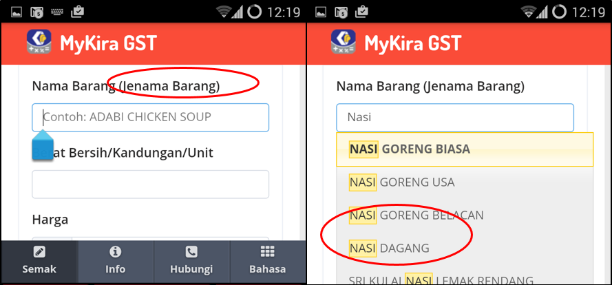
Looking at the screenshot above, users had thought that they are required to insert the ‘brand name’ together with product name (the given example was ‘Adabi Chicken Soup’), but ‘Nasi Goreng’ was searchable and had no brand name. Nonetheless, the sequence of the dropdown selection is not arranged according to alphabetical order.
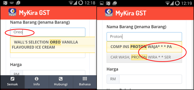
When user searched for ‘oreo’, only 1 result was available from the dropdown selection. It means there is only one relevant result from the database (yes, Oreo biscuit was not listed). However, all users did not realize about it and continue spending their time to fill in all required details but only to get informed that ‘this product is not listed’; something should have been done in the first place.
The citizens were informed that the app can be used to check the price of goods, but we’re surprised to find that ‘Car Wash, Proton Wira *** service’ was included too, and it used short forms, unlike the naming of ‘Oreo vanilla ice-cream’.
Read also: No GST price hike for Cadbury, Jacobs, Oreos
Searching for the Wrong Product (& its business impact!)
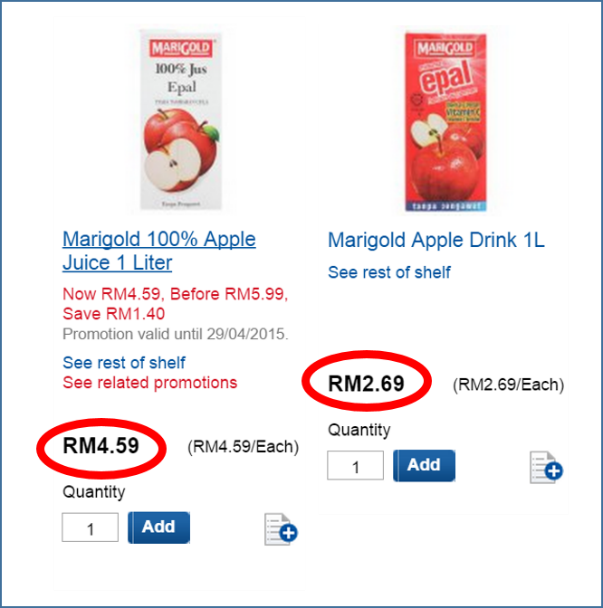
Credits: Tesco.com.my
It happened that some of the users did not realize that they were looking for the wrong product and got the wrong price results.
For example, when users were tasked to check the price of Marigold Apple Juice, but users didn’t know that they were actually selecting Marigold Apple Drink from the list, which is a completely different product.
This can ruin the reputation of businesses, say Tesco, if users mistakenly assume that the price was ‘out of range’ (greater than the price limit).
Complaint about the Complaint!
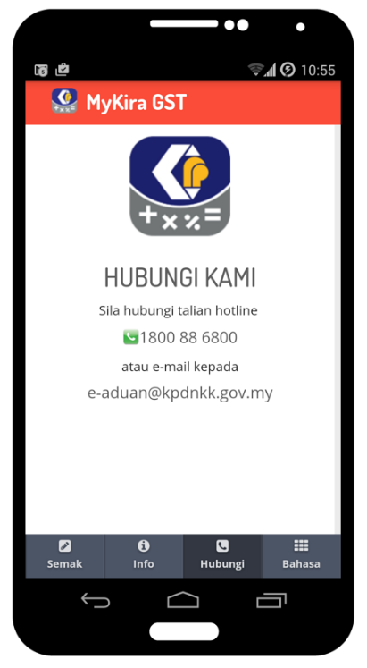
Both e-aduan and 1pengguna will redirect you to other non-mobile responsive sites. Users found this move confusing because they had to fill in all the details again and the sites were difficult to navigate on mobile. Also, both the ‘e-aduan’ and ‘1pengguna’ button will only appear after you perform a price checking function.
Users thought that they can only file complaints through email or phone call because only these two are included on the ‘Contact’ section.
Suggested Solution: One of the users suggested streamlining both ‘Contact’ and ‘Info’ into one because he didn’t find both to be useful as a function of an app.
After accessing the sites on 29th April, it is found that both sites were not loading.
| http://e-aduan.kpdnkk.gov.my/eaduan/aduanbaru.php?lang=2 |
| http://www.1pengguna.com/11pengguna/index.php |
Confusing User Journey
At first, the user above thought that the app is able to help her to ‘check the price of an item’, thus she proceeded to try out the app. After she realized that she had to insert the price, she still couldn’t get the idea of the app and misunderstood that the app will show the total price after GST when she checks for the price in the shopping mart. After using the app for more than 10 minutes, user was very confused and frustrated.
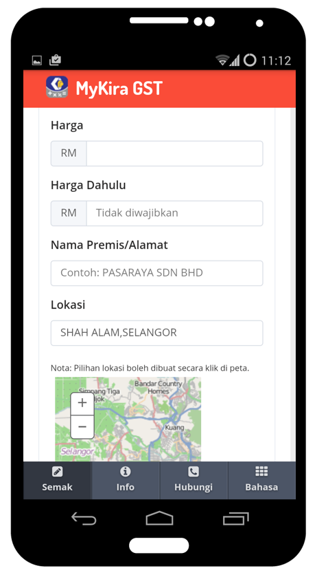
Other than these major findings listed above, there were many minor issues with the app. For example, it takes a while for the user to go back to previous page by clicking the ‘kembali’ (back) button. Therefore, users might think the app was not functioning properly. When an app has so many minor usability issues, it can collectively contribute a very poor overall user experience. Users nowadays are smarter than we expect, and they expect to use something that is user friendly on their smartphone.If you cannot provide much value during their first interaction or within a short time, users will leave. What is the worst part? They discourage people around them to use the app too.
Take a look at the screenshot, some users skipped inserting the price and are extremely confused about the function of the app.
Suggested Solution: An asterisk (*) sign might be good to indicate that certain fields are mandatory. Users were also frustrated with the fact that they had to insert the location again and again.
NET PROMOTE SCORE: 2.5 / 10
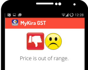
Overall Impression of all users is ‘thumbs down icon and sad face emoticon’. Some users were also confused with the words ‘Price is out of range’.
When users were asked on how likely they would recommend this app to their friends (from a scale of 1 to 10, 10 is very likely), the average score is 2.5/10. 2 Two of the users actually rated 0 out of 10 and the highest rating was 6 by a user.
We are also surprised with the fact that only 1 user had heard of the app before this testing session. That particular user downloaded the app on 1st April. Below is the heartfelt voice of the user (with harsh words censored) when he tried out this app again recently.
This app is not useful! It looks like an app but it is just a website and brings you to other websites! It’s only ‘kira’ harga but nothing related to gst, and it doesn’t ‘kira’ (count) the gst for you, it only tells you whether the price is within range or out of range, and most of the time it failed because the product is not listed in the database! This app doesn’t contribute any benefit to me, please improve it.
It is already a fact that all users found this app confusing. It is difficult to perform both price checking and complaint filling which are supposed to be the main functions of the app. However, the users do hope to see improvement on this app as they think it will benefit the people in Malaysia.
Verdict
We truly appreciate the initiative by the ministry for creating a mobile app to ease everyone’s lives in Malaysia, especially in the GST era. However, we really hope to see more efforts in improving the usefulness and usability of the app so that everyone can easily benefit from it. Otherwise, the objective of empowering people in Malaysia to be smarter consumers through usage of this app will not be attained.
You can download the Android app, or alternatively, the web version.
