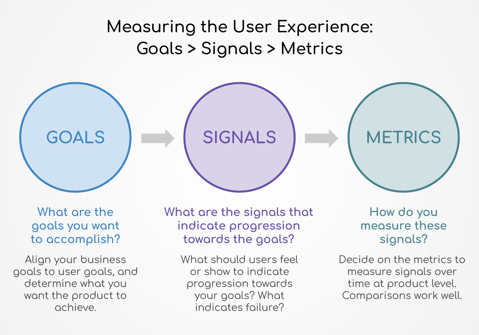
KPIs (Key Performance Indicators) is a great starting point in understanding how your business measures success; this could be user numbers, retention, growth, revenue, etc.
When it comes to measuring UX KPIs, we can look at metrics of quantitative data points in order to track, measure, and compare the user experience of a website or an app over the course of time. When we conduct any usability research, the choice of metric is important in reflecting the objectives and overall KPIs of your business.
Why Do We Measure UX?
User research and user testing helps us understand what changes and improvements need to be made to the UX, whereas UX KPIs helps us track the performance of the UX changes in determining whether the change has worked.
There are appropriate metrics to measure the success of different disciplines. For example, if you would like to measure the success of a company's social media presence, we look at the number of followers. Have the number of followers increased over time? Do the followers leave any comments? What is the 'share' statistics of the posts?
Of course, website/app traffic analytics can provide us with a lot of data, but data is only part of the big picture. It tells us what's going on but doesn't tell us why. When it comes to UX, the only way to find out why is through user research and user testing. We measure UX to find out how well the UX is performing.

Behavioural vs. Attitudinal UX Metrics
Behaviour UX metrics looks at what users do, whereas attitudinal UX metrics looks at what users say. It's critical to understand what your users are doing with your product and how they are using it.
1. Behavioural UX Metrics
1.1 Conversions
A high conversion rate is what every business wants, wouldn't it be great if every visit converts to a sale?
Reality is, not every single visitor has the potential to convert and conversion rates vary based on visitor types. However, this behavioural UX metric in measuring conversion can help to gauge whether the UX improvement has paid off.
The conversion rate measures what happens when people are on your website, and it's affected by the design on the website. It is also a great way to track and assess whether your UX strategy is working.
For example, newsletter sign-up is a clear cut task completion measure. If after implementing a UX improvement for the newsletter sign-up, and there has been an improvement in the conversion rate of that specific task, it could be fair to say that it has made a good impact.
1.2 Average Order Value (AOV)
Average Order Value (AOV) is the ratio of total revenue to the number of checkouts, so if your UX efforts are related to upselling or cross-selling, this UX metric can be a helpful indicator.
1.3 Abandonment Rate
Simply put, the abandonment rate measures how many people have added to their cart but abandoned their cart and left without checking out.
The abandonment rate is the ratio of the number of abandoned shopping carts to the number of initiated transactions.
1.4 Pageviews
Pageviews and clicks are one of the most common metrics and can be easily measured across websites and apps. In many cases, combining this behavioural UX metric with data analytics can provide further beneficial insights.
1.5 Problems & Frustrations
This can be measured either as 'number of unique problems' and/or 'number/% of participants that encounter a certain problem'.
A great way to determine this is to utilise the think-aloud practice where users are asked to speak their thoughts aloud in order to identify problems. These problems are then quantified to find out the percentage of problems encountered by the sample size.
1.6 Task Time
For most task-based research where the goal is for the user to complete their task as efficiently as possible, the preferred outcome would be a short task time.
Whereas for website or apps where the goal is to keep users engaged and for them to spend more time such as Instagram, longer task times are a good indication. So it really depends on the nature of the task and what is defined as a successful task time.
1.7 Task Completion
This is measured when a sample of representative users are given a set of realistic tasks to complete. It's vital that a clear definition of success or failure is defined in order to determine whether the task is successful. For example, success: user reached a specific page e.g. payment page in the check-out flow.
Behaviour UX Metrics are mostly collected on a task basis, which is then aggregated to an average for the study or digital product. The data is then monitored and compared over a period of time or with the digital products of competitors to benchmark.
2. Attitudinal UX Metrics
2.1 Customer Satisfaction Score (CSAT)
This attitudinal metric measures customer satisfaction from a single question up to a full-length survey, the results are measured as a percentage.
The advantage of this metric is that it is fully customizable, however, a large drawback is that users who take the time to fill in a full-length survey are likely completely for or against your product.
2.2 Net Promoter Score (NPS)
Different from the customer satisfaction score, the net promoter score is a survey that is included at the end of UX tests. This score helps to measure loyalty: 'How likely are you to recommend this product/service to a friend/family member/colleague?'
Based on a scale of 0-10 where 0 is not likely and 10 being very likely:
- Those who respond with a score of 9 or above are classified as 'promoters'. These loyal and enthusiastic users will recommend to others and are highly likely to continue buying in the future.
- Users who respond with a score of 7 or 8 as considered 'passive'. These users are satisfied but there is no real loyalty, thus a likelihood to stray to competitors.
- For those who respond with a score of 6 and below are 'detractors'. These users are not satisfied and will not likely return.
The final score is calculated by subtracting the percentage of 'detractors' from the percentage of 'promoters': Promoters - Detractors = NPS.
2.3 System Usability Scale (SUS)
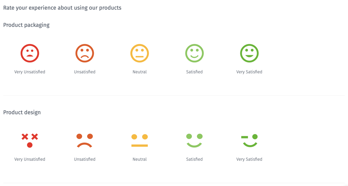
This is usually in the form of a short questionnaire after each usability test, and is derived as a score. Because it's on a Likert scale, it helps users to quantify their opinions when they respond to a statement such as 'I found this website easy to navigate' by ranking how strongly they agree or disagree with this statement.
[caption id="attachment_1458" align="aligncenter" width="1128"]

Credit: Questionpro.com[/caption]
2.4 Task Performance Indicator (TPI)
Users are asked 10-12 task questions, these questions are derived from the top tasks that you want to test. Bear in mind that these questions need to be repeatable as the same questions will be asked when the test is conducted again. These top tasks are then given to a representative sample of your customers (typically between 13 and 18) in a moderated usability testing. The TPI test is usually carried out every 6 to 12 months by measuring whether the customers are able to complete those tasks, how much time they take and what are the main problems.
Over time, the business will be able to monitor the UX performance using the same uniform task questions.
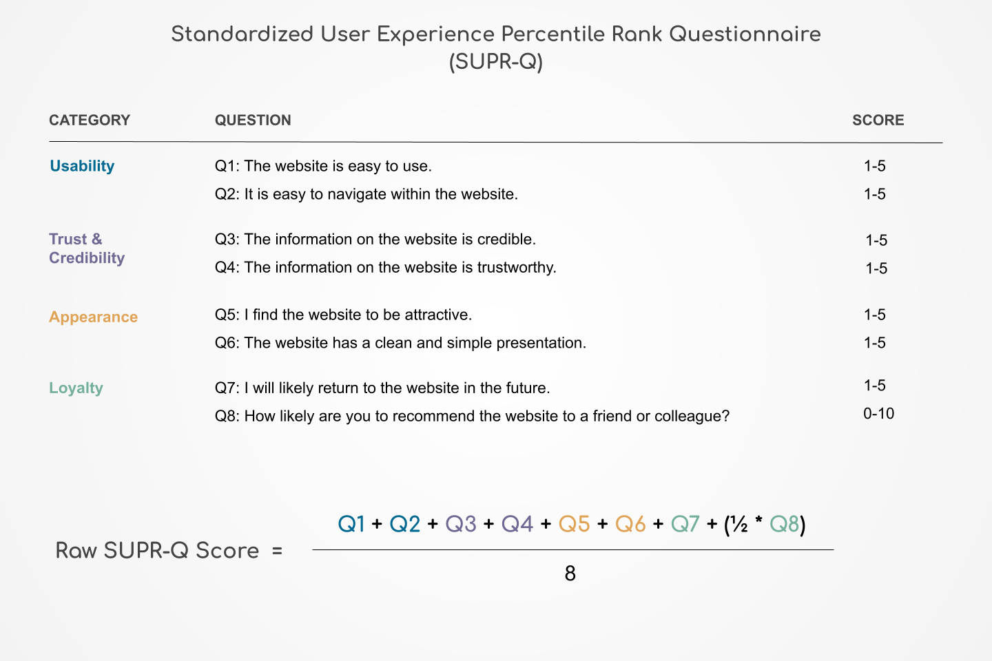
2.5 Standardized User Experience Percentile Rank Questionnaire (SUPR-Q)
This is an 8-item questionnaire designed to gauge the quality of user experience by measuring the usability, credibility, loyalty and appearance.
What are the SUPR-Q items?
Usability:
- This website is easy to use.
- It is easy to navigate within the website.
Trust & Credibility:
- The information on the website is credible.
- The information on the website is trustworthy.
Appearance:
- I found the website to be attractive.
- The website has a clean and simple presentation.
Loyalty:
- I will likely visit this website in the future.
- How likely are you to recommend this website to a friend or colleague?

Task Performance Indicator (TPI)
Users are asked 10-12 task questions, these questions are derived from the top tasks that you want to test. Bear in mind that these questions need to be repeatable as the same questions will be asked when the test is conducted again.
Final Thoughts
There is an abundance of possible UX metrics, the ones above are the most common referenced in the market.
The choice of UX metrics will depend on the goals of your company and what your stakeholders want to see. The vital element is being clear on what is being measured and why it is being measured.
If you would like to create a UX measurement plan, we have written up an article to guide you, find out How to Create a UX measurement plan.


