Due to the proliferation of mobile devices, information available to humans keeps growing on a daily basis. The more data we have, the harder it is to sift through to find what you need.
Fortunately, a well-thought-out information architecture (IA) can help users find their way while ignoring what isn’t relevant to them.
After all, who would like to utilise an application that constitutes unorganised content that makes navigation difficult?
If users easily get lost or feel aggravated, they may not give your application a second chance.
Product owners, product managers, UX researchers and UX designers, therefore, have the responsibility of constructing content and navigation systems in a manner that accommodates users’ perceptions. This is the fundamental premise of information architecture with regard to user-centred design.

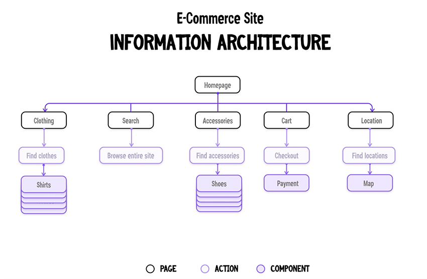
The information architecture of an eCommerce website. Credit: tutsplus
What is information architecture?
Information architecture is a scientific discipline that fundamentally focuses on data organisation within digital products. For instance, whenever web designers create apps, they lay out each screen so users can easily find the exact information needed.
The primary idea behind IA is to create a flow that lets users seamlessly navigate between application screens without much effort. This means that information architects’ work revolves around organising content, describing it clearly and providing ways for users to access it.
As a software discipline, information architecture plays a critical role in defining the user experience of a website or mobile app. The design is usually dictated by the target users’ needs and the organisation’s business goals.
For instance, the information architecture of a blog website and an e-commerce shopping site will differ considerably. This means that a UX architect designing the online shopping site will design the IA of the site with the principal motive of making it easy for visitors to find what they want while still showcasing the business offerings.

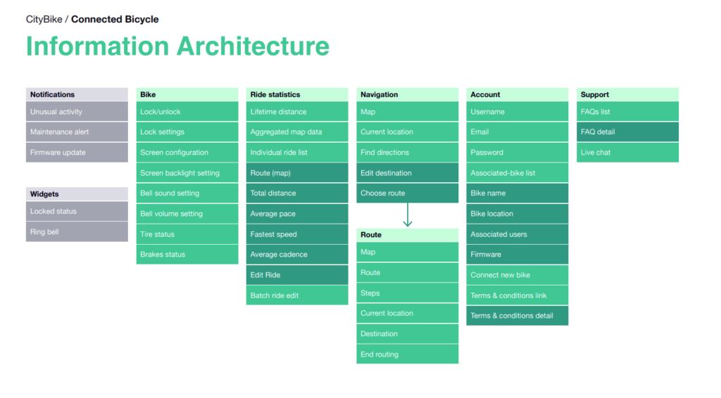
The information architecture of a bike-sharing app. Credit: practical.guide
When to do information architecture design / appropriate timing
Information architecture design is typically performed at the beginning of a project to fully understand the depth of the information to be worked with.
This usually involves figuring out how to portray the top-level aggregated nodes which users will first encounter (for example, top or left navigation contents), or even what efficiencies need to be provided for search, faceting, short-cuts, etc.
It is also suitable timing when there are a lot of new categories of content/services being added to a company’s offering.
For example, a company that used to sell internet subscriptions has now expanded to provide smart home products, then its website information architecture ought to be reexamined to see if it still supports visitors to find information easily.
Principles of information architecture
As mentioned above, an intuitive, well-designed, and user-friendly information architecture ensures that visitors spend less time and effort searching for the information they need.
The discipline of IA was founded by Richard Saul Wurman, an American architect and graphic designer. He conceptualised and popularised the discipline as a means of organising content for users to easily find everything they need without much effort.
As a starting point, ‘information architects’ consider the specifics of their target audience’s needs and impose user satisfaction as a priority.
Furthermore, the information structure also depends on the type of product or offers that the companies have. For instance, a retail website and a tech blog will possess two completely different structures to accomplish specific objectives.
Generally, the key components of information architecture are:
- Organisation schemes and structures: These dictate how one categorises and structures information.
- Navigation systems: These focus on how users browse or move through information.
- Search systems: These dictate how users look for information.
- Labelling systems: These dictate how information is presented.
To design all these systems of information, one needs to understand the inter-dependent nature of the content, users, and context.
- Context: This encompasses business goals, politics, culture, technology, resources, and constraints.
- Content: This revolves around content objectives, volume, existing structure, document and data types, governance and ownership.
- Users: This focuses on audience, tasks, information-seeking behaviour, needs and experiences.
To contextualise the information ecology, let’s dig deeper into some basic principles of information architecture.
The Objects Principle
It is imperative to perceive all content as an organic whole, with its own strengths, and weaknesses.
The initial stage of developing an information strategy involves organising all the categories of content objects. This is done while simultaneously determining the types of interactions that users need to have with the content objects.
The core idea is to present the content to users in the most efficient manner.
The Main Entrance Principle
This principle dictates that despite a site’s home page being the main entrance to the website, it shouldn’t be the only landing page on the website.
The Growth Principle
Most existing websites understand the importance of updating their content periodically. However, as the complexity and magnitude of the content increase over time, it becomes more vital to employ a flexible approach to content management.
This means that the complete structure of a site and its search tools should be flexibly scalable. This helps the website grow sustainably, regardless of the different types of content that spring up in the future.
The Principle of Gradual Disclosure of Information
This principle recognises that most users can perceive and process only a minimal amount of information at a time.
The best design approach is to always display only as much content as is necessary for visitors to know what to expect next.
This can be achieved by either incrementally revealing more information on the same page, or displaying it on another page. Nonetheless, the user should be able to assess the data on a page to subconsciously predict what information might appear on the next page.
The Multiple Classification Principle
Different internet users can employ the same site in different ways, and may even use disparate methods of searching for the same information.
For example, some might rely on search, while others may prefer to extensively browse through a site.
As such, it is important to adapt the website’s content to various user behaviours, needs, tasks, and scenarios.
The Focused Navigation Principle
It is important not to mix dissimilar categories of information within an individual navigation structure. The UX designer’s task is to provide all users with the elements necessary for effective navigation.
For instance, in a menu containing products that the business sells, try not to mix support services that the business offers into the same menu.
The Examples Principle
Whenever possible, ensure to provide visual examples of content types to improve the user experience. This can help users navigate the site faster, even without fully understanding what a label for a category exactly means. Therefore, the effective use of images in the menu could be very helpful to signal to users what they should expect the content to be.
Generally speaking, once a UI/UX designer learns to employ these principles, it becomes relatively easy to solve the most complex information challenges and build user-friendly websites.
What do information architects do?
Many organisations do not have information architect as a standalone role, it is usually done by someone in the UX design team or outsourced to a UI/UX design agency.
However, if an organisation is able to have a dedicated resource to have an information architect, their main job would be to design actionable and useful content structures and navigation systems from sophisticated sets of information.
This happens before the UX designers and developers add any functionality to the website or app.
Most of the work of information architects revolves around identifying common features in content, linking documents to other documents on the same topic, and forming groups of similar information objects.
This work typically involves the generation of sitemaps and navigation systems that UI/UX designers can then subsequently incorporate into the mock-ups of their webpage designs.
Whenever information architects collaborate with UI/UX designers, the result is a high-quality website that effectively communicates and facilitates interactions.
An information architect seeks to address the challenge of cognitive overload. They do this by adding sufficient structures, labels and browsing aids to sites and software applications to improve usability.
Cognitive psychology revolves around how the human mind works, encompassing mental activities that occur in the brain and the different elements that influence human perception.
Information architects rely a lot on cognitive psychology in order to organise information within products.
Generally, the more content an application has, the more important the role of an information architect is in the UX design process.
Here is a summary of the everyday activities that the average information architect engages in:
- User research and interviews.
- Card sorting and tree testing to understand users’ mental models.
- Usability testing to determine whether the structure they have created works for their users.
- Creation of hierarchy and navigation by creating simple, low-fidelity prototypes to demonstrate the hierarchy of information and navigation.
- Visiting users in real-world environments to examine how they interact with a product.
- Classifying and grouping items using categories, sections, or metadata tags.
- Identifying the relationships between information.
- Performing content audits for insight into how useful, accurate, and effective the content is.
- Mind mapping to organise information connected to a single topic and structures in a systematic and meaningful way.
Information architecture vs UX
If you have reached this far down the article, you are probably asking yourself if IA design is the same as UX design.
Despite being closely connected, they aren’t the same.
User experience revolves around the way a user thinks and feels when using a system, or service. Principally, UX focuses on usability, utility, and the satisfaction of using a system— more than only the content’s structure.
Read: What is UX design?
However, it’s practically impossible to create a great user experience without a solid information architecture. This is why every competent UX designer should learn the skills to be a relatively good information architect.
Remember, the information architect’s main job is to create an experience that enables users to focus on their tasks.
Information architecture pertains to the blueprint of the design structure necessary to generate wireframes and sitemaps of a website. UX designers use these wireframes and sitemaps to plan the navigation of a system.
This consequently enables UX designers to build a pleasant interaction model, so that users feel comfortable when using a product. Thus, influencing users’ behaviours and actions like emotion and psychology.
Why is information architecture important in UX?
Content is the main reason why most users visit websites. While it is important to produce content that users find valuable, it is equally important to ensure that the content is easy to find.
Time is a precious resource, and people expect to find solutions to their problems with the least effort.
Unfortunately, when finding information becomes challenging and complicated, there’s a high risk that people will just abandon it. And whenever visitors abandon an application or a website, it’s more challenging to bring them back.
This is where information architecture comes into play to frame the skeleton of any design project. As we have seen, functionality, interaction, visual elements and navigation are typically built with IA principles.
Overall, the information architecture is not visible to end-users but is the backbone of any app design.
How to create the information architecture for websites?
There are four key steps necessary to develop IA for any website or app, namely:
- Group, prioritise and label the content using card-sorting techniques.
- Define the navigation and create a site map.
- Determine the usefulness of pieces of content to ensure that the content that users see is exactly relevant to the page they are on.
- Test early and often using quantitative and qualitative techniques like:
- Tree testing: to determine if key information can be easily found in the information architecture of the website.
- Closed card sorting: to determine the strength of category names.
- Click testing: to show how users use the available UI components.
Information architecture examples
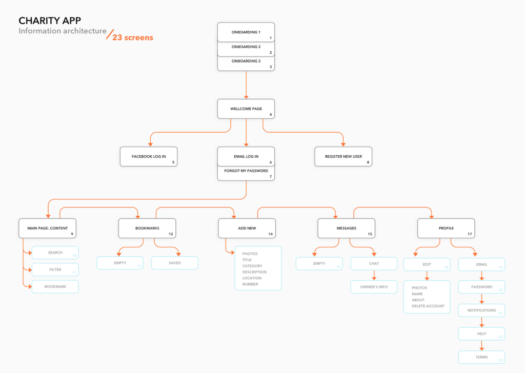
Simple tree structure
In this example, the developers built on top of a basic site mapping and then added in both child pages and actions.
Furthermore, the addition of number values helps to denote the priority of pages in the information hierarchy instead of leaning on colours.

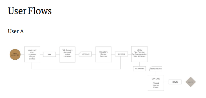
Felesky Flynn Website
This information architecture for a Canadian tax law firm laid the foundation for its website.
The user flows convey the actions their users could take while navigating through the site, tied into the functionality goals desired for the intended audience.

[/et_pb_text][/et_pb_column][/et_pb_row][/et_pb_section][et_pb_section fb_built="1" _builder_version="4.20.0" _module_preset="default" global_colors_info="{}"][et_pb_row column_structure="3_4,1_4" use_custom_gutter="on" gutter_width="4" make_equal="on" disabled_on="on|on|off" admin_label="Row" _builder_version="4.19.5" _module_preset="default" background_color="#f0f0f0" width="100%" custom_padding="|25px|0px|25px|false|false" custom_css_main_element="display: flex;" global_colors_info="{}"][et_pb_column type="3_4" _builder_version="4.19.4" _module_preset="default" global_colors_info="{}"][et_pb_text content_tablet="
Respondent Recruitment Services For Representative User Insights
" content_phone="" content_last_edited="on|desktop" _builder_version="4.20.0" _module_preset="default" header_font_size="42px" width="100%" custom_margin_tablet="" custom_margin_phone="" custom_margin_last_edited="on|phone" custom_padding="||0px|5%|false|false" header_font_size_tablet="42px" header_font_size_phone="42px" header_font_size_last_edited="on|desktop" header_2_text_color_tablet="" header_2_text_color_phone="" header_2_text_color_last_edited="on|desktop" global_colors_info="{}"]
UI/UX Design Services
[/et_pb_text][/et_pb_column][et_pb_column type="1_4" _builder_version="4.19.4" _module_preset="default" global_colors_info="{}"][et_pb_image src="https://cdn.netizenexperience.com/wp-content/uploads/2023/01/NX-logo.png" title_text="NX-logo" align="center" disabled_on="on|on|off" _builder_version="4.19.5" _module_preset="default" width="100%" module_alignment="right" custom_padding="24px|4px|||false|false" custom_padding_tablet="24px|4px|||false|false" custom_padding_phone="24px|4px|||false|false" custom_padding_last_edited="on|desktop" global_colors_info="{}"][/et_pb_image][/et_pb_column][/et_pb_row][et_pb_row use_custom_gutter="on" gutter_width="4" make_equal="on" disabled_on="off|off|on" admin_label="Row" _builder_version="4.19.5" _module_preset="default" background_color="#f0f0f0" width="100%" custom_padding="|25px|0px|25px|false|false" custom_css_main_element="display: flex;" global_colors_info="{}"][et_pb_column type="4_4" _builder_version="4.19.4" _module_preset="default" global_colors_info="{}"][et_pb_image src="https://cdn.netizenexperience.com/wp-content/uploads/2023/01/NX-logo.png" title_text="NX-logo" align="center" show_bottom_space_tablet="" show_bottom_space_phone="" show_bottom_space_last_edited="on|phone" disabled_on="off|off|off" _builder_version="4.20.0" _module_preset="default" width="100%" module_alignment="left" custom_margin="|70px||70px|false|false" custom_padding="24px||||false|false" custom_padding_tablet="24px|180px||180px|false|false" custom_padding_phone="24px|60px||60px|false|false" custom_padding_last_edited="on|desktop" global_colors_info="{}"][/et_pb_image][et_pb_text content_tablet="
Respondent Recruitment Services For Representative User Insights
" content_phone="
UI/UX Design Services
" content_last_edited="on|phone" _builder_version="4.20.0" _module_preset="default" header_font_size="42px" width="100%" custom_margin_tablet="" custom_margin_phone="" custom_margin_last_edited="on|phone" custom_padding="||0px||false|false" header_font_size_tablet="42px" header_font_size_phone="42px" header_font_size_last_edited="on|desktop" header_2_text_color_tablet="" header_2_text_color_phone="" header_2_text_color_last_edited="on|desktop" global_colors_info="{}"][/et_pb_text][/et_pb_column][/et_pb_row][et_pb_row _builder_version="4.19.4" _module_preset="default" background_color="#f0f0f0" custom_padding="|50px||50px|false|false" global_colors_info="{}"][et_pb_column type="4_4" _builder_version="4.19.4" _module_preset="default" global_colors_info="{}"][et_pb_text _builder_version="4.20.0" _module_preset="default" global_colors_info="{}"]
Key Highlights
- Provides UX design services for businesses & organizations
- Uses a human-centered design approach to create digital products that meet users' need
- Conduct research to understand users' needs
- Create wireframes & prototypes to test and refine a design
- Conducts product analysis, validation & testing
[/et_pb_text][/et_pb_column][/et_pb_row][et_pb_row column_structure="1_2,1_2" module_class="key-highlights" _builder_version="4.20.1" _module_preset="default" background_color="#f0f0f0" custom_padding="0px|||||" custom_css_main_element="display: flex;" border_color_all="RGBA(255,255,255,0)" border_width_right="25px" border_width_left="25px" locked="off" global_colors_info="{}"][et_pb_column type="1_2" _builder_version="4.19.4" _module_preset="default" global_colors_info="{}"][et_pb_button button_url="https://www.netizenexperience.com/ux-design/" url_new_window="on" button_text="LEARN MORE" button_alignment="center" _builder_version="4.20.1" _module_preset="default" custom_button="on" button_text_size="16px" button_text_color="#000000" button_bg_color="#ffc947" button_border_width="0px" button_border_radius="0px" button_font="|600|||||||" button_icon="5||divi||400" global_colors_info="{}"][/et_pb_button][/et_pb_column][et_pb_column type="1_2" _builder_version="4.19.4" _module_preset="default" global_colors_info="{}"][et_pb_button button_url="https://www.netizenexperience.com/contact-us/" url_new_window="on" button_text="CONTACT US" button_alignment="center" _builder_version="4.19.4" _module_preset="default" custom_button="on" button_text_size="16px" button_text_color="#000000" button_bg_color="#ffc947" button_border_width="0px" button_border_radius="0px" button_font="|600|||||||" button_icon="5||divi||400" global_colors_info="{}"][/et_pb_button][/et_pb_column][/et_pb_row][/et_pb_section][et_pb_section fb_built="1" _builder_version="4.16" global_colors_info="{}"][et_pb_row _builder_version="4.16" background_size="initial" background_position="top_left" background_repeat="repeat" global_colors_info="{}"][et_pb_column type="4_4" _builder_version="4.16" custom_padding="|||" global_colors_info="{}" custom_padding__hover="|||"][et_pb_text _builder_version="4.20.0" background_size="initial" background_position="top_left" background_repeat="repeat" global_colors_info="{}"]
Conclusion
All things considered, information architecture is a critical part of UX design for all types of apps and websites.
It is actually more important for websites that constitute many pages and extensive content.
Creating an IA should be a collaborative and iterative process that involves product managers, UX researchers, UX designers and information architects.
The process should also evolve organically, with as much of the structure defined up-front as possible. While many companies do not yet see the true value of information architecture, others realise that it is an effective tool to guarantee reduced usability or navigation problems.
In turn, well-thought information architecture can help save an organisation both time and money, which they otherwise would have spent on fixing future usability issues.


