
Well known on providing the best user experience possible, the first thing that you will read on About Google page about their philosophy: #1: Focus on the user and all else will follow. Google recently updated their Android mobile browser with a major design overhaul, but how did it turn out to be a backlash?

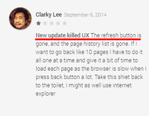
Other than the fresh ‘flat’ design feel, the most prominent update was removing of certain buttons from the newly updated mobile browser. Many users critiqued about some missing elements especially the ‘Refresh’ button. There were a lot of users who provided harsh comments on the new browser design. “New update killed UX”, said Clarky Lee, a Google Chrome user reviewed on Google Play.
Is the UX (User Experience) of the new design really that bad? We conducted some usability tests to find out. The users were requested to book a hotel room (comparing Agoda and Expedia) using the latest Google Chrome browser. At the end of the test, we asked them about their overall experience of using the updated Chrome browser. We tested it with different users consisting of first-time, regular and advanced Chrome users.
Evidently, advanced Chrome user had no issue dealing with the new update, utilized almost every single Chrome function well, such as incognito tab and swiping from address bar to switch tab. Video below shows one of the Chrome users maximizing the full potentials of Chrome mobile browser with his Samsung smartphone.
https://youtu.be/0SUSWgDG42A
Refresh Button and Removal of Back Button
In order to refresh a webpage, this user utilized the ‘refresh’ button on the menu bar; nonetheless, he also triggered the menu bar by clicking ‘menu’ button on his Samsung smartphone (only applicable for certain android smartphones). Generally, most users clicked on ‘Enter’ button on their keyboard once they do not see a ‘Refresh’ button on the address bar.
In addition, the ‘Back’ button has also been removed from the new design. This move seems to show that the Chrome team wants to replace the browsers ‘Back’ button with the Android OS ‘Back’ button that appears at the bottom of your phone screen. Perhaps this is an aim to make the Chrome as ‘clean’ as possible with the minimum amount of navigational buttons.
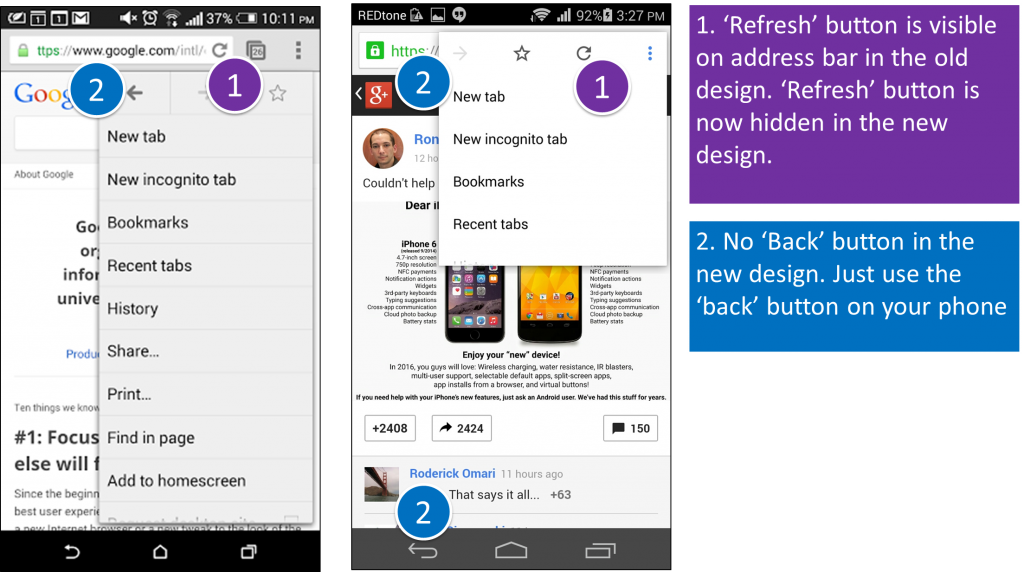
Comparison between the old (left) and new (right) designs
As mentioned above, the refresh button might not be something critical for most users, but there are users who claimed that they will consider switching to other browsers because of the need of taking extra step to refresh page. Read more here.
Based on the usability tests conducted, users did not face difficulty in ‘refreshing’ a page; however, some regular users commented that it would be even better if they can ‘refresh’ it directly from the address bar (requires only one click, instead of two).
Desktop Bookmarks
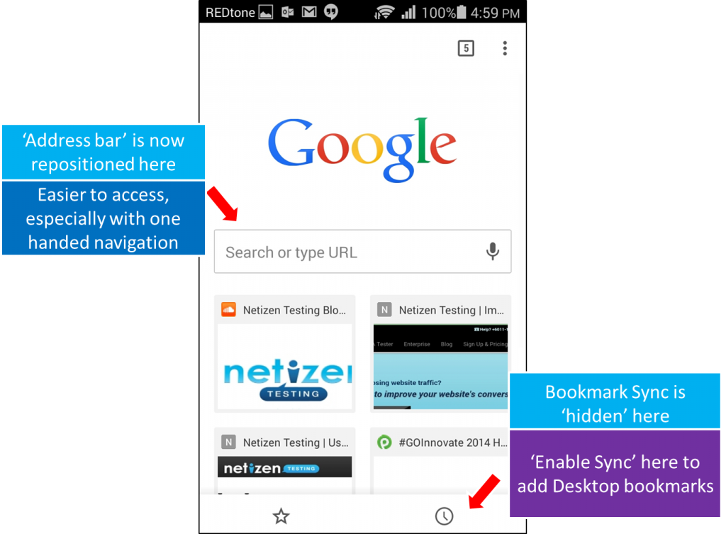
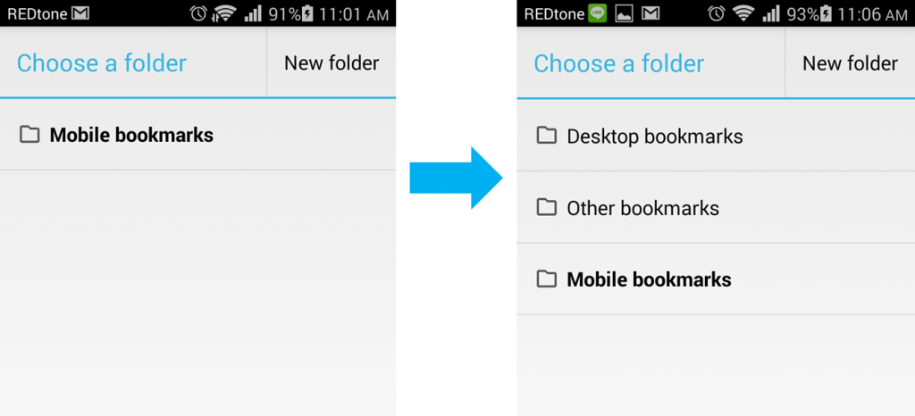
Users do not know what happened to the missing ‘Desktop Bookmarks’ folder on their bookmarking page and have no idea what to do next. Reviews on the Google Play Store showed that users did not realize that the function is now ‘hidden’, where the users will have to ‘enable sync’ at some where else in the browser to activate the Desktop bookmarking feature. It’s rather tricky.
It seems that the Chrome team chose to ‘hide’ the Desktop Bookmarks in the new update. Similarly, it took me quite a while to figure out how to add bookmarks to my Desktop bookmarks folder (something that I am used to doing regularly). It is great that Google allows us to access browsing history of our Desktop on our mobile phones.
From our usability tests, users are generally fine with the new look and feel. I personally like the new tab page, it is easier to insert URL and to access some sites directly. The main concern would be the removal of ‘Refresh’ button.We found that the ‘missing refresh button’ issue has happened on the Chrome desktop browser too, some time ago. Undoubtedly, Google Chrome is already a major player in the browser market, will they care enough to bring back the ‘refresh’ button this time? Was it a mistake or a design decision? What do you think?
Source: Screenshot of recent bad reviews on Google Play Store for Chrome
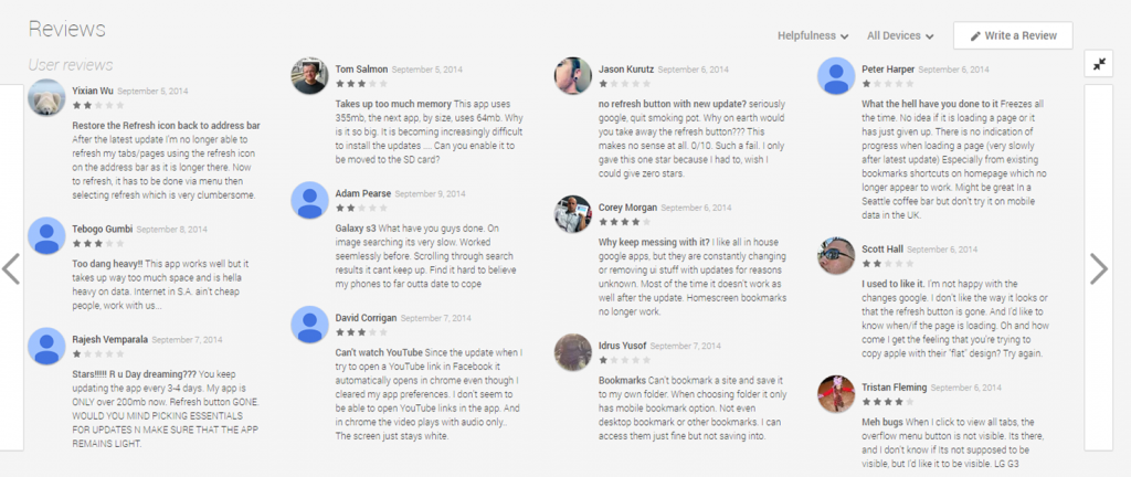
Image Credits:
https://www.google.com.my/intl/en/about/
https://play.google.com/store/apps/details?id=com.android.chrome&hl=en


