Have you seen the new Google icons? What do you think?[video width="596" height="596" webm="https://cdn.netizenexperience.com/wp-content/uploads/2020/11/04-google-workspace-icons.webm" loop="true" autoplay="true"][/video]When Google announced an update back in July to bring Google Meet, Chat and Docs to the inbox environment, it was just a sneak peek of what's to come. Recently, Google has streamlined and incorporated all their productivity services together with the intention of making a single, complete experience called Google Workspace.Before we go into details regarding the usability of the new icons, let's understand why Google has decided to design the icons in this particular way.
Google Workspace
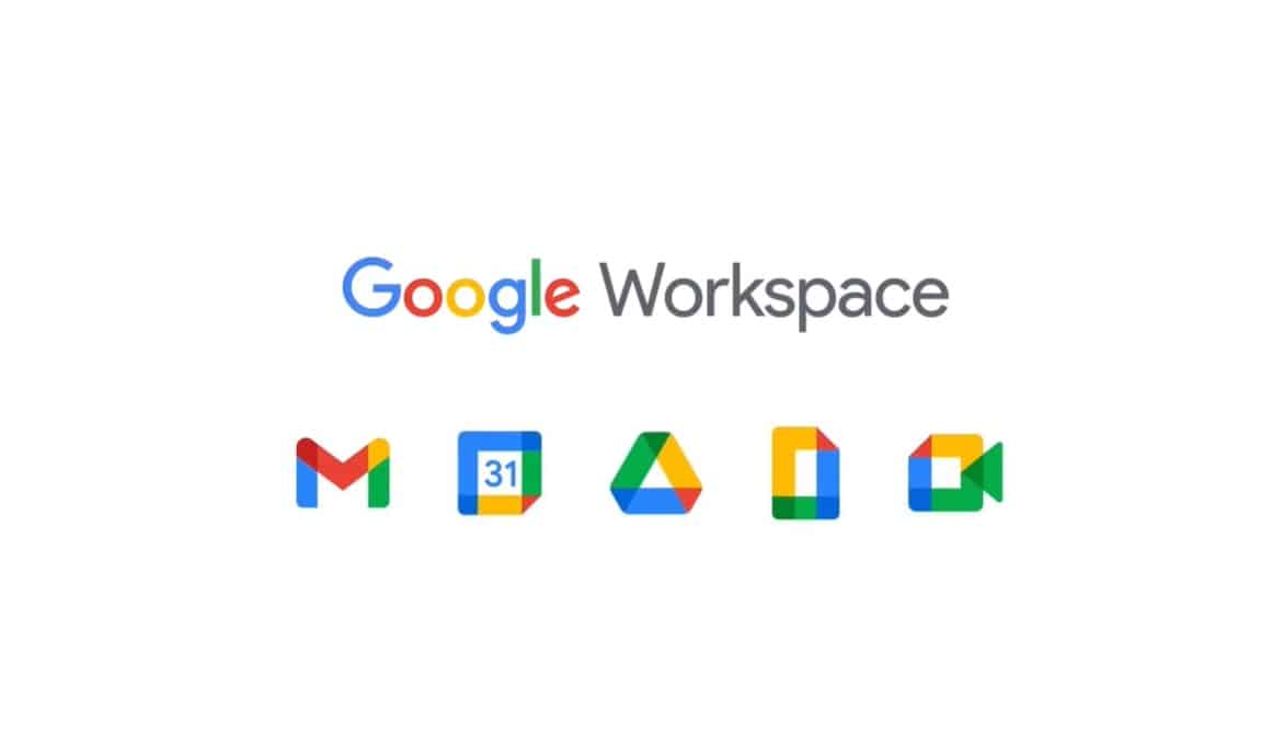
According to Google's blog when they first introduced Google Workspace, they stated: "Our new Google Workspace brand reflects this more connected, helpful, and flexible experience, and our icons will reflect the same."They go on to explain the concept behind the icons: "In the coming weeks, you will see new four-color icons for Gmail, Drive, Calendar, Meet, and our collaborative content creation tools like Docs, Sheets, Slides that are part of the same family. They represent our commitment to building integrated communication and collaboration experiences for everyone, all with helpfulness from Google."It's clear that their intention is to design the new icons & brand identity to convey how the tools in the workspace are in the same family, and it is without doubt that they have achieved that because the icons really do look similar.
Same Same But Different?
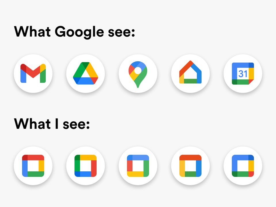
Actually, the new app icons look so similar, people are finding it difficult to differentiate the services:[caption id="attachment_1520" align="aligncenter" width="960"]

Credit: https://www.reddit.com/r/google/comments/jie6b7/for_opening_home_instead_of_drive_gang/[/caption]The icons of apps are ever-changing, keeping up with the trends of time and styling. However, the purpose of the icon remains unchanged. Icons are meant to provide visual clarity, it embodies the identity of the app, leaving an impression on the users' mind in hopes of building a sense of trust and loyalty.In addition, icons serve as a visual identity of the app, a frame of reference in our minds. Icons are small images that transmit information without words, it helps us to quickly identify an app without reading or cognitive recognition.There are so many apps on our digital devices that it's even more important to have a distinct visual identity, after all, the primary goal of an icon is to communicate a concept quickly and easily. The keyword here is: distinction.
Low Usability of Google's New App Icons
Unfortunately, Google's new app icons are not distinctive enough. Users may even have to double-check before selecting the app they want because they all look so similar to each other. There are several reasons why users are not a fan of the change, let's look in detail why the new app icons are considered low usability.
Colour
This is one of the first things we notice about the new icons, the colour scheme is exactly the same, gone is the signature red of gmail, and the classic calendar blue. We understand that Google is trying to re-brand their apps into the workspace family but the colour of the new apps poses a big problem.

The new icons all have all the same colours, it makes it so difficult to tell them apart at a glance. Time really is of the essence these days, and the time that users have to spend telling the apps apart is time wasted.Brands make use of colour to stand out, each app has a primary colour that is well established and easily recognizable.

Google misses the mark by forcing all the primary colours into each icon, they all have every colour and it confuses the brain.This is especially true for users who are using Google Workspace for work, where they have multiple applications opened on their laptop browser.

However, most users’ gaze focus on the content in the middle of their screen and the quick occasional glance to change between Google apps would look like this:

Then the user would take an extra few seconds to look carefully which is the correct browser tab and their title before clicking. This is not helped by the fact that the icons on the browser tab are much smaller, therefore harder for the eyes to tell the difference. This would eventually accumulate frustration as the user is being slowed down on their daily work. These icons design goes against making the user more productive. In addition, imagine that you have these icons in a Google folder on your phone. Usability wise, the colours of the new icons are not distinctive and distinguishable enough that users can quickly and effortlessly identify the app.
Shape
The shape of the icons also contribute to the low usability of the new icons, Google has chosen to run with the concept of hollow squares, which further reinforces how the icons are indistinguishable. Take away the colour, the shapes are also too similar.

The original icons didn't have a problem with the shape, each had a unique solid shape that was easily identifiable. But the new icons at a glance are mostly angular O's, resulting in a low usability because it isn't user friendly for users to easily pick out the icon according to its shape.
Familiar Concepts
The fact is, if a new user is introduced to Google Workspace, they would have no idea what each icon is for. In order for icons to be recognisable instantly, it should lean on familiar concepts, like how the home page takes inspiration from the outline of a house.Take the new calendar icon for example, it really is just a square with a number in the middle, with absolutely no visual resemblance to a calendar.The lack of familiar concepts further contributes to the low usability of the new icons, people should be able to have a good idea or at least a good guess of what app an icon represents. If users need to spend time guessing what the icon represents, it isn't user friendly.
Brand Over Usability
It's clear that Google has decided to focus on harmonising the apps in Google Workspace to have a clear brand identity, it's been designed so that users can differentiate any Google app from non-Google apps. But sadly it isn't distinguishable between various Google apps.We could argue that Google has done this because the apps are all under the same corporation. However, let's look at another company that has multiple apps under the same umbrella:

These are all the apps under Microsoft 365, a worthy comparison to Google Workspace in which both have their own multiple apps in a single suite. We see here that Microsoft has allocated a primary unique colour for each icon to represent the app, it's easily distinguishable yet because of the design style, we can see how it fits in the same family.Usability wise, users can very easily identify the apps in Microsoft 365 because of its shape, colour and familiar concepts. Notice the lines in Word, or the cells in Excel, and Outlook combines the familiar concepts of a calendar and mail. Yet at the same time, the brand is undoubtedly Microsoft.Google has prioritised brand over usability, resulting in the new app icons redesign being low in usability due to its choice of shapes and colours that are too similar in style and lacking in familiar concepts.
Takeaway
Despite Google being such a giant in the tech industry, they make mistakes too, as any humans do. Unfortunately, the new app icons are ranked as low usability because it doesn't fulfil the primary purpose of an icon, which is to communicate a concept quickly and easily.Distinction of the shape and colour of an icon is vital, when users take a glance on their phone searching for an app, it should be quick and painless. Users should be able to identify the app they want through a quick scan for shape or colour.Furthermore, the new Google icons lack in familiar concept, so much so that if any new user that is unfamiliar to Google tries to identify the purpose of the app, they wouldn't have a firm idea.Usability isn't restricted to the user experience of a product, service or system, the icon of your app also plays an important role in usability. If you're unsure how the usability of your product is ranked, we can help in conducting an UX audit check.Contact Netizen Experience at support@netizenexperience.comor check outwww.netizenexperience.comfor more information.


