The human brain, 100 billion neurons firing with signals racing across trillions of synapses at 400 km per hour. The brain is a very powerful organ, exceptionally good at managing our daily lives, but at the same time with a powerful imagination, able to fill in the blanks we get from our eyes, ears and other senses. Which is why we see shapes or patterns in the clouds, or from splashes of water on the pavement.
Making use of the brain’s ability for creative imagination is the fundamental idea behind Gestalt principles of design. This isn't a new idea, it dates back as early as the 1800s, but these principles are so firmly embedded in modern-day design, it is beneficial revisiting these important principles. The right usage of Gestalt principles of design can improve usability, aesthetics and functionality.
Gestalt Principles of Design
1. Similarity
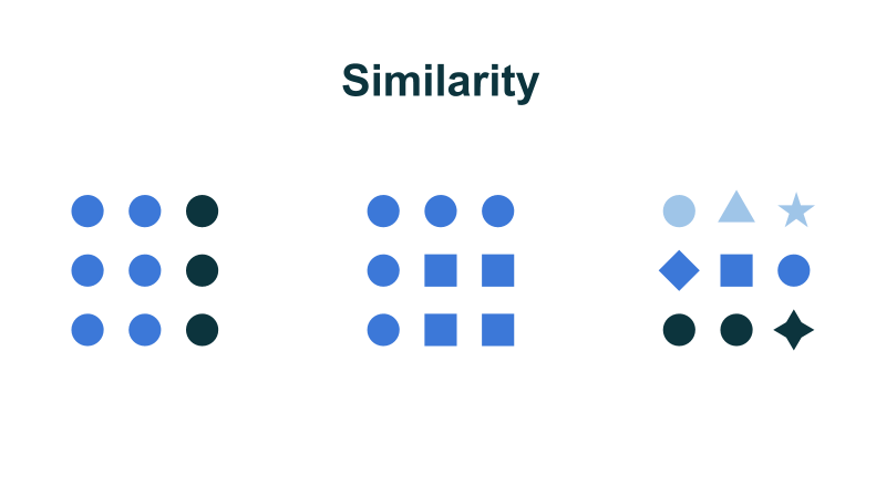
It is human nature to group things together. This is reinforced through education as from a young age, children are taught to sort things into similar piles. Homework questions will often be something like ‘Find the odd one out: Apple, tree, orange, pear’. Our upbringing and surrounding has further reinforced the idea of sorting and arranging.
No matter how elements are spaced on a page, similar elements are always visually grouped by users. This can be done through colour, shape, size, layout, font type or other visual elements.

This law of similarity is handy when you want to organize dissimilar objects, such as text or images of different sizes into a group. In order to create a visual unity of dissimilar objects, consider applying a common characteristic to these objects. This could be through the same background colour, same font type or font colour. This helps the user to link these objects together for faster and easier processing.
If you are looking to make certain elements stand out on a website or app, making it dissimilar will help users identify it much faster. This is often why checkout buttons on pages are designed to be a different colour from the rest of the page so that it stands out and draws attention, ensuring that the call-to-action button serves its purpose of getting the users' attention.
[caption id="attachment_1623" align="aligncenter" width="1156"]

Credit: https://www.zalora.com.my[/caption]
The law of similarity makes it clear for users which items are alike and which items stand out. On Zalora's website, all the items that qualify for a discount have a similar design in black that stands out. This allows shoppers to quickly browse through all the items and identify with ease which items are on discount.
[caption id="attachment_1624" align="aligncenter" width="1151"]

Credit: https://www.zalora.com.my[/caption]
2. Continuation
The rule of continuation states that “The human eye will follow the smoothest path when viewing lines, regardless of how the lines are actually drawn.”
Continuation can use a very useful tool in guiding the users' eye to the desired direction, you can then ensure that the most important elements and objects you want the user to notice fall within this path. We prefer to interpret visual information as connected instead of disconnected.
Since our eyes naturally wish to follow a line to its end, putting elements in a series in line will very naturally draw the user from one element to the next. Horizontal sliders and menu bars are typical applications for the principle of continuation.
Using Netflix as an example, they apply the law of continuation by displaying their products in a line. Users tend to naturally follow the line and will not only scroll up and down but also scroll sideways for continuation.
[caption id="attachment_1029" align="aligncenter" width="1844"]

Credit: https://www.netflix.com[/caption]
3. Closure
The law of closure suggests that the brain is able to fill in the gaps of a missing image, icon, word or paragraph in order to create a whole. It is the brain’s extremely powerful tool of imagination mixed with common sense.
The most classic example is found in the use of logos, as seen in the Adobe logo:

The red box is made of two inverse triangles and a polygon in the middle, but notice how there isn’t a letter “A” anywhere in the logo. However, you can obviously see the A in the white space, and that’s the power of the brain to fill in the gaps to find sensible information.
In UX/UI design, the law of closure can be utilized well in loading or progress bars in order to communicate better to users, it may also help in instilling patience in users because their mind automatically fills in the gap.

Furthermore, the law of closure can also be used to encourage users to explore more. By showing users a partial image fading off, it tells users that there is more to be found if they swipe. If there isn't a partial image fading off, the brain won't easily interpret that there is more to be seen and the user will not likely scroll and explore since they think the closure is apparent.
Using the same example from Netflix above, we can see that they have applied the law of closure by displaying a partial image that fades off on the right side of the screen, this tells users that there is more to be found.
[caption id="attachment_1626" align="aligncenter" width="1844"]

Credit: https://www.netflix.com[/caption]
4. Proximity
The law of proximity states that users subconsciously perceive objects that are close to each other as within the same group.
As we can see on Lazada's website, the logo of each brand overlaps with the product, and there is sufficient white space between each brand. This tells shoppers which content are grouped together and which are separate simply through their proximity to each other.
[caption id="attachment_1628" align="aligncenter" width="1513"]

Credit: https://www.lazada.com.my[/caption]
By grouping elements together, you can create a strong proximity effect. In UX design, proximity is used to group things together without having to use lines and borders. Which makes it easier on the eyes of the user and allows them to pick up on the structure you want them to perceive.
5. Figure/Ground
The figure/ground principle is similar to the closure principle. It manipulates the way the brain handles negative space.
Let's look at this picture, what do you see when you focus on black?
[caption id="attachment_1630" align="aligncenter" width="540"]

Credit: http://simoncpage.tumblr.com/[/caption]
Now try focusing on yellow. What happens is that when our eyes focus on a certain element, we choose it as the figure and the rest becomes the ground. When we focus on black, we see Batman and the yellow bit becomes the background. However, when our eyes focus on the yellow part, we can see an upside-down nemesis of Batman: The Penguin.
When looking at an image or webpage, the brain will always try to figure out what to focus on. Generally speaking your brain will see the larger areas of an image as “the ground” and any smaller elements on top of it as features.
The law of figure/ground can be used to highlight a particular element on a page or an app that you want users to focus on.
[caption id="attachment_1629" align="aligncenter" width="1830"]

Credit: https://www.thebatikboutique.com/[/caption]
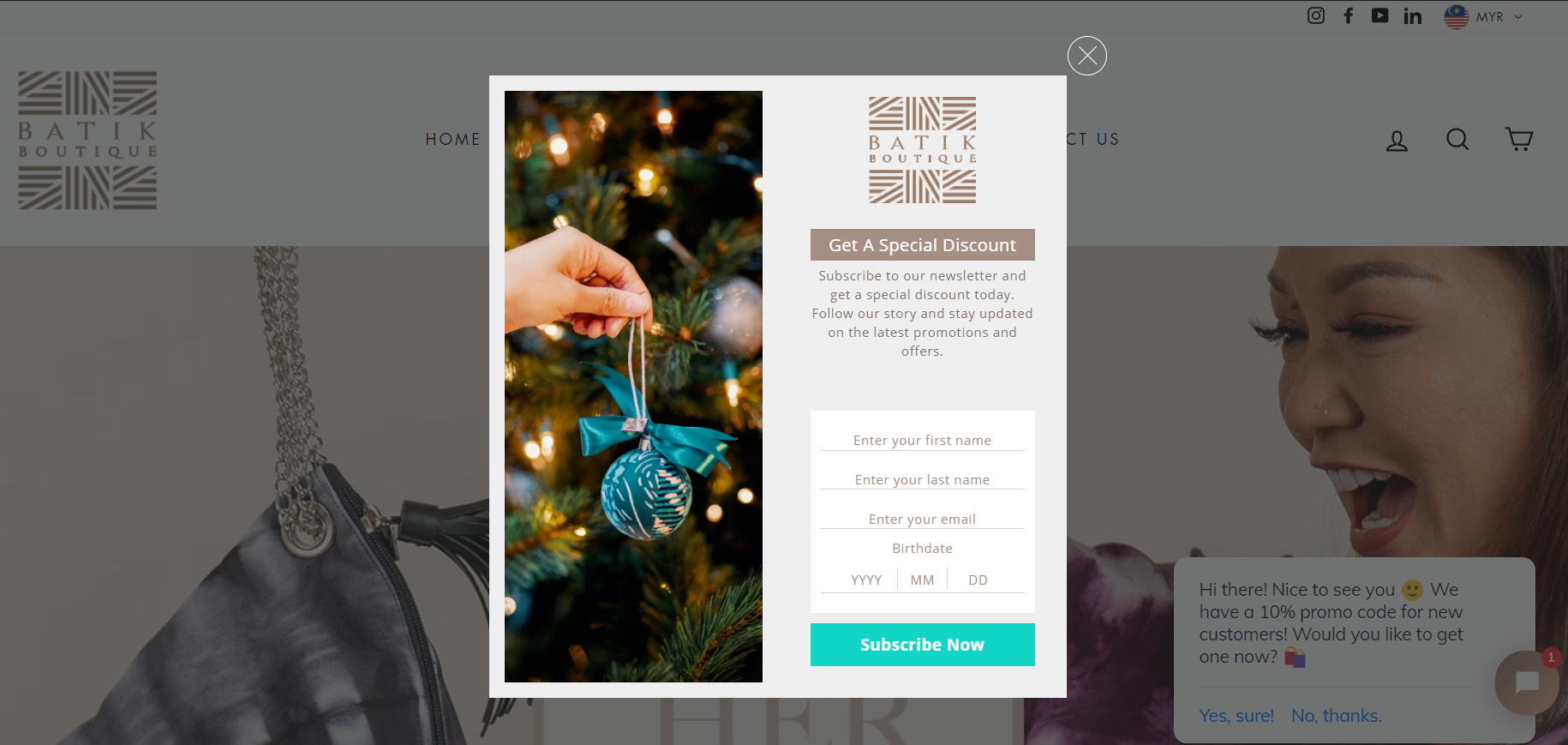
When a user first enters this site, a pop up appears encouraging the user to subscribe. Notice how the rest of the website has a lowered brightness, creating an impression of a background allowing the subscription pop-up to be the focal point. This draws the user's attention to the pop-up and may result in higher conversion rates.
6. Symmetry and Order
The law of symmetry and order is also known in German as prägnanz, meaning “good figure”. What this actually means is that your brain will interpret and break down complex or ambiguous shapes into a simple pattern, as simple as possible.

In this image, our brain automatically interprets the image as a triangle, circle and rectangle even if the outlines are incomplete because these are simpler shapes compared to the overall image.
When we look at a website or app, elements that are symmetrical to each other helps users to easily scan and recognize patterns. Users will subconsciously order and arrange the page, and this helps them understand the placement of elements and makes navigation easier and less stressful.
You can make use of this principle to arrange order and symmetry to meet the user’s natural inclination for ordering. If you're not sure whether it works well, it's always a good idea to conduct UX testing to determine how well and usable your product is. UX Testing helps you to see from the point of view of the user and where they are confused.
7. Common Fate
Common fate is a relatively new addition to the Gestalt Principles of Design; however, its significance in UX design cannot be overlooked. The principle of common fate tells us that people will group together things that are pointed or moving in the same direction.
Taking nature as an example, we associate schools of tuna and flocks of migratory birds as one single cohesive unit despite the fact that they are separate entities that are simply grouped together.
The law of common fate is especially useful in motion design. Elements on a page don't need to actually be moving in order to benefit from the principle. As long as it gives the impression of motion, we see this in dropdown or accordions, or nested menus.
Summary
Gestalt principles of design can be easily incorporated into your website or app design. These principles seamlessly improve the user experience and decrease stress in navigation. Understanding how the brain works and taking advantage of people’s natural tendencies will make for a more comfortable experience on a website even if they haven’t visited before, therefore vastly improving the user experience.
These principles are easy to implement into your design, resulting in a quick elevation on your design. Turning a haphazard, loud website or app into a natural and pleasant interaction which gently guides users to the right direction down the sales funnel. And UX Testing can be deployed as a check on whether your target users understand what you are trying to achieve.


