More and more startups are disrupting the remittance space and making it so much easier for consumers to make money transfers with full knowledge and transparency of their transactions. Let's take a look at how new fintech UX is challenging the conventional banks in money transfer.
Transferwise
Transferwise is fintech specializing in online money transfer service founded in 2011, and it has been challenging conventional banks ever since. It was "born out of frustration" because the founders felt that sending money abroad using banks was deceptive and expensive, thanks to the hidden charges.
On the main page, consumers can go straight to their intended goal to calculate the exchange rate and fees. Transferwise's UX allows consumers to easily input the amount and currencies to get a very clear conversion in return.
[video width="520" height="512" mp4="https://cdn.netizenexperience.com/wp-content/uploads/2020/06/Transferwise-Calculation-.mp4" loop="true" autoplay="true"][/video]
Their UX also provides an expand and collapse function which allows consumers to get an in-depth look to 'see calculation' for full transparency on relevant fees, showing a full breakdown of the entire calculation, as well as showcasing a guaranteed exchange rate for a certain amount of time.
All of this information is clear in every sense, giving consumers a full and transparent understanding of how their money is handled.

To aid their transparent approach, they clearly highlight how much money consumers could save compared to banks and the timeline on how long the money will take to be transferred.
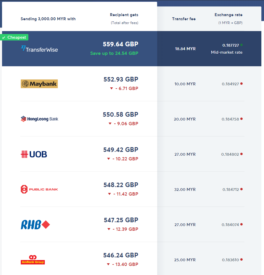
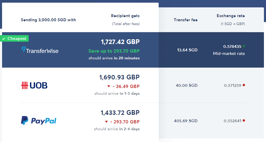
In addition to a clear and transparent approach, Transferwise takes it a step further to show consumers how their rate compares to their competitors. This information dynamically changes depending on the currency chosen.
Comparison for converting from MYR:
Comparison for converting from SGD:
Transferwise has challenged the standards of transparency in money transfer, and this is evident in how they have designed the UX of their services.
Following Transferwise in the pursuit of transparency in money transfers, Revolut and BigPay has taken things a step further in providing not just money transfers overseas without unfair fees, but also provide an easy-to-open bank account that comes with its own card!
Revolut
Revolut is a fintech company founded in 2015, offering a range of digital banking services in a mobile app.
[caption id="attachment_1145" align="aligncenter" width="840"]
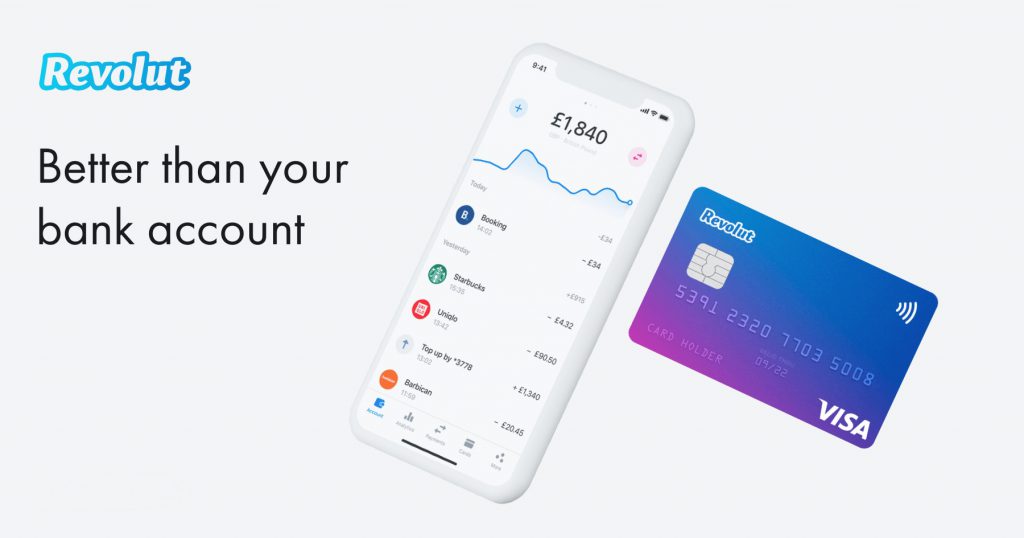
Credit: https://www.macrumors.com/2020/03/24/virtual-banking-app-revolut-launches-in-the-us/[/caption]
Consumers can provide their phone number, Revolut will then send them an SMS with a link to their app for consumers to download. The app then allows consumers to open a free account in a matter of minutes, instantly getting a virtual debit card to use online and in-store, with a physical card that will be delivered to consumers.
When it comes to money transfer, Revolut also practices transparency in allowing consumers to calculate the exchange rate.

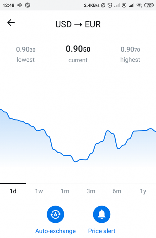
Revolut recognises that exchange rates fluctuate a lot, and that waiting for a favourable rate is time-consuming. As an answer to this problem, consumers have the option to set a specific rate they are looking for, and when the exchange rate hits the target the consumers have set, consumers can choose to automatically trigger an exchange or get a price alert.
BigPay
BigPay is a mobile wallet app, this fintech company was founded by AirAsia in 2018 as an effort to bring fair financial services to South East Asia. Operating with a motto that "Everybody should have access to fair financial services, in all transparency and with no hidden fees."
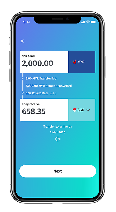
We believe in full transparency: you’ll see exactly when your money leaves your bank account, what fees you’ll pay and when the receiver will get your money - all on one screen!
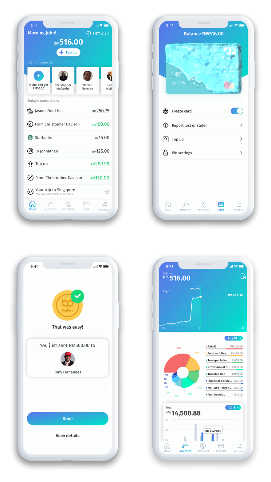
Consumers can select anyone in their contacts who has a BigPay account to send money to without friction. All the transactions are easily viewable on the dashboard, including a money management tool for consumers to review and manage their finances.
When it comes to money transfer, BigPay also strives to provide a transparent calculation for consumers, making it clear how much the transfer fee is, conversion rate and when the money transfer will arrive.
In an attempt to get into the digital payment game, WhatsApp has recently launched a new feature for money transfer. It's currently only available in Brazil, allowing users to send money securely or make a purchase from a local business without having to leave their chat!
WhatsApp has built this payment model with security in mind, a special six digit PIN or fingerprint will be required to prevent unauthorised transactions.
Users won't even need to pay any fees to send money or make a purchase, however businesses will need to pay a processing fee to receive payments, similar to accepting a credit card transaction.
[caption id="attachment_1153" align="aligncenter" width="1600"]

Credit: https://blog.whatsapp.com/bringing-payments-to-whatsapp-for-people-and-small-businesses-in-brazil[/caption]
Transferwise, Revolut, BigPay and WhatsApp are examples of tech companies utilizing UX as an advantage in achieving transparency and fairness for consumers when it comes to money transfers, challenging banks to adapt to a fair and transparent model.


