User experience (UX) is deeply linked to psychology, namely cognitive and behavioural psychology. A better understanding of the psychology behind your users' decisions can help to build more effective and engaging user experiences.Fret not, there's no need for a degree in psychology in order to make meaningful improvements to your user experience. A great way to get started is understanding essential UX psychology principles that influence the way your users interact with your product/service.We'll be looking into 5 key psychology principles:
- Goal Gradient Effect: Motivate Users Through a Feeling of Progress
- Speak-easy Effect: Using Simple Language
- Endowment Effect: Letting Users Have Ownership of Their Experience
- Choice Paradox: Don't Give Users Too Many Options
- Peak-end Rule: An End to Remember
You may navigate to any topic that interests you by clicking the links above, or just keep reading.
Goal Gradient Effect: Motivate Users Through a Feeling of Progress
Think about the feeling you get when you're about to beat the high score, or when you're halfway through something and there's an alert: "You're almost there!" encouraging you to continue.As it turns out, whether we're actually making progress is irrelevant but the illusion of progress towards a goal encourages users to reach the goal faster. This is known as the goal gradient effect.Many products and services take advantage of this human psychology by implementing progress bars or checklists, doing so helps users get started in progressing towards a goal. Furthermore, there is a significant increase in the likelihood that they will complete the given task due to the drive and encouragement created by the progress bar or checklist.Showing a progress bar with a substantial percentage or proportion already completed helps the users feel like there is progress that has already been made, further motivating them to complete that task at hand.For example, Shopee engages their users in various ways, through games, live streaming videos and assorted interactive features. Shopee games encourages their users to play games in exchange for rewards, this works in engaging customers more and keeps them on the app longer.In one of their games, Shopee Farm, users log in to water their plant which results in a prize when it's fully grown. There is an obvious progress bar that motivates users to complete their task at hand:

Due to the goal gradient effect, users are less likely to abandon their progress, especially after being able to see exactly how much progress they have made upfront and how much more progress is required to reach their goal.
2. Speak-easy Effect: Using Simple Language
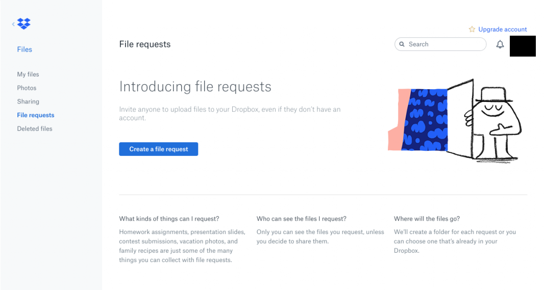
Humans on the whole innately prefer things that we're familiar with, whether it's products, experiences or words. As an adverse effect, humans also associate new experiences with uncertainty.When we are presented with something familiar on a product/service, we feel a sense of trust due to the familiarity, thus increasing the likelihood that we'll follow the directions presented or to complete the task.This is where the speak-easy effect comes in handy, we trust words that are easy to read compared to more complicated phrases. In fact, there was a research report by the University of Michigan that shows there's a risk perceived when things are difficult to pronounce: "low processing fluency fosters the impression that a stimulus is unfamiliar, which in turn results in perceptions of higher risk."Dropbox takes care in doing so by using familiar terms and language in explaining their steps without overwhelming their users.

A good way of testing this out is to conduct A/B testing where users can compare two variations of content and design in order to find out which is more commercially effective.
3. Endowment Effect: Letting Users Have Ownership of Their Experience
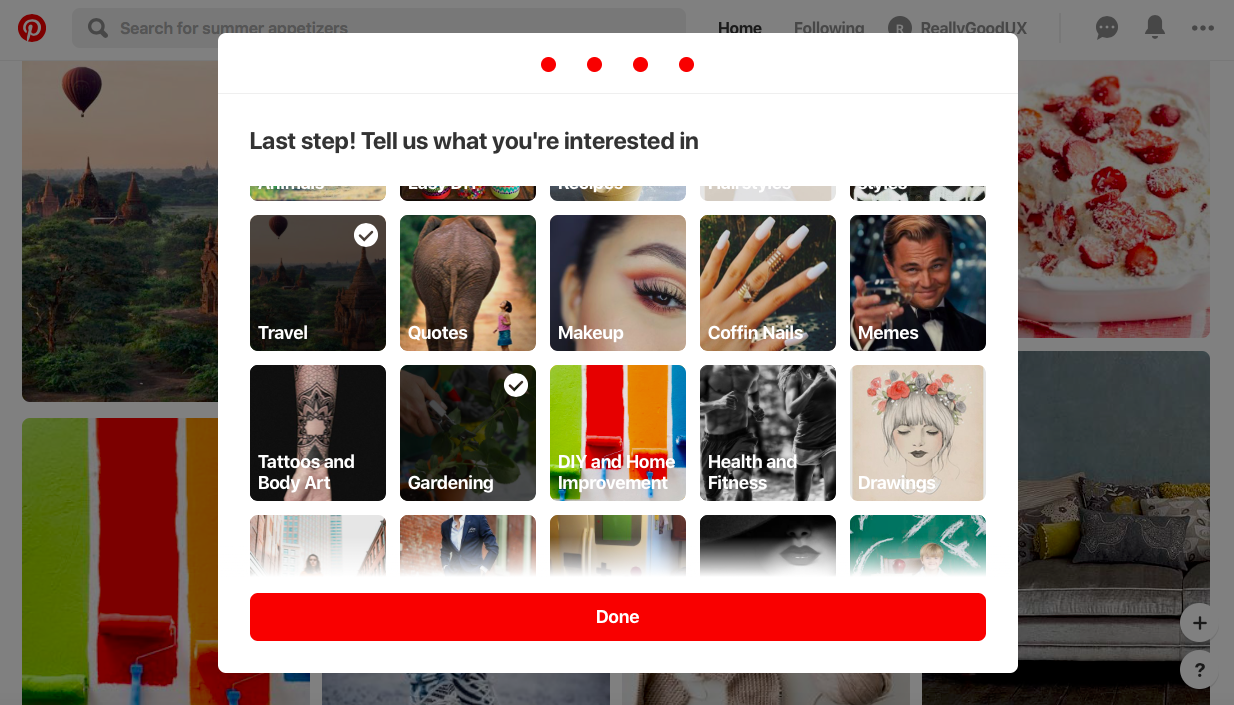
The endowment effect is based on the principle that once users feel like they own something, they value it. If they are told that they own it, they are less likely to trade it for something owned by someone else.This effect can be used in personalizing user experience during the onboarding process, it helps users in attributing value to your product/service early on, which creates an emotional connection. This, in turn, increases the engagement factor where they will continue using your product/service.Pinterest does this by asking users to define their interests in order to customize their feed, the personalized onboarding gives the users a feeling of ownership because they have attributed their interest which creates higher value throughout their experience.

4. Choice Paradox: Don't Give Users Too Many Options
Have you ever been to a restaurant that has too many options? Or perhaps you have scrolled aimlessly on your food delivery service, feeling so spoilt for choice that you just can't decide what to eat? This is what happens when we suffer from a choice paradox.The choice paradox occurs when we're presented with a growing number of choices, in which we feel overwhelmed and making a decision becomes a difficult process. We may feel mentally drained having to choose from so many different options or perhaps even always feeling like we should have made a better choice, regardless of your actual choice.This is also related to Hick's Law, a simple idea stating that the more choices we present the user with, the longer it will take them to make a decision.Avoid overwhelming users and creating simplified choices will help users make an easy decision, providing them with a good user experience.There are a few ways to combat choice paradox; efficient product filtering and information architecture, effective recommendations based on users' choices and AI or use social influence to create suggestions. Simplify choices by breaking down complex tasks into smaller steps or make use of progressive onboarding to minimize the cognitive load for new users.If you're unsure how to create an efficient information architecture, ask your users by conducting card sorting to find out their perception of information space. As a result, you will have a suitable information architecture that makes sense to your users.
5. Peak-end Rule: An End to Remember
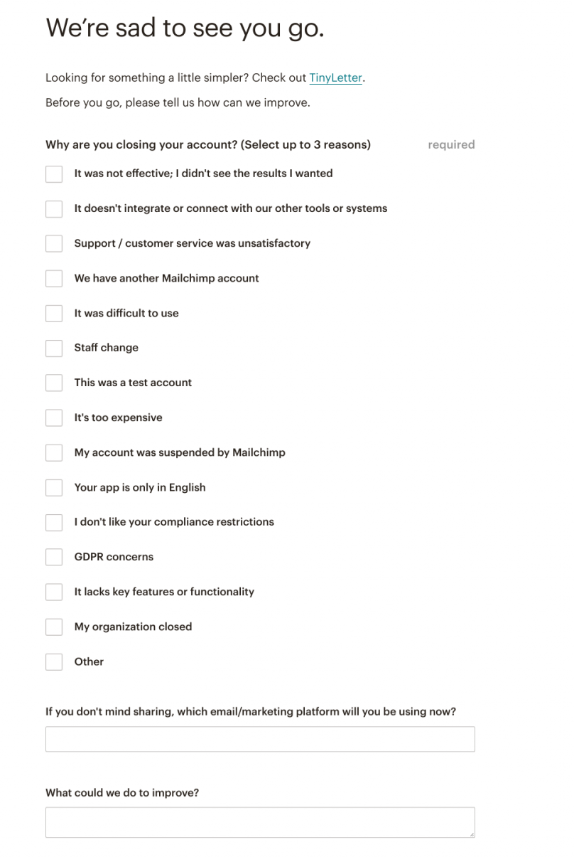
When we look back at experiences, we remember it like mental snapshots or a series of particularly strong moments. The most powerful moments and the final moments of an experience are weighted more heavily compared to the average moments of the experience.This is the peak-end rule. We have touched on the onboarding and in-progress experience and as we near the end of this article, we'll be looking at how this UX psychology principle can help to make a good last impression.Getting customers onboard is important, so is the offboarding experience when your users decide to leave. Most of the time, it's inevitable and they have their own reasons for leaving, but by creating a good last impression, it increases the chance of them coming back.Mailchimp does this by offering their users the option to pause or permanently delete their account by making these options easy to find. Furthermore, they help users by providing supporting information and links as to how they can export data from the account before everything gets deleted.Mailchimp has made the entire process easy and straightforward for the user, leaving them with a lasting positive impression. They then go on to suggest a simpler solution that the user might prefer, and ask reasons why the user has decided to leave, which may provide an opportunity for further action.

These small improvements that are applied to the most vital points of the user journey can leave a last impact on the overall user experience. Even after the customer has left, they can still refer your business or come back again at a later time because of their positive user experience with your business.


