As part of our digital healthcare series, we will look at digital healthcare UX. We have previously explored the digital transformation of Asia's smart hospitals, digital patient trends for 2021, and the keys for successful digital transformation in healthcare.As long as users are involved, there is user experience (UX), and this most certainly includes digital healthcare. Digital healthcare has opened up an array of opportunities for better experiences across the healthcare journey, removing pain points, frustration and friction from the patient experience and providing more value instead.Digital healthcare UX helps in increasing efficiency and cost savings, and can provide convenience for all parties involved. It's imperative to design digital healthcare to suit patients and to provide them with a good user experience, but what does digital healthcare UX actually look like?
What is Digital Healthcare UX?
Healthcare is complex and digital healthcare UX is relatively new compared to more widely known UX disciplines such as e-commerce UX for example. Designing digital healthcare UX requires more thought and consideration, the healthcare industry is so heavily regulated and complicated, with various moving parts that are not often communicated effectively.Understanding how to design effective digital healthcare UX includes considerations of patients' needs and frustrations, as well as considering the other parties in the ecosystem such as specialists, governments, insurance companies, etc.
Patient-Centred
Start with empathy in the patient's user journey, meeting patients where they are is vital, especially because healthcare journeys are often complicated and personal. It isn't just a single transaction but instead there are multiple touchpoints across the span of days, months or even years. Along the way, the patients' emotions range between anxiety, frustration, satisfaction, fear and doubt. Digital healthcare UX needs to have a bedside manner, it needs to be empathetic, to be patient-centred.Recognising and working to understand the various needs, feelings, and expectations of a patient through each step of their journey is the starting point to a good digital healthcare UX, not the design, or prototypes or coding.User research such as in-depth interviews, diary studies, user persona helps to uncover insights into patients' emotions and actions, steering the healthcare digital experience in the right path, setting a firm foundation to build excellent digital healthcare UX.Having the user journey map provides invaluable insights, and with empathy, generates a road map to kick start the design and building process. There is a lot more on the line for digital healthcare UX, for some patients, it could be a matter of life or death, which is why patient-centred UX is vital.
Usable
Digital healthcare UX is usable, there is a great extent of utility involved. Patients don't want to get things done, they need to get things done. Digital healthcare has opened up an opportunity in saving time and effort, providing complex utility. At the touch of our fingertips, we can order food, book an entire holiday, get groceries, hire a car, pay our bills. These experiences have become so common that it's considered the norm, this is utility and it's very much expected.When it comes to digital healthcare UX, this is no exception. The principle of utility, to make it usable, is an important consideration and necessity. Patients need to be able to take control and gain value, such as booking an appointment, understanding and taking preventative health measures, updating their personal health record, directly communicating with the care team etc.
Private & Secure
Digital healthcare UX needs to be private and secure, taking from the essence of traditional healthcare, privacy and security is of utmost priority for all parties of the healthcare industry.Healthcare is heavily regulated, but patients may not always believe that their data is kept private and secure. In digital healthcare, this needs to be communicated to patients and to assure them that their data is safe, and this can be done through reinforcing concepts of privacy and security through content and features.Passwords is just a start, implement strong encryptions, two-factor authentication, etc but also importantly, communicate plainly to patients how their data is handled and kept secure. Patients need to feel safe in sharing their personal information, and to share access to caregivers and family members.
Transparent
Transparency is quite lacking in the healthcare industry, it is not unheard of occasions where patients have gone for a CT scan, a quick 5 minute CT scan of just their head and left the room with a bill for RM500. That's RM 100 per minute, the patient wouldn't have guessed it, none of that information was communicated, there was simply no transparency.Patients need to know what their out-of-pocket expenses are, what is covered under their insurance and what isn't, in a plain and simple manner. Patients aren't able to plan and budget for things they simply don't know about. Furthermore, attempting to find out this information isn't an easy process, sometimes requiring to go through several points of contact before getting an answer.Advocate for transparency for the patients' behalf, it's better to know too much than too little. Patients will want to know how long it takes, how much money is involved, how much of it is covered by their insurance so that they can manage their expectations.Make the pricing transparent by displaying costs upfront, and take insurance information into account for patients to have a clear idea. Insurance can also be such an unknown aspect to patients, there is so much complicated language involved. User experience is about making things simple for patients, making insurance transparent by simplifying the complicated jargon and language.Consider making time and expectations transparent through notifications on changes and delays, you don't want patients to be late and they don't want to be sitting aimlessly in the waiting room either. Digital experience can help in coordinating timing and setting expectations, it could be informing patients at the right time on what they need to bring with them to appointments and what they should expect to happen during the appointments.It could be reminding patients to fast before their lab test through timely notifications and to even let patients track their progress through their journey.
Personalised
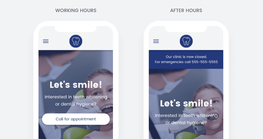
Digital healthcare provides an opportunity for personalisation, a good digital healthcare UX would include a healthy extent of personalisation for individual patients. Each patient's journey is unique and personal, a pleasant digital healthcare UX involves their personal information such as age, geography, conditions and other compliant information in improving the patients' experience.Apps can utilise the patient's geographical location to make recommendations on the nearest clinics or hospitals, or to make use of the time to determine the search results based on the hours of operations. For example, if the patient is searching for a clinic after the closing time, the personalised experience could allow the patient to make an appointment or to provide important contact details in case it's an emergency.[caption id="attachment_1173" align="aligncenter" width="899"]

Credit: https://www.smartinsights.com/mobile-marketing/mobile-marketing-strategy/from-desktop-mobile-why-matters/[/caption]
Plain Language
Patients aren't doctors, medical professionals or insurance agents, they won't understand medical jargon. Of course, the healthcare industry consists of extensive medical and technical jargon but digital healthcare provides an opportunity for the jargon to be understood by patients.Digital healthcare UX consists of having plain and simple language, and this doesn't necessarily mean throwing away all the medical and technical jargon but to have a breakdown or translation of what all really means. If a patient is having stomach issues, they wouldn't be searching for something starting with 'gastro-'.The point is to meet patients where they are, most patients haven't attended medical school and so they wouldn't understand medical jargon. Making the user experience understandable and readable includes making the medical language easy to understand, consider even providing a pronunciation when it's needed for context.
Accessible
Plain language is an example of accessibility, when we refer to digital healthcare UX being accessible, we're talking about considering accessibility needs.Patients have various conditions and disabilities and these are important considerations, and is the designer's responsibility to adhere to these considerations and to design accordingly.There are various forms of impairments, it could be visual, physical, cognitive impairments that need to be considered in order to cater for inclusivity, as well as patients' conditions and disabilities.The World Wide Web Consortium (W3C) has standards and guidelines that help in ensuring that content and feature experiences are accessible. The Web Content Accessibility Guidelines (WCAG) provides success criteria that can be helpful in testing accessibility. It is also important to conduct user testing with real users to verify that it is indeed usable and accessible.
Integrated
Digital healthcare opens up an opportunity for integration, imagine integrating your smartwatch that frequently updates your heart rate information to monitor your blood pressure, alerting you if your blood pressure is too high in order for you to take necessary action.Furthermore, integration includes making use of existing software and devices, there's no need to create an entirely new app just to communicate with patients when there's existing software that already works well. Work with existing technology to enhance the user experience instead of trying to reinvent the wheel.Leverage on current experiences and devices like email, calendar, chat apps that patients are already using and integrate accordingly. There's no need for a separate system for booking an appointment, another system for the patient portal, and yet another system for billing.Having a good digital user experience means making it easy for patients to complete their intended tasks, striving for a single sign-on, a single platform for patients to manage their entire healthcare journey digitally. Doing so will also help in building a long term relationship with patients. They already have their health conditions to deal with, they shouldn't have to face problems with the user experience.
In Closing - What is Digital Healthcare UX?
Digital healthcare UX is patient-centred, it helps patients get things done. It assures patients that their information is private and secure, and good digital healthcare UX is also transparent, keeping patients well informed.It caters to the patient's unique and personal journey through personalisation. It is also in a plain and simple language so that patients can understand all the information easily, and it is accessible for all patients, catering for various impairments and disabilities. In addition, integrating with existing solutions also help in providing a pleasant user experience for patients, making it as easy as possible for patients to complete their tasks.[/et_pb_text][/et_pb_column][/et_pb_row][/et_pb_section]


