Have you ever taken a flight somewhere, landed, just to find out your check-in luggage didn't make it? And all you have to wear for your well-earned getaway are the clothes on your back. Or perhaps your flight home has been delayed and you had to pay for another night of accommodation unexpectedly?Some of us are lucky enough not to experience these situations, but for those of us who have, we make it a practice to always buy travel insurance. With an abundance of digital travel insurance available, it's easier than ever to get travel insurance and peace of mind.In fact, it's gotten so easy to buy travel insurance online that customers are spoilt for choice, price and coverage are the key factors in choosing which travel insurance to buy. But what good is having a great price to match a full coverage if customers can't find the information they need? What are customers' expectations when it comes to digital travel insurance user experience (UX)?
1. Covid-19 Coverage
Although a lot of us are restricted in our travel plans at the moment, one of the first things that comes to the mind of users when they are looking for digital travel insurance is whether the policy covers for Covid-19.
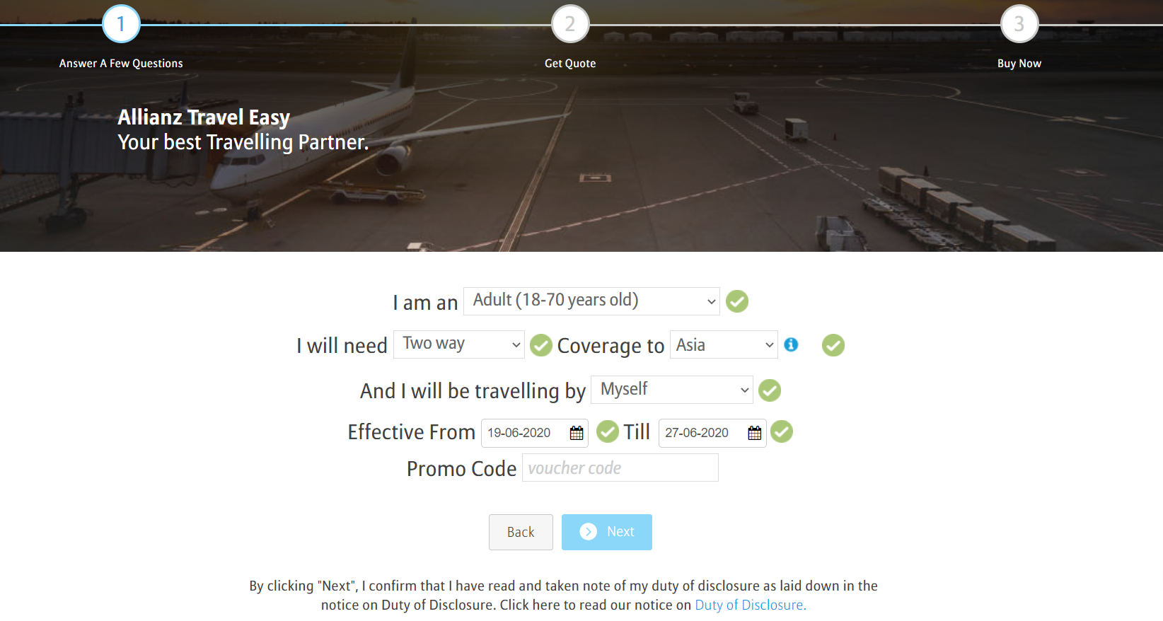
Bad Example:
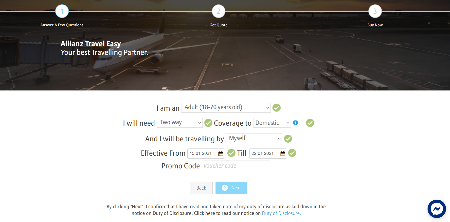
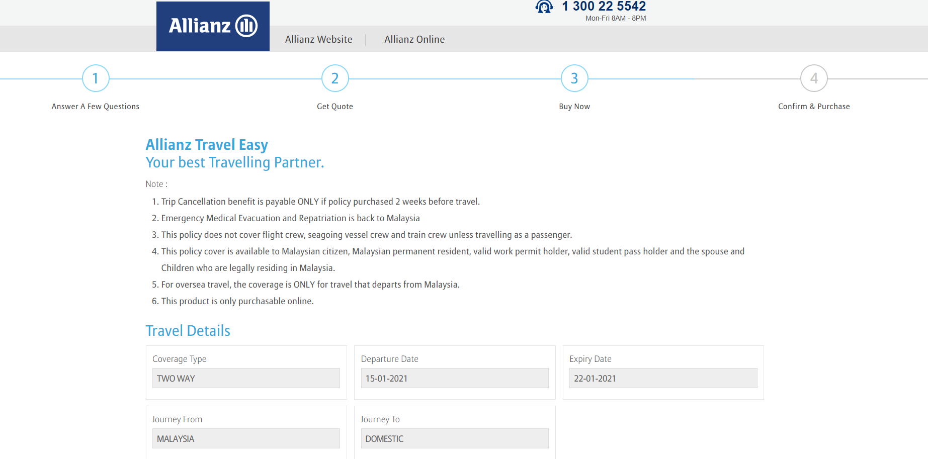
On the first page, there is no statement informing users regarding the coverage for Covid-19 anywhere. In fact, even towards reaching the end of the user journey at the checkout process, there is still no information to be found. This creates a negative user experience because users are not only uninformed from the very start but there is a lack of useful information regarding Covid-19 throughout the entire user journey.[caption id="attachment_1700" align="aligncenter" width="1845"]
Credit: https://getquote.allianz.com.my/travel-care/[/caption]
Customer Expectation:
[caption id="attachment_1701" align="aligncenter" width="1460"]
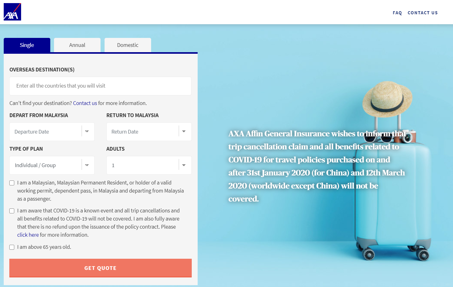
https://digital.axa.com.my/travel-insurance-malaysia/[/caption]On the first page, there is not only one but two statement regarding Covid-19 coverage. On the right side of the page, there is a large statement informing users that Covid-19 is not covered under the travel insurance policy.Furthermore, users are required to read and acknowledge this information by having a compulsory checkbox that ensures users read the information and click the checkbox before being able to proceed. Furthermore, the language used it clear and concise, and there is a link for users to click on for more information. This doesn't just save the user's time and effort but also creates a positive impression of the company and a pleasant user experience.
2. Clear & Defined Qualifications
Most travel insurance companies have certain qualifications, for example, they may only cover those with citizenship, permanent residency, work or study permit in their respective country. Oftentimes these are unclear until the very end when the customer is filling in their details. Or worse, it's not stated anywhere at all and only discovered when the customer tries to utilize the travel insurance coverage just to find out the plan is null and void.
Bad Example:
On the first page, there's no indication anywhere that the policy cover is only available to Malaysian citizens, Malaysian permanent residents, valid work permit holders, valid student pass holders, the spouse and children who are legally residing in Malaysia.
This is only shown on the third page after the customer enters their travel information and reviews the quote.[caption id="attachment_1085" align="aligncenter" width="1670"]
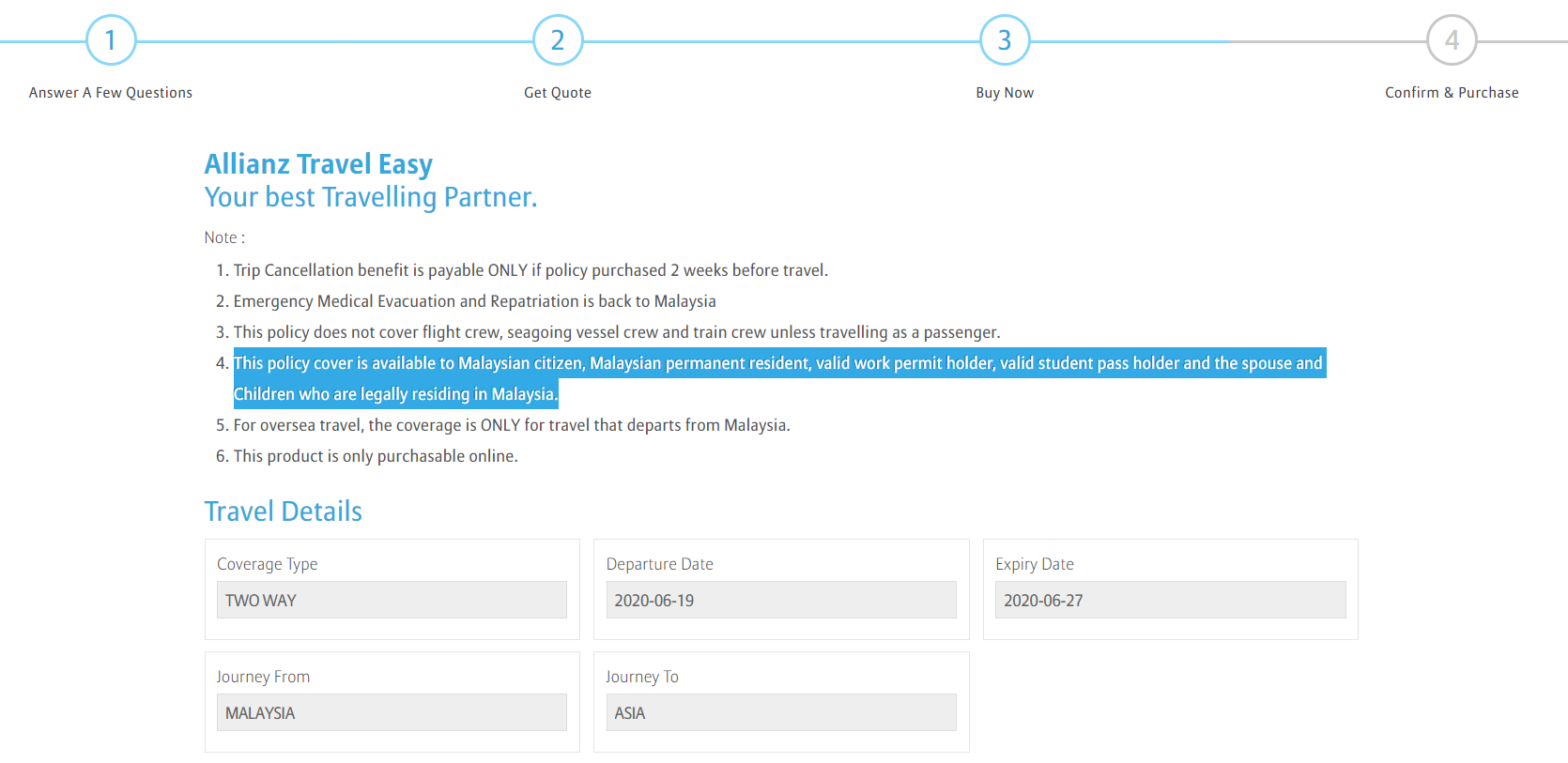
Credit: https://getquote.allianz.com.my/travel-care/[/caption]In this example, the qualifications aren't stated at the very start causing certain customers to feel dissatisfaction in the time and effort wasted, also creating a lasting negative impression.
Customer Expectation:
[caption id="attachment_1090" align="aligncenter" width="1639"]
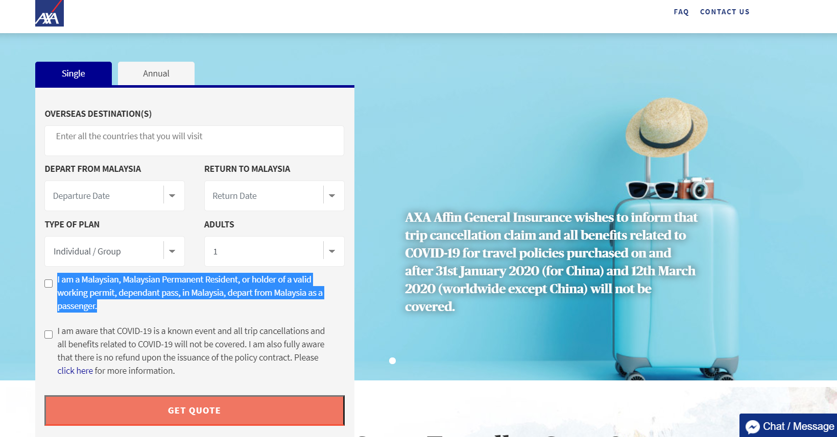
Credit: https://digital.axa.com.my/travel-insurance-malaysia/[/caption]In this example, customer expectations are fulfilled when the qualification is clearly defined on the very first page. By taking it one step further than just showing a statement, having a checkbox that is compulsory to proceed forces the customer to read and acknowledge this. Because the qualifications are clear and upfront, it reduces the risk of negative impressions, as well as time and effort wasted.
3. Understandable and Updated FAQs
There are many possible questions that customers may have when it comes to buying travel insurance online, especially if they have never purchased it before. This is why customers would expect travel insurance companies to have and maintain a clear and updated list of frequently asked questions (FAQs), especially when there's a global pandemic.
Bad Example:
[caption id="attachment_1095" align="aligncenter" width="1181"]
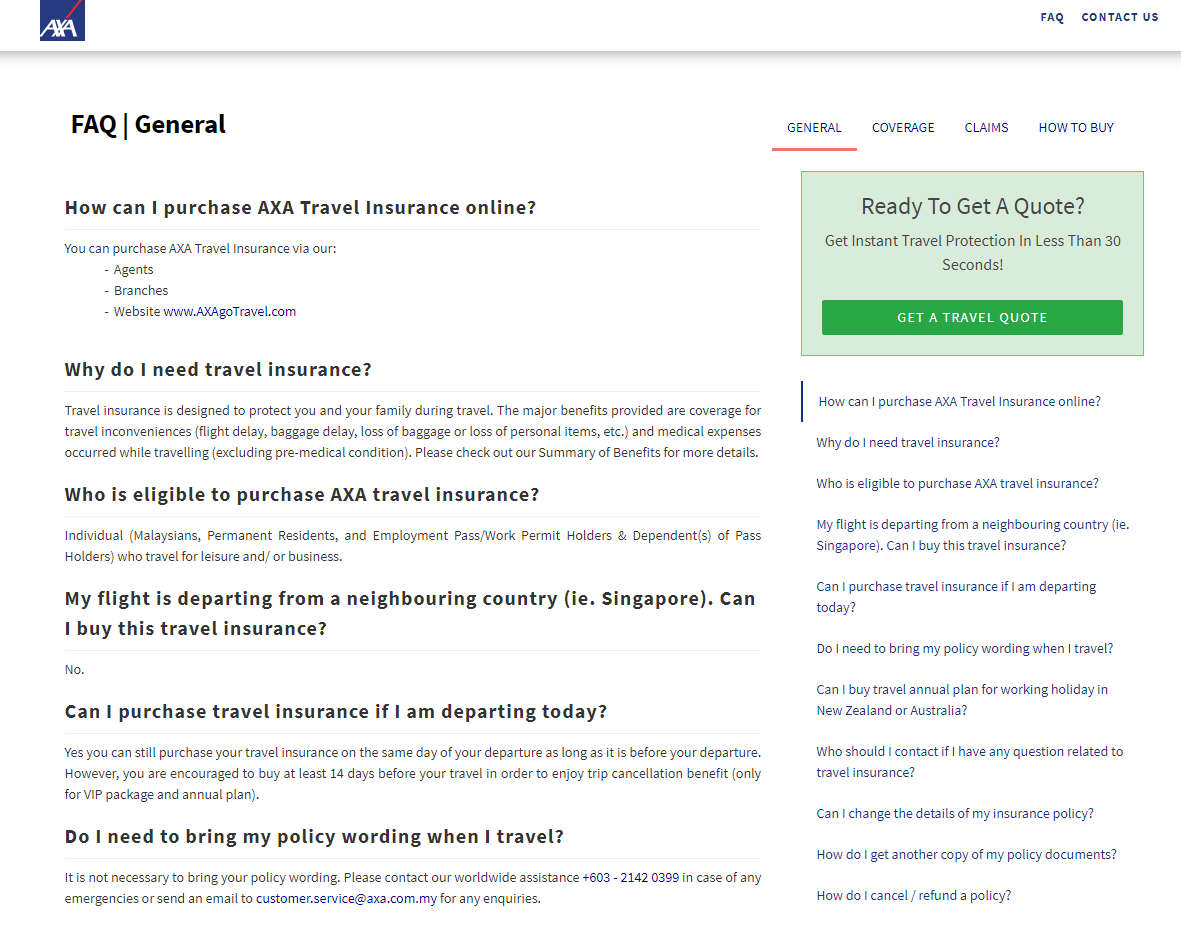
Credit: https://digital.axa.com.my/travel-insurance-malaysia/faq/?active=0[/caption]In this example, there is no updated information on Covid-19 leaving customers uninformed, likely causing them to err on the side of caution and not purchase a policy.
Customer Expectation:
[caption id="attachment_1131" align="aligncenter" width="1159"]
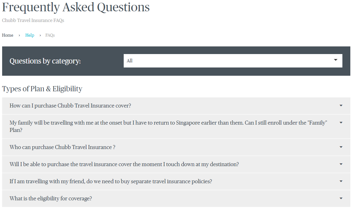
Credit: https://www.chubbtravelinsurance.com.sg/en/help/faqs#section1group1[/caption]The FAQs utilise the accordion layout which is easy on the eyes compared to the example above where both the questions and answers fill the page, causing the customer to scroll through everything to find what they are looking for. By using the accordion UX, customers can see all the questions at a glance or select the category of questions they want answers to.
4. Coverage Layout and Information
When customers buy travel insurance, they want to know in detail what the plan covers, and if there is more than one coverage plan offered, customers should be able to easily compare the plans to make the decision.
Bad Example:
[caption id="attachment_1096" align="aligncenter" width="1050"]
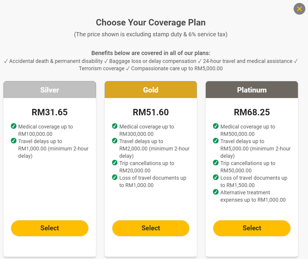
Credit: https://www.etiqa.com.my/tripcare360-new/en/insurance/qq1[/caption]There are three different coverage plans available in this example, all of which covers baggage loss or delay compensation but there is no indication anywhere regarding the coverage amount of this for each plan, nor is a link for the customer to click on to view all the details.
Customer Expectation:
[caption id="attachment_1098" align="aligncenter" width="1291"]
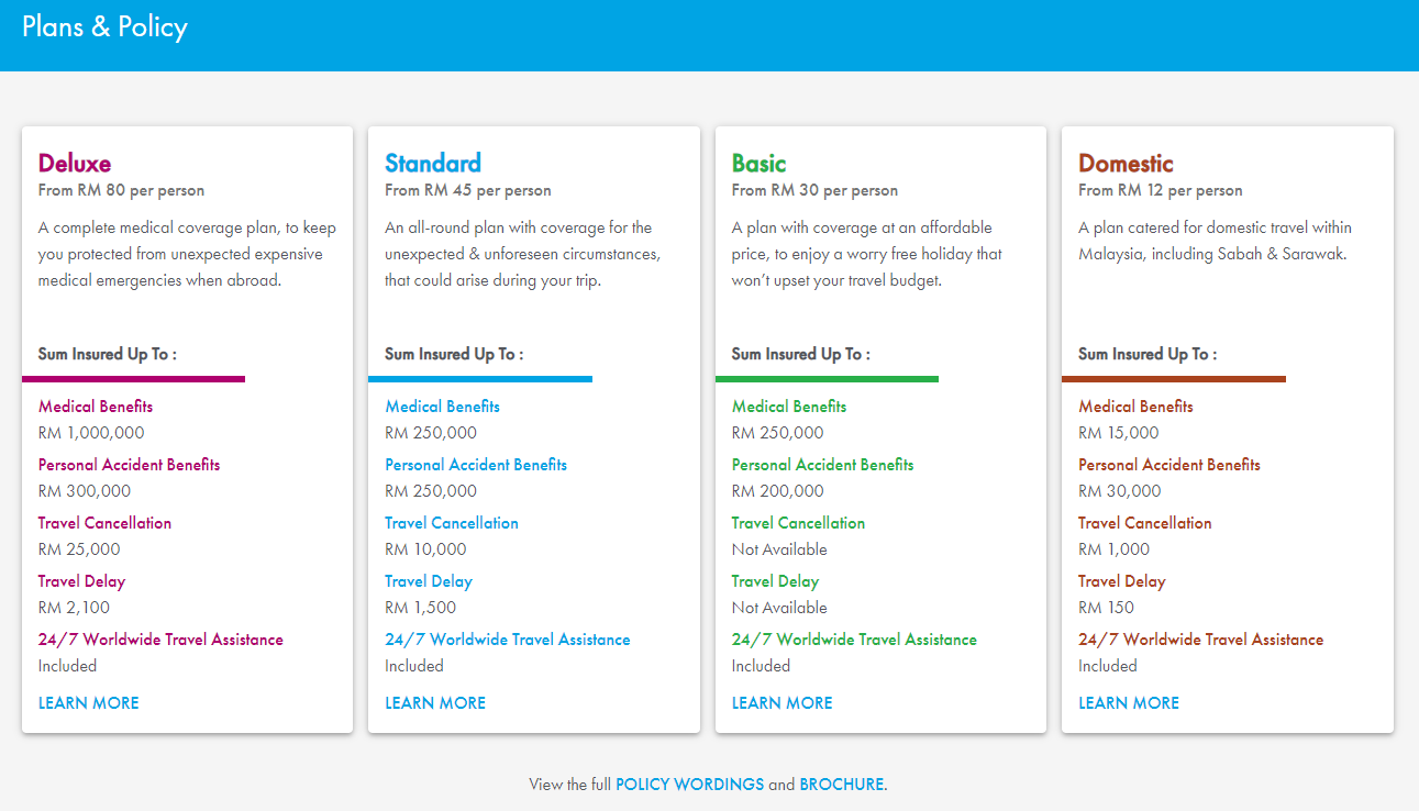
Credit: https://www-424.aig.com.my/buytravel[/caption]In this example, the coverage plans offered are easily viewable and compared, it also utilises colour UX in highlighting the plans respectively. In addition, customers can click on 'Learn More' to see the coverage amounts in detail as below.[caption id="attachment_1097" align="aligncenter" width="1734"]
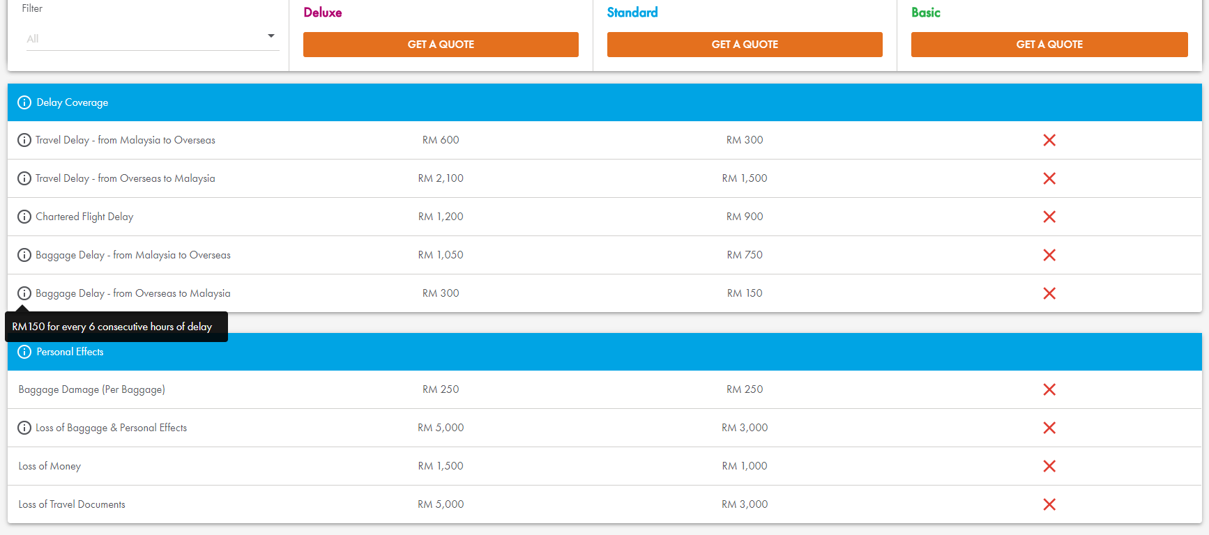
Credit: https://www-424.aig.com.my/learnmore[/caption]The full details show the coverage amount for each benefit, it also makes use of the tooltip feature that allows customers to find out more specific information.
5. Forms
Once customers have selected their preferred travel insurance plan, they will need to complete a form with their personal details. The worst thing to happen now is for the customer to feel frustrated filling out the form and decide to abandon the purchase entirely. Saving user’s time whenever possible is an important UX consideration. You can find out if your customers are dropping off by looking into data analytics to check the bounce rate, and to figure out how best to optimize your website. Digital analytics can help to measure what fields users are abandoning your website so that you can further pinpoint the problematic UX issue.
Bad Example:
[caption id="attachment_1102" align="aligncenter" width="764"]
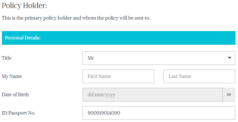
Credit: https://www.chubbtravelinsurance.com.my/[/caption]For Malaysian National ID numbers, the first 6 digits indicates the date of birth and the last digit indicates gender. In this form, it fails to take the ID number to auto-populate the date of birth, and the customer needs to manually fill out their date of birth.
Customer Expectation:
[caption id="attachment_1134" align="aligncenter" width="650"]
Credit: https://www.etiqa.com.my/tripcare360-new/en/takaful/qq2[/caption][caption id="attachment_1103" align="aligncenter" width="1197"]
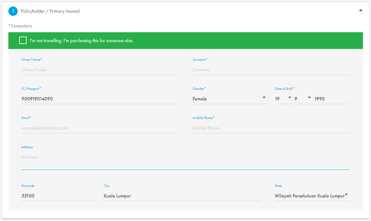
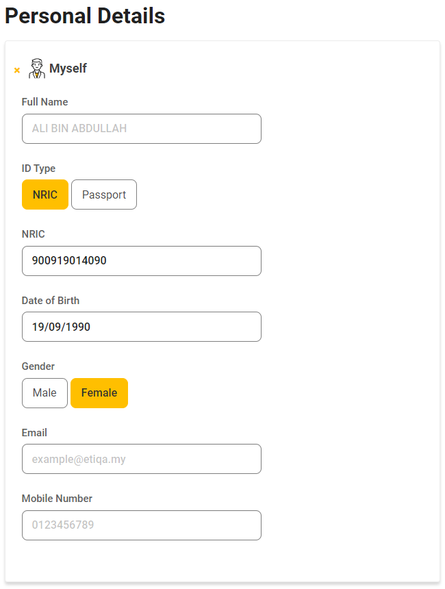
Credit: https://www-424.aig.com.my/details[/caption]Customers expect the form to take the ID number entered to auto-populates the gender and date of birth which is easily derived from the ID number itself, saving the customer the hassle of completing these fields manually again. In addition, by inputting the postcode, the form auto-populates the city and state as well.By having a smart form, using the ID number and postcode to fill up four fields has saved the customer from having to complete the same fields manually. A form that is smart helps the customer fill in the form in no time and without much effort. In doing so, it also helps in error prevention due to human error, lowering the rate of user errors and improving the usability.
Summary
When customers choose their travel insurance plan, firstly they need to know whether they qualify upfront, without having to go through the entire process just to realise they aren't qualified at the end.Customers should be able to find all the information they need easily, having a clear, updated and well-organised list of FAQs is a great resource for referencing and in answering their doubts and questions. In addition, they expect to be able to see all the available coverage plans and their respective benefits to be able to make an informed choice.Once the customer has decided on a coverage plan, a smart form that is able to auto-populate certain fields makes the form filling process an easy and pleasurable user experience for the customers.Fulfilling these customer expectations for digital travel insurance in creating a good and positive user experience will help to decrease the bounce rate, increasing customer satisfaction and positive impressions.


