Colour psychology plays an important role, it is a key aspect in creating a suitable colour palette that brings digital design to life. There's a reason why McDonald's, KFC, Texas Chicken, Burger King, Carl's Jr and the like all favour the colours red and yellow. Think about it, aside from the common denominator of producing deliciously greasy food, they all share a similar colour palette of red and yellow.
These companies have long been using colour psychology to incite hunger. The colour yellow brings about a feeling of happiness and contentment whereas red brings out a sense of excitement and urgency.
According to a study by Management Decision, people make 62% - 90% of their snap decisions based on colour alone, this is the impact of colour and why colour psychology plays a vibrant role in user experience.
A great colour palette can elevate a design, and a bad colour palette will negatively affect your users' experience and could even complicate the usability of your website or app.
Colour Psychology

We may not even notice this but colour affects our brain waves and nervous system. Studies show that on a physiological level, colour can affect the production and release of hormones, affecting heart rate, blood pressure, blinking, respiration rate, muscle activation and brain waves.
Colours have strong biological links to emotions and physical reactions
In fact, colour psychology plays such a huge role in the human psyche that in the late 2000s, Japanese railway stations implemented blue lamps above the train station platforms in hopes of deterring suicide attempts. As a result, findings show that the suicide rate reduced by a whopping 84%!

Photo credit: unsplash
When it comes to user experience on websites and apps, understanding colour psychology can maximize your design. Colour evokes a feeling in your users, albeit unnoticeable, but definitely present. It helps to frame the users' mind, gently nudging them toward the right action, leading users down the conversion funnel.
When used correctly, colour can improve the user experience and conversion, grab hold of the users' attention and to elicit the right emotions which improve your sales as a result.
Cultural Differences
Colour in different cultures is an important factor to consider. The colour purple represents wealth and power in Japan, whereas in Thailand, it is a colour worn by mourning widows. Similarly, the colour red is an auspicious colour in Asia but in South Africa, it is one of mourning.
It's important to consider the cultural implications of colour palettes based on your target audience. If your website or app is intended for a worldwide audience, it is imperative to balance the colours and imagery in order to avoid negative connotations.
Colour Preferences
It is also essential to consider your users' background. Research suggests that our age affects our colour preferences. Young children are more drawn towards strong and warm colours, but as they grow older, they tend to prefer softer tones.
In terms of geographical climates, those living in warmer and sunny climates prefer bright colours whereas those in cooler climates favour a cooler and less saturated colour palette. This is evident when we see the vibrant colours present in India and Africa in their art and clothing, whereas Scandinavian design is geared towards more subdued and neutral tones.
Connecting UX Colours to Your Brand
Brand values play an important role in selecting a colour palette, as well as industry norms. One of the first things to do in creating a colour palette that supports your brand's values is to understand the significance behind various colours.
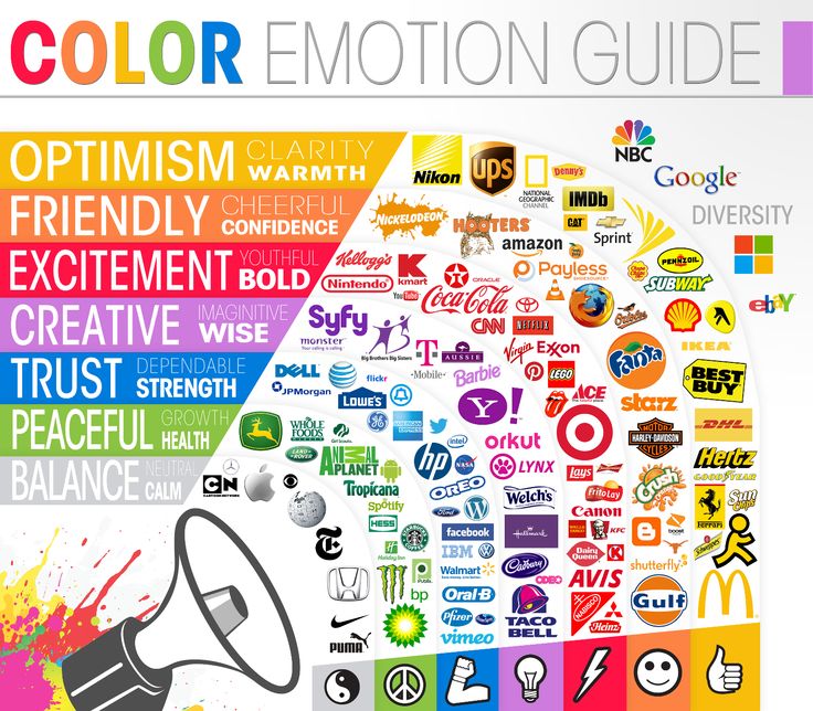
[caption id="attachment_1172" align="aligncenter" width="736"]

Credit: https://thelogocompany.net/blog/infographics/psychology-color-logo-design/[/caption]
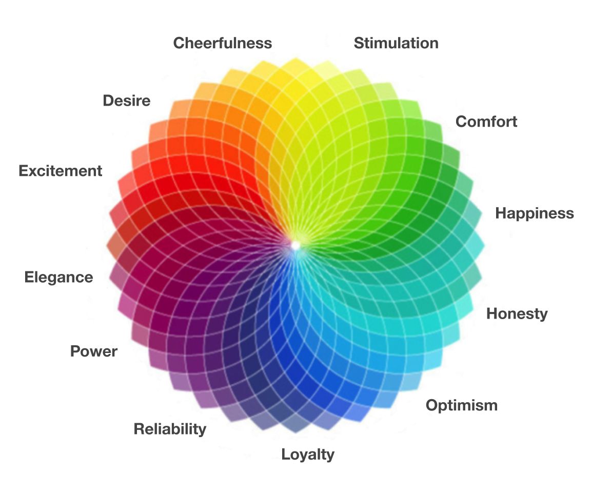
Red: Associated with excitement, danger and passion. Red is a strong colour, it grabs your attention and can evoke strong reactions in people. Lightening the red to a pink creates a more feminine feel whereas darkening the red to a maroon colour can feel warm. For example, AirAsia uses the colour red to evoke the feeling of excitement to urge users to book their flight.
Orange: This is a retro colour with strong ties to style in the 70s. Orange is often associated with youth and adventure. It is used to showcase unique and exciting creativity. It is almost as attention-grabbing as red but less overwhelming.
Brown: Earthy and grounded. The colour brown is often associated with nature, and coziness when used well. An excess of brown may come off looking dirty though.
Yellow: This colour is a happy, optimistic colour that has grown in popularity. Pastel hues are commonly used as a gender-neutral colour, whereas bright yellow stands out in creative designs. Yellow in dark shades like gold can signify prosperity and success.
Purple: Purple dye was actually very rare in ancient civilization, reserved only for royalty which is why it's been long associated with royalty and wealth. This colour also has a mysterious feel and can evoke feelings of creativity.
Blue: Loyalty and trust are common associations to this colour, bright blue is often for communication like Celcom whereas dull and dark blues are more serious. Blue is the most universally liked colour, which is perhaps why a large number of companies prefer to use blue shades in their branding, such as AIG, Paypal, BigPay.
Green: This colour has varied associations, it can evoke feelings of wealth and rejuvenation but also an environmental feeling. A light shade of green such as lime green is commonly associated with growth and renewal.
Grey: Depending on context, the colour grey can be seen as conservative and sophisticated. Or it can be seen as dull and emotionless.
Black: Luxurious and sophisticated associations can be provoked through this colour. It can feel modern, formal, or casual depending on the other UX colours that complement the use of black.
White: Similar to black, white can easily take on the characteristics of other colours in the colour palette. This colour is seemingly popular in minimalistic designs due to the neutral and simple nature.
Which Is The Right Colour Palette?
Consider what feelings and emotions you want your brand to evoke, the nature of your business and what you want your website or app to do.
A handful of banks such as HSBC, DBS, OCBC Bank, CIMB, AmBank and Public Bank all use a red colour palette whereas healthcare and insurance companies tend to use blue colours for feelings of trust as seen in Allianz, AIG, AXA, Zurich.
Media companies such as Media Prima and Netflix uses a majority of black colour with a red accent colour, and we see a lot of green being used in Grab and GoJek.
When the main colour of the website or app is black, it doesn't just feel more sleek and elegant but it also could help to absorb and soften other elements, as well as reducing eye strain. This effect is called dark mode, we have previously written an article about dark mode and whether it is suitable for your business. Read about it here: Dark mode UX has come to Facebook. Is it really suitable for your business?
Free Tools to Create A Colour Palette
- Muzli Colors: This tool can create and edit colour palettes and match colours. There is even a Live UI Kit Demo to preview your colour palette, allowing you to play around with colours and see an immediate preview.
- Colours.co: There are numerous user-generated colour palettes readily available to explore, you can quickly change colour palettes, change the number of colours in your palette and move around colours.
- Canva colour palette generator: This tool allows you to upload an image to generate a colour scheme, great for creating colour schemes that perfectly match an image you need to use in a web design.
- Colormind.io: In addition to generating free colour schemes, it also applies them to a mock landing page in real-time to allow a better visualization of your website design from the very start.
- Adobe Colour: Not only generates a colour palette using a colour wheel, but also allows you to extract a theme or gradient from any image you upload, and even has a function to check whether it's colour blind safe, which is an important design consideration for accessibility.
The best way to determine whether the colour palette for your business is suitable is by doing user testing. You could conduct A/B testing to allow your users to compare between two different colour palettes and to find out what emotions and feelings they feel and which colour palette they prefer for your brand.
The 60-30-10 Rule
This is a simple rule for creating well-balanced and visually appealing colour palettes. The main colour makes up 60% of the palette, this colour is generally quite neutral. A secondary or complementary colour takes up 30% of the palette and the remaining 20% is an accent colour.
Secondary and accent colours are a great way to stand out from brands that use a similar dominant colour, it is also an easy place to start if you want to add unconventional colours into your design.
Having pops of unexpected hues outside the expected norms can elevate a design and to stand out from your competitors, creating an impression of forward-thinking and leaving a memorable impression on your users.
Button Colours
When it comes to deciding what colours to use for buttons, it is beneficial to consider existing conventions. We have been conditioned to think that red means stop or warning and green means go, and these conventions are carried forward to the digital world.
Think about it, when you get a call on your phone, we have the option to decline or accept the call. The decline button is further reinforced using the red colour whereas the accept button is reinforced using the green colour.

Users shouldn't have to use much cognitive thinking to process their understanding of buttons, it should be a split-second decision that users can easily make.
When we see the red buttons, we think cancel whereas green buttons are to proceed. So when it comes to the colour psychology of buttons, it's essential to take into account these existing conventions.
It's important to note that 4.5% of the world's population is colour-blind, they have difficulty distinguishing between red, green, brown and orange. Which means that we can't rely on colour alone to convey meaning, we recommend to always provide additional information. This can be in the form of an icon or text to be inclusive of those who are colour-blind in order to provide them with a pleasant user experience.

In Closing
Colour psychology plays a bright and vibrant role, an important part in your website or app, it helps to convey your brand value without using any words to your users. Colour is indeed subject to personal taste, and having cultural implications but when used properly, can stir desired feelings in users to increase your conversion rate.
It isn't noticeable but colour affects the human physiology and has been proven to really make a change, take the implementation of blue lights in train stations for example. The simple blue colour has been so successful in decreasing the suicide rate.
Take careful consideration when it comes to creating a colour palette, a great colour scheme can elevate your design but a bad colour scheme will deter users and potential customers.
Furthermore, always remember to adhere to the best practice of providing additional information such as text or icons so that users don't have to rely on colour alone. Avoid excluding those who are colour-blind in order to provide all your users with a considerate and pleasant user experience.


