Sometimes, cross-functional UX teams are required to analyse substantial amounts of research data and synthesise their findings to achieve the desired user experience outcome. One tool that helps facilitate this process is affinity mapping.
This article will delve into the basics of how to create an affinity map from scratch and exploit it to enhance user experience.
What is an affinity map?
Also known as affinity diagramming, or collaborative sorting, affinity mapping is a synthesis tool employed to quickly surface common themes in UX research findings, and visually present them in a way that almost anyone can interpret.
For all intents and purposes, an affinity diagram can be simply referred to as a visualisation of the relationships between concepts. It helps to identify patterns in UX data, and can be used to make sense of large amounts of information.
Overall, the advantage of using an affinity map over other types of UX research is that it allows one to see how two user groups and categories are related and how they differ from one another.
For context, imagine two groups where Group A consists of users who like tea, whereas Group B contains users who enjoy coffee.
By creating an affinity map for these two groups, you'll be able to see that there's likely some common ground between them—in other words, where both groups have similar interests.
But what about differences?
Let's say one group drinks five cups per day while another group drinks only three cups per week. This difference might not seem so significant at first glance, but when viewed through an affinity map lens, the differences become clearer.
What is the purpose of an affinity map?
Affinity mapping aims to organise information like field notes or surveys into groups of themes based on relationships and commonalities during UX ideation sessions.
As such, the core purpose of an affinity map is to first streamline data collected through user interviews, surveys, and other research methods into one centralised location. This is where one can easily find information as needed when creating prototypes or building out new features within a product roadmap.
So, utilising affinity maps, UX research team can create a visual representation of their UX research findings. They do so by mapping users' preferences for features, functions, and interactions with a product. This will give them valuable insight into how people are using their apps or websites and what they like about the solution compared to other products.
When to use affinity mapping?
Affinity diagrams help multiple UX teams across various disciplines to iteratively analyse substantial qualitative data and plot a meaningful path forward. In fact, affinity maps help make large research data more manageable and digestible, and thus, more actionable.
Bottom line, affinity mapping can be used to turn user research into actionable insights that drive product decisions. However, they shouldn't be used as a brainstorming tool but instead as a way to reconcile and act on the ideas derived from the brainstorming exercises.
So, affinity mapping should be used when:
- You are solving a complex problem.
- After your brainstorming session.
- You have many ideas or substantial research data to work with.
How to create an affinity diagram?
The most effective way to create an affinity diagram is by collaborating with all members of your UX design team. In practice, the diagram structures are relatively straightforward to facilitate the easy breakdown of sophisticated information.
This allows any team member to understand the disparate elements of the concept. It also enables UX teams to streamline their processes, reach consensus within a group and create new and innovative solutions.
Here are the main steps involved in the creation of an affinity diagram:
Idea generation
The affinity diagramming process starts with the generation of ideas one would desire their findings to revolve around. In practice, these ideas shape the direction of the team’s questions and notes. However, this should happen after the team has brainstormed the main product ideas.
Make notes
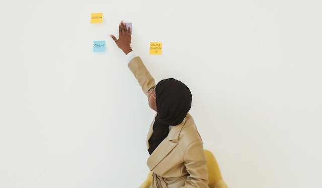
In the next step, teammates create sticky notes detailing the problems observed from their research or the questions they are seeking to answer.
[caption id="attachment_8226" align="aligncenter" width="640"]

Photo by Polina Tankilevitch[/caption]
Find patterns and themes
After having a number of sticky notes to work with, they are organised into common themes, groups or categories. The next steps is to continually iterate this process whilst evaluating each sticky note to add it to an existing category or create an entirely new one.
Ensure to name these groupings by their key identifying factors, but remember that you may need to make slight adjustments as you proceed.
Subsequently, you can choose to input this information into a spreadsheet, or a tool like Miro, Mural or FigJam to visualise everything at once, then move to the next step.
Explore findings from groups
This step involves exploiting your affinity diagrams to create action items and timelines that drive you to solve the problem at hand. You do this through exploration by identifying which groups and categories are related to one another—or not.
Try using arrows to visualise these connections to indicate potential relationships between themes.
In essence, the goal of the exercise isn't just to find correlations between multiple UX variables. It is also to analyse patterns across multiple UX variables so that the UX research team can make better decisions about how those variables affect each other and what they want each variable to represent.
After identifying these groups, you can introduce some additional filters and organisation tactics, such as:
- Prioritisation: Here, UX teams can prioritise the groups based on the project goal.
- Hierarchy: If there is a clear hierarchy between stickers, UX teams can group them based on the level of idea.
The fundamental premise of the above steps is to help UX teams derive major insights, understand user needs, pain points and identify gaps in UX data. These insights can be translated into empathy maps, personas and problem statements to aid the design process.
Generally, UX research team should see their data come to life as they iterate through these steps and get a better understanding of the scope of the problem.
How to use affinity mapping to analyse UX research?
Affinity diagrams essentially provide an excellent way for any UX team, especially product teams, to organise and synthesise their ideas. They help in turning qualitative user research—from thematic analysis to ethnographic research— to derive actionable insights that drive UX product decisions.
However, affinity mapping isn’t suited for quantitative data or research from sources like focus groups. This is because focus group participants tend to render disparate perspectives concurrently, eliminating the affinity mapping requirement.
That being said, affinity mapping is well suited where UX research has lots of contexts and is required to consider various experiences. For example, in-depth interviews (IDIs).
The outcome of effective affinity mapping can then be exploited to:
- Build personas that clearly represent one’s target audience.
- Inform the creation of empathy maps.
- Synthesise insights to create a problem statement for one’s design process.
- Provide a stronger foundation for ideation.
Affinity mapping UX example
[caption id="attachment_8227" align="alignnone" width="640"]

Photo by Yan Krukau[/caption]
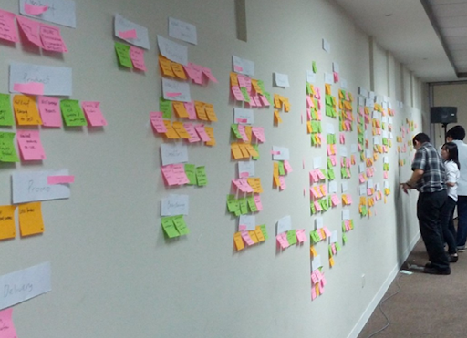
UX teams can organise their ideas by colour-coding, using different coloured sticky notes to organise ideas. They can choose different colours to represent ideas, customer feedback or even label each cluster with a different colour. Sub-categories can also be a different colour from the main categories.
Subsequently, teammates can reorganise the sticky notes into new groups, while retaining the colour from the original organisation.

Affinity mapping vs card sorting
Both affinity mapping and card sorting are tools employed during information architecture organisation. Card sorting is a usability technique in which participants are asked to categorise cards based on their assigned labels (e.g., "categories" or "functions").
On the other side of the spectrum, affinity mapping analyses how users interact with products and how they think about those products through their past experiences and current expectations.
Despite sharing similarities, affinity mapping is more free-flowing and less structured than card sorting. In fact, card sorting is more structured to help UX designers better understand what content types might work together on a specific page or feature.
Furthermore, card sorting is a better tool for understanding how users categorise information, while affinity mapping is better for understanding how users think about things.
What is the difference between affinity mapping and empathy mapping?
You may have heard the term affinity mapping and empathy mapping used interchangeably. However, there is a clear distinction between these two techniques.
Affinity mapping is a technique for organising and visualising the data collected from user research. It helps you to understand how your users relate to each other by identifying themes and patterns across all users' behaviours. Affinity maps encourage different ways of thinking for UX teams to break ingrained assumptions.
On the other hand, empathy maps are considered a temporary container for the insights gathered during user research. For example, some UX researchers would save time by writing insights from user interviews directly onto an empathy map. Thereafter, the UX researcher would start the affinity mapping activity to organise the information they have on the empathy map.
Conclusion
In summary, affinity maps are useful for turning user research into actionable insights. Affinity maps are typically used by product teams to synthesise their findings from user interviews in order to identify pain points related to the design elements that were discussed during UX research interviews.
If you're new to UX research or haven't done much of it before, affinity mapping can also help you get started with this type of work.
In fact, it's important to note that affinity maps aren't just for UX researchers—anybody can use them! For example, designers might map out which elements they think are most important when designing an app.
On the other hand, marketers might map out how users interact with certain sections within an e-commerce site during shopping trips online before making any changes based on this information.
In summary, affinity maps work:
- When you want to group ideas together. Especially, as a great way of getting an overview of the pain points that affect your users and their needs.
- When you have too many ideas to organise. Affinity mapping is a quick way to see where they overlap and where they're not connected at all.
- If you have a substantial amount of data (or if your team is just having trouble prioritising). Affinity mapping can help you find commonalities between different types of information—and help prioritise which pieces are most important for further research or development.
At NetizenExperience, we’ve helped create affinity maps for various user research services projects. Reach out for a discussion on how they can be useful for your UX design project
[/et_pb_text][/et_pb_column][/et_pb_row][/et_pb_section]


