User Interface: Beginner’s Guide
A user interface is the most essential element of a computer-based system.
If a user interface is poorly designed, users’ ability to leverage computational applications may be severely hindered. Actually, a weak interface can cause an otherwise well-designed and solidly executed application to fail altogether.

What is user interface design?
A user interface (UI) is an interactional point at which human users can communicate with a computer program, website, or application.
The central goal of an effective UI is to fundamentally make a user’s experience more straightforward and intuitive, requiring minimum effort to receive the maximum desired outcome.
That being said, user interface design is a discipline where designers build interactive interfaces in software or computerised devices, with a principal focus on looks or style.
In UI design, designers seek to create interfaces that users will find easy to use and pleasurable. It is commonly synonymous with User Experience (UX) design, which we shall expand on later.
Overall, UI design starts with identifying users, tasks, and environmental requirements. Once tasks have been extensively identified, user scenarios are then created and analysed to define a set of interface objects and actions.
This provides a foundation for the creation of a screen layout that depicts:
- Graphical design,
- Icon placement,
- Definition of descriptive screen text,
- Specification of major and minor menu items.
As the design progresses, elements like response time, error handling, command and action structuring are handled as the design model is refined.

Types of user interfaces
- Graphical user interface: This UI takes input via a visual UI output (keyboard and monitor).
- Form-based user interface: This type of UI is used to enter data into a software program or app by offering a limited selection of choices. For instance, a settings menu on a device is form-based.
- Menu-driven user interface: This type of UI uses a list of choices to help users navigate a program or website. For instance, ATMs employ menu-driven UIs that are easy for everyone to use.
- Touch user interface: This type of user interface operates through haptics or touch. Most tablets, smartphones and smart devices that operate using a touch screen employ a haptic input.
- Voice user interface: This type of interface supports interactions between humans and machines via auditory commands. For example, virtual assistant devices like Apple Siri or Amazon Alexa, talk-to-text, GPS, etc.
User interface design principles
The three key principles for the effective design of user interfaces are:
- Place the user in control
- Reduce the user’s memory load
- Make the interface consistent.
However, to achieve an interface that conforms to these principles, an organised design process is required that considers other supporting principles.
So, let’s break it down, shall we?
- Define interaction elements in a way that doesn’t force a user into unnecessary or undesired actions: For example, there is no reason to force a user to remain in spell checking mode if the user desires to do a small text edit along the way. Ideally, a user should be able to enter and exit any mode they choose, with little to no effort.
- Reduce users’ memory load: Remember, the more users have to remember, the more error-prone their interaction with the system will be. This is why it’s important to build a user interface that doesn’t tax the user’s memory.
- Enable flexible interaction: Since different users have disparate interaction preferences, choices should always be provided. For instance, software can allow users to interact via keyboard commands, a digitiser pen, mouse movement, or voice recognition commands.
- Allow user interactions to be interruptible and undoable: Whenever involved in a sequence of actions, users should be able to interrupt the sequences to do something else (without losing the work that has been done). Users should also be able to always undo‖ any action.
- Always streamline user interactions as skill levels advance and allow the interaction to be customised: Users typically find that they execute the same sequence of interactions repeatedly. As such, it can be helpful to design a mechanism that enables an advanced user to customise the interface to facilitate their exact interactions.
- Establish meaningful defaults: Your initial set of defaults should always make sense for the average user. However, a user should also be able to specify individual preferences. Furthermore, a reset option should always be available to enable the redefinition of original default values.
- Define shortcuts that are intuitive. Whenever mnemonics are exploited to accomplish a system function (for instance, alt-P to trigger the print function), it should always be tied to the action in a manner that is easy to remember (for example, the first letter of the task to be invoked).
- Hide technical internals from the casual user. An effective user interface should always move users into the virtual world of the application. Users should not be aware of the operating system’s underworkings, file management functions, or other technical complexities.
Ideally, the interface should never require users to interact at a complex level that is ―inside the machine. For example, users should never be required to type OS commands from within application software.
- Maintain a level of consistency across a family of applications: A set of apps (or products) should all execute the same design rules so that consistency is maintained for all interactions.
- Design for direct interaction with elements that appear on the screen: Users should always feel a sense of control to easily manipulate the objects that are necessary to execute a task in a manner similar to if the object were a physical item.
Why is user interface important?
A user interface is imperative to meet user expectations and support the effective functioning of any website.
A well-executed user interface facilitates effective interaction between users and a program, app, or machine via contrasting visuals, clean design, and responsiveness.
So, when designing a UI, it’s imperative to always consider the user’s expectations in terms of visual aesthetic, accessibility, and ease of use.
This is because an optimal mix of unique visuals and efficient responsiveness can improve a website’s conversion rates, since it anticipates users’ needs, and then satisfies them.
What is the difference between user interface (UI) vs user experience (UX)?
Often confused with user experience (UX) design, UI design mainly revolves around the surface and overall feel of an application or program.
This means that UI design principally focuses on enabling designers to build an essential part of the user experience. UX design encompasses the entire spectrum of the user experience.
Nonetheless, user experience and user interface are highly related and equally important, but their specifics differ. As we noted, UI focuses on the intended look and feel of the site.
On the other hand, UX spans the entire process of conceptualisation, interface development and delivery. To contextualise this better, let’s breakdown the main differences between UX and UI:
- UX focuses on the purpose and functionality of the product, while UI is focused on the quality of the user interaction with the product.
- UX encompasses components like market research and identifying user needs, while UI focuses on artistic design components pertaining to the look and feel of the user’s experience.
- UX can be referenced in relation to almost any product, while UI mainly pertains to digital products.
- UX focuses on the overall project management process, from ideation through development and delivery. On the other hand, UI specifically focuses on the design of the finished product.
Read more in our article on “UX Design and UI Design – What Is the Difference?”
Tips and techniques for creating a good user interface
Overall, an effective UI design should always support a positive UX. Essentially, it should have an attractive appearance, a coherent structure, and be easy for users to understand.
Furthermore, even after the UI design is perfected, there will be some debugging and fine-tuning required once it goes live.
To get the best outcomes, ensure to follow these tips to create a compelling user interface:
- Be mindful of contrast
- Keep it consistent
- Keep relevance in mind
- Know your target user
- Maintain branding
- Make it easy on the eyes
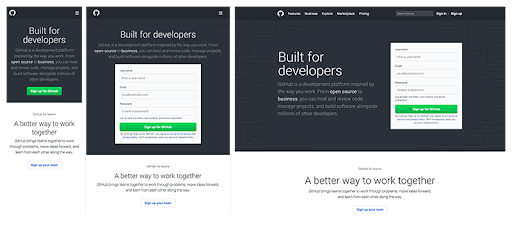
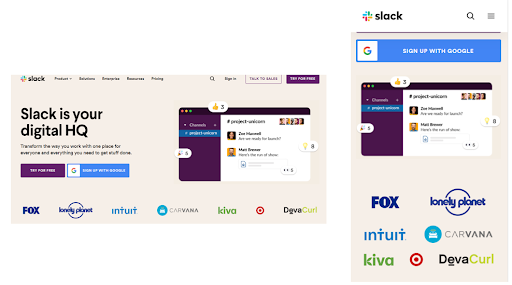
- Design for responsiveness
- Experiment with design
- Focus on usability
- Make it easy overall
- Always proofread
- Provide logical next steps
- Remain predictable
Conclusion
User interface design is like working on a blueprint for a house that is not complete without a representation of doors, windows, or utility connections for water and electricity.
Remember, interface design primarily focuses on three areas of concern:
- The design of interfaces between software components
- The design of interfaces between software and other non-human producers and consumers of information
- The design of the interface between a human (the user) and the computer.
While it’s true that user interface design has advanced, one still encounters user interfaces that are inherently difficult to learn, use, confusing, and in many cases, very frustrating.
Yet, a designer spent time and resources building the interface, and it’s not likely that the designer created these problems purposely.
To avert such instances, user interface design should focus on the study of people as much as technology issues.
For example, who is the user, and how does the user learn to interact with a new computer system?
Or how does the user interpret data generated by the system?
What will the user exactly expect of the system?
These are some of the many questions that must be asked and answered during user interface design.
Reach us at Netizen Experience for UI/UX design services in Malaysia.


